Do you enjoy deep dives into strange history like this? Check out my book, Hidden History of Walt Disney World, for more bizarre tales! Available nationwide through History Press.
While I was doing my photo gathering and my fact checking for The Contemporary Resort in the 1970s, I noticed something that was sort of funny. There's hardly an element anywhere in the hotel that somebody hasn't taken a photograph of and posted as being "from the 1970s" - including stuff from the California Grill. It's true, there's a lot of history at that hotel, and it can be tough to discern exactly what came from which era. Which is why I knew I had to go further than 1981 from the start.
This article picks up exactly where my previous article left off and will bring the Contemporary up to what I consider its fourth distinct version, the big "turquoise and purple" reboot in 1995. That version of the Contemporary stuck around until about 2007, and is well documented elsewhere online and in recent memory. It's funny, from the perspective of a historian attempting to crunch history, to see photos of the post 1995 remodel labeled as "old Contemporary" or "original Contemporary". It's an ironic fate for a hotel with such a name to be always so behind the forward curve of history so as to seem to each new generation of visitors to be untouched from 1971, but really there's very little - outside of the Mary Blair mural - left from her earliest years.
This is going to be a much quicker moving overview than the first, for no other reason than that it's a much less involved story to tell. So catch up with the history of the first ten years of the hotel if you haven't already, and then it's time to move on to:
1987 - 1989: The Second Big Rebuild
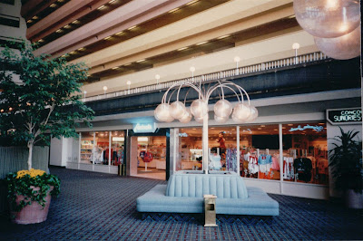
Not much changed at the Contemporary through most of the 1980s. The 1978 rebuild of the south side of the Grand Canyon Concourse removed all of the original "shattered glass" indoor trees, but the north side - the Plaza Shops area - remained untouched. Then, sometime around the opening of EPCOT Center, the old trees were replaced with silk trees, familiar from many a mall across the land:
By the mid-80s, changes were brewing in Walt Disney World hotels. The old guard of the 1970s were out and Michael Eisner and Frank Wells were in. Eisner had a specific mandate to expand Walt Disney World's fleet of hotels, and already plans for "Moderate" and "Budget" hotels were rolling forwards.
In late 1986, a Walt Disney World press release read:
"A multi-million dollar roof-to-lobby remodeling is making one of America's most famous hotels, the Contemporary Resort at Walt Disney World, even more of a favorite place to stay. The multi-year project will not only change the appearance of each of the 1,050 guest rooms in the 15-year-old resort but will also touch most other guest areas of the structure.Changes were already underway on the concourse. In 1986, The Spirit World liquor store was remodeled and reopened as Concourse Sundries and Spirits, featuring one of the most iconic signs from olden Walt Disney World:
First evidence of the change is in the lobby, which has been completely redone with new furniture and appointments. New costumes for the Contemporary Resort staff complement the rich new appearance guests see as they enter the building.
First impressions of a world-class hotel will be reinforced as guests see the totally remodeled rooms. Warm new carpeting and wall coverings blend with the all-new bleached-oak furniture, paddle fans and lighting. Bathrooms have been completely remodeled, as well, and now feature luxurious, black granite sinks. Each room's balcony has a new ceramic tile floor.
The design, says Contemporary Resort Manager Dale Stafford, was chosen because of its residential feel: 'It gives our guests a feeling of coming home after as busy day in the parks.'"
Notice the three windows displays of liquor outside:
Nearby, the Fantasia Shop and Plaza Gifts & Sundries were officially joined together under a new name with a new central Mickey statue: Fantasia.
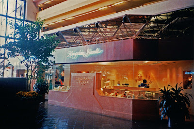
1987 saw the closure of Monorail Club Car bar as the entire original Contemporary shop complex was demolished and replaced with a new structure, with an open, airy top. "Bay View Gifts" took over the former Monorail Club Car space, while The Contemporary Man, The Contemporary Woman, and Kingdom Jewelers continued on:
Here's a good view of an oft-forgotten feature: the various levels of the Concourse Towers were each painted a different shade, suggesting the layers of the Grand Canyon. This appeared sometime around 1983 and lasted until 1995.
By 1988, the Terrace Cafe had changed its name to the Character Cafe, to reflect the fact that it hosted the popular character breakfast and buffet, but the name seems to have lasted at most a year or two, because by 1988 the entire South side of the Grand Canyon Concourse had closed.
Meanwhile, elsewhere at Walt Disney World, the massive Walt Disney World Swan and Dolphin complex was rising west of EPCOT Center. Designed by Michael Graves, the Swan and Dolphin combined pink and green colors, lattice, indoor trees and silk plants, and bizarre geometric shapes into a highly distinctive whole.
 |
| David Simpson |
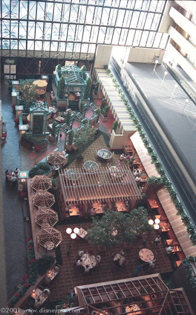
For the 1989 remodel, the three-level restaurant terrace which had been constructed in 1978 was flattened. The Terrace Cafe / Character Cafe became the new Contemporary Cafe, and annexed the Pueblo Room for additional seating. You can see the entrance to the restaurant leading directly towards where the Pueblo Room once was:
 |
| DisneyPix.Com |
7) The Concourse Grill 8) The Contemporary Cafe
9) Outer Rim Seafood & Cocktail Lounge
9) Outer Rim Seafood & Cocktail Lounge
The Contemporary Cafe continued offering its popular breakfast in the morning and Italian buffets at night. Characters could be found at each meal.
Terrace Buffeteria was entirely rebuilt, abandoning its food line service and installing a trendy open kitchen, a gazebo-like central dining area, some light poles and trees and those weird not-quite-umbrella things over some of its booths. It became The Concourse Grill.
 |
| DisneyPix.Com |
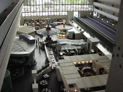
Outer Rim survived the transition but gone were the Prime Rib dinners and in was seafood cocktails, beer, and televisions. In these photos by Jerry Klatt you can see the minimally altered 1972 architecture existing alongside the upgraded 1989 restaurants.
Sitting behind the Contemporary Cafe you can still see the sign for Coconino Cove. The windows have been frosted. The Cove lounge disappears from Birnbaum guides around this time, so it's extremely likely that the space was dismantled or simply used for private events only from 1989 onwards. Also closing at this time was The Gulf Coast Room, downstairs. It was converted back into a conference room and remains one to this day.
Now we must switch our scene to the Walt Disney World Village for an unexpected interlude. Since 1975, the Shopping Village had attracted a mix of tourists and locals for its relaxed atmosphere and casual mix of high end boutiques. Certain features had quietly become Central Florida institutions: the Village Wine Cellar, which back in the 70s was just about the best wine store around (and they offered a membership club), and the Village Lounge, which quietly began booking top name jazz talent and slowly became so much of a mecca for Floridian music students that they had to institute a cover change.
Prior to 1989, Walt Disney World had operated under a "good neighbor" policy in Central Florida; they had even offered buses to Sea World, Cape Kennedy Space Center, and Cypress Gardens. In 1989, Disney turned insular, opening three direct challenges to local entertainment offerings: Typhoon Lagoon (to compete with Wet n' Wild), The Disney-MGM Studios (to undercut Universal Studios Florida), Pleasure Island (to compete with the downtown Orlando nightclub complex Church Street Station), and even a movie theater. As part of the creation of Pleasure Island, The Walt Disney World Village switched names to the Disney Village Marketplace, and began to renovate its high end boutiques and restaurants into explicitly family-friendly locations.
Walt Disney World's clientele, which had previously been substantially adult, was starting to skew younger and younger. One by one, fine dining restaurants around the resort began to close or be converted into more populist concepts. The end of the road for the original vision for Walt Disney World of relaxed elegance was at hand.
1991: The Convention Center Expands
The Convention Center opened in 1991 and its largest ballroom, the colossal Fantasia Ballroom, displaced the Ballroom of the Americas as Walt Disney World's single largest meeting space.
(Look carefully in the photo below and you can see the original sunroom-style windows where the Pueblo Room seating was; they've since been rebuilt into standard flat windows.)
The original drive-through lobby dropoff area would be truncated by the extension of the Level of the Americas to bridges leading down into the new convention center, so a new outside Porte Cochere was built outside, instead of under, the west-facing wall of the Towers:
At this point the lobby was extended forward to meet the new drop off area. When you walk out the side doors of the current Contemporary Resort lobby and walk towards the bus drop-off, you're walking where cars used to drive! This should explain a lot.
The Convention Center is one of Walt Disney World's most distinctive spaces, even 25 years later, making it among the most successful pieces of architecture built for Disney in its era. Where so much of the interior of the modern Contemporary feels strange and forced, the Convention Center remains effortlessly airy and unique.
1995: The Third Big Rebuild
Since 1988, the Eisner administration at Disney had made remarkable strides in developing and expanding the concept of what a "themed hotel" could be. Starting with the hotels at Euro Disney Resort in 1992, and especially the Wilderness Lodge and Boardwalk hotels in 1994 and 1996, a new standard was set where the very best hotels could be themed as well or better than any area of any theme park. The Eisner administration was instrumental in creating this expectation, and still has built many of its best examples.
In the early 90s, efforts to deepen and improve the theming at the Polynesian Village were underway, and the Golf Resort, which had only ever sought to create a pleasant country club atmosphere, was given a mild Snow White motif in 1987 (along with a new name: The Disney Inn), and sold outright to the US Military in 1994. But the Contemporary Resort wasn't really ever themed, not in the way that the Yacht Club or Dixie Landings was, anyway. How do you upgrade the Contemporary to be a "theme" hotel?
This blurb from a January 1995 issue of "VISIONS", which was a sort of in-house "newspaper" for the Contemporary, lays out pretty fully what Disney hoped to do with their most distinctive resort.
"When you stepped through the front door and into Disney's Contemporary Resort, you knew, of course, that you were stepping into a first-class Resort. But did you know that you were stepping into one giant modern art gallery?
As a lasting tribute to Walt Disney's vision to combine the best of science and art, Disney's Contemporary Resort has no shortage of the latter.
The lobby's look was visualized and created by an Independent design firm from Philadelphia to inspire the mood of a modern art and set the tone for the resort. The soft hues and marble textures illicit a progressive "contemporary" feeling.
Take a few moments to peruse to collection of limited edition prints adorning the walls of the lobby and elsewhere. This impressive collection was acquired through an independent professional art consultant, who traveled extensively in search for the right piece.
You'll see such works as The Five Seasons by Roberto Juarez, Grape Leaves by Ellsworth Kelly, and Nella Pupilla by Judy Pfaff, plus many more. We're sure you'll enjoy this varied collection.
Tucked away in a far corner of the Convention Center is a meticulously realistic sculpture depicting an immortal scene from Disney's animated classic Fantasia. A single frame of two-dimensional celluloid is brought to vivid three dimensions. (Actually, this was in the lobby, but maybe in early 1995 its final location had not yet been determined - ed.)
At the center of the 4th floor Concourse is the world's largest mosaic mural. It took artist May Blair and her assistants more than eighteen months to design and create, and is based on the Native American lifestyle of the Southwest. It is composed of 18,000 one foot square tiles. In true artistic fashion, you can see a five-legged goat inside the mural. According to Indian beliefs, only the gods could create perfection, and all man made creations must be made with an intentional imperfection.
The modern art collection also includes less traditional forms. In fact, it's literally right under you; the furniture. Fitting in perfectly with the lobby's ultra-progressive look is a collection of ultra-modern furniture. Created with sharp angles and sloping curves, they instantly conjure visions of the future.
The sofas in particular were imported from Italy and designed by renown Baghdad-born artist Zaha Hadid. They're named The Woush and The Wavy, for obvious reasons.
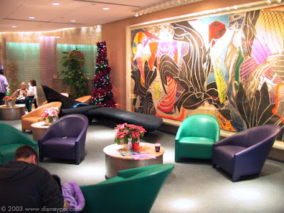 |
| DisneyPix.Com |
If one of the goals of art is to reflect ourselves back at us, this furniture seems to reflect our future selves back at us. After strolling the hallways in your quest for fine modern art, take a break and relax on this unusual furniture. This, you see, is functional art, meant to be enjoyed by the eyes as well as the rest of the body. Perhaps if this furniture represents the decor of tomorrow, you could be sitting on the future.
With such a wide-ranging collection of modern art, we're sure that there's something here for everyone. From the serious art scholar to the casual enthusiast, art touches all of our lives and makes the world a much more interesting place."
 |
| DisneyPix.Com |
Besides the obvious strain that writing those paragraphs placed on its author, we can detect several distinctly Eisnerian themes in that body of text. The most obvious is that there is no reference to Mary Blair as being a Disney employee, never mind a Disney Legend. Her mural, instead of being the thematic and conceptual centerpiece of the hotel, is just one of many works of modern art. And instead of her status as a home-grown Disney talent being valorized, her work is validated by sitting alongside other works of modern art, called out by name.
The blurb has an almost apologetic "it's art and it's fun!" tone to it that Disney would never pursue today. The key phrase, repeated over and over again, is "Independent", as in, "pointedly not done by Disney", with the implication being that Disney could never successfully do these things themselves.
So 1995 is the official end of the line for all of the Southwest architecture and design at the Contemporary and the start of its "chic" and "retro chic" phase. Besides "The Woush" and "The Wavy", the lobby also gained a new feature - an espresso bar, called Contemporary Grounds, often not too much more inhabited than it looks here:
The Fiesta Fun Center got a new updated look, with fresh-for-1995 graphics and architecture, and became the Food and Fun Center, although it still offered essentially the same snack food in pretty much the same footprint.
For the "Food & Fun Center" iteration of the concept, the game machine area was darkened up quite a lot. A prize redemption counter sat in the far left corner, where the Shooting Gallery once stood.
 |
| DisneyPix.Com |
Throughout the hotel, the rooms were once again refreshed, this time in cool modernist beige and tans. The hallways were done in alternating colors of purple, turquoise, tan, and grey. The main pool was rebuilt with flowing curves and a new slide.
On the "4th Floor Concourse"
Most of the changes this time occurred in the Restaurant side of the Concourse. Early 1995 directories show the shop complex still contained all of individual stores - Contemporary Man, Woman, and Kingdom Jewelers - but by mid 1996 the entire shop had been unified under the name Bay View Gifts, abbreviated BVG in a stylish, 90s-style "serif thin" font.
Meanwhile, by early 1995 the restaurant side had been rebuilt yet again, even while the actual layout changed at best minimally.
4) The Outer Rim Lounge
The Mary Blair Concourse dioramas were removed at this time, and their windows filled in and smoothed over - only three small windows at the top of the Outer Rim hexagon remained as a reminder of what was once there. The old Southwest architecture was removed and the entire space given a new open bar under what could be described as a colossal leaf.
 |
| DisneyPix.Com |
5) The Concourse Steakhouse
Economically built out of the basic infrastructure of the Concourse Grille, Concourse Steakhouse was essentially the same restaurant as the previous Concourse Grill. The wooden central structure became an abstract white canopy and the indoor trees were removed, but this one changed in look and name only from its 1989 incarnation.
One feature fondly remembered by many was the restaurant's display case near the entrance.
 |
| DisneyPix.Com |
An October 1998 menu includes Chicken Pizza, Contemporary Chopped Salad, T-Bone, Prime Rib, Filet Mignon, Glazed New York Strip, Mango BBQ Glazed Pork Ribs, Beef Short Ribs, and Jambalaya, with most entrees in the $20 price range.
6) Chef Mickey's
The big one. Common wisdom is that Chef Mickey's "moved" from the Village to the Contemporary, but it's far easier to say that the Contemporary Cafe simply expanded again, taking on the name as it did so. This time it swallowed up the Coconino Cove atrium area.
This is when the huge buffet and napkin twirling appeared. It's fascinating to think that Chef Mickey's takes up a space which was once home to, counting the back half of Outer Rim, four separate restaurants.
The California Grill
Topping off the hotel, both conceptually and literally, the California Grill opened in October 1995 to rave reviews. Replacing the stuffy "club" atmosphere of the Top of the World, California Grill was a significant demarcation point in Walt Disney World history.
The 1990s were the site of a major food reawakening across the United States, a movement which began in California in the 70s, went national in the 80s, and went populist in the 90s.
Prior to the 90s if you wanted top line food anywhere in the country, you put on your most expensive clothes and went to a place where the menu was likely as not printed in French. The rise of what we now recognize as "California fusion" dispensed with the formalities, exaggerated the presentation value, and focused heavily on local, in-season ingredients. Prior to this there really didn't exist much of a stopgap between the "family restaurants" of the 1960s and serious dining rooms. It wasn't until the spread of California fusion techniques that a true option for high end food in a more casual milieu was created.
Walt Disney World offers a good example of the distinction. On the low end of the spectrum were the "Snack Bars" and "Cafes" such as Pecos Bill at Magic Kingdom or The Dock Inn at the Contemporary. The next level up was the "Coffee Shops" such as Town Square Cafe and Coral Isle Cafe, and the "buffeterias" like Crystal Palace. The next step up from there brings you to the "serious food" locations like Papeette Bay Veranda and Flaglers, with the trio of top-top flight jacket and tie restaurants beyond that: The Empress Room, The Gulf Coast Room, and Victoria & Albert's.
Of course California Grill was and remains an expensive restaurant, but it symbolizes the democratization of fresh, excellent food at Walt Disney World in the 90s. You didn't need a jacket and tie to get in, and the servers were young, informed, and friendly. It remains a symbol of central Florida dining because in 1995 there was simply nothing like it anywhere, and it paved the way for later successes like Flying Fish and Jiko. For many living outside of New York and Los Angeles, California Grill would be their first encounter with anything of its type. For its time, California Grill extended and validated the legitimacy of the name on the sign of this hotel.
When you lay out the story of this hotel in the way I've done here, you can see that it's always existed on and in a wave. And while it may never have been "Contemporary" per se, I'm not sure that that was the point. The point was to have dramatic, unusual architecture and designs for the pure pleasure of having it, a sort of modernistic grown up Fantasyland. And to my mind, since the big 1978 overhaul of the concourse I detailed in the last article, the 1995 iteration of the hotel is the second-nearest it's ever come to actually making sense. It's never been perfect - the design of and the fact that Chef Mickey's devoured four separate restaurants is a noteworthy example - but for the 1990s it was an exciting, interesting place to be.
 |
| Michael G. Smith |
In the first part of my article I brought up Victor Gruen and the indoor shopping mall, and said that I considered it no insult to suggest that the Contemporary was a really good mall. The same distinction applies here. In the 90s as the hold of the mega mall waned, those centers of commerce responded to their own decline by rationalizing that if people were no longer going to their malls, the outdated decor must be the reason. And so they stripped out those large atriums filled with hanging abstract mobiles, trickling fountains, and silken indoor trees. And the death of the mall only accelerated. Today it's hard to find a mall that has the romance that those darkened, abstract proto-Disneylands held 25 years ago.
It's impossible not to see the correlation with the Contemporary. With no more lounge seats, warm colors, weird indoor trees and unique boutique shops, is it any wonder that the Grand Canyon Concourse today often seems abandoned? To appeal to people you need to first not lose sight of the fact that any public space needs to invite interaction. Right now, the Contemporary is at the shallow spot between the waves, as it was in the late 80s. But for a place called the Contemporary, it's ironic that the path back to having an attitude that matches the name on the door doesn't lie in the present, but in the past, in the foundations best expressed at the Magic Kingdom and Disneyland. Make it beautiful, make it fun, give people a place to sit and enjoy it, and they'll be back again.


