 Author’s Note: Over time, I have come to believe that the only useful, acceptable way to analyze and discuss what the themed experience does to the human observer is to discuss it as an extension of what the filmed image does to the human observer. This extends to the title of this essay.
Dialectical is derived from dialect, or language, languages carrying meaning. Therefore Dialectical Montage is nothing more nor less than how movies carry meaning through their editing patterns.
The purpose of this essay is to explore how film form – editing, camera placement, set design, lighting and on-screen movement – carries over through Disney films to Disney land.
 I have the unique and unfortunate distinction of having a birthday on the same day that not only Horizons closed, but Claude Coates died – two enormous losses to the art of the theme show. Of the major designers who worked at WED Enterprises during their “Golden Age” (1963 – 1982), Coates was perhaps the most undervalued as well as the most gifted. He was responsible for atmosphere and place setting. A Claude Coates touch is the fully stocked market placed behind the wench auction in Pirates of the Caribbean. A Claude Coates touch is the utilization of Rolly Crump’s “living architecture” throughout The Haunted Mansion. A Claude Coates touch is the way the cavern walls in Pirates of the Caribbean part at just the right moment to allow you a perfect view to Dead Man’s Cavern, passed four minutes ago. Claude Coates’ art was brilliant manipulation but infinitely transparent: cinematics transposed to three dimensions effectively and almost invisibly.
“If God could do the tricks we could do, he’d be a happy man.”
The quote above is from The Stunt Man, a mini-classic of reflexive film. It is told to a convict disguised as a stunt man by a maniacal director while being swept across a fake battlefield on a monstrous crane. The film itself is concerned with the process of cinematic deception.
 “I don’t want it to be like anywhere else in the world.”
The above quote is from Walt Disney, on the creation of his synthetic wonderland. Synthetic, of course, insofar as it is constructed of concrete and steel beams and fiberglass elephants. It is not synthetic in its’ artistry and its’ effect on the audience. Disneyland’s art is actually no more synthetic than that of the film art, despite being 60 years younger and still grossly undervalued by the critical elite. Yet Disneyland is a place that was conceived of and built by filmmakers and using studio resources that would not have been possible without Walt’s live-action units.
Disneyland is, in effect, a film, and its filmmakers were engaged in the art of the process of cinematic deception. “The problem [we were having] with Mr. Lincoln was that were weren’t building a person, we were building an illusion”, says Marc Davis. Disneyland constructs illusory spaces as ethereal as those shadow-plays that film creates on a screen, and the resulting dream state – branded “Disney Magic” by the corporate world – is identical.
Disneyland is actually the next evolution of film, just as film was the next evolution of the photograph. Now the camera has been removed and replaced with a vehicle which moves through a designed space in a fashion not dissimilar from a camera trucking along on a dolly. This observation was, of course, not dissimilar to one made by Christopher Finch in his famous volume The Art of Walt Disney, but it skips over a crucial fact: although the best attractions are, in fact, cinematic, they are not actually narrative.
So these attractions in fact usually relate themselves cinematically not to the narrative scene but actually the non-narrative montage: riders are shown a succession of images not through the device of a physical break in the material world of the attraction, but by moving effortlessly from one to the next in a vehicle. This forward motion actually becomes a form of montage, whereby one impression replaces another in the spectator’s gaze. This is part of the reason it is so difficult to relate the emotional experience of riding an attraction without actually just recounting the images which have been presented – the same thing can be said of montage.
 At this point it may be useful for a basic refresher on montage. Film theorist-maker Sergei Eisenstein (right) posited that since film is the process whereby one image replaces another (24 times a second to create the illusion of motion), that the basis of film-making ought to be the process of montage, whereby one unit (single shot) replaces another, contrasting shot to create a collision of ideas and, thereby, meaning.
Montage has been applied to early attractions in generally crude form; the art of the attraction did not, after all, reach maturity until 1967. And yet there are prescient precedents in the form of Snow White’s Adventures in 1955, where the directly linear mode of conveyance moved viewers past rapidly approaching and receding simple painted sets. The form of the attraction replicated, abstractly and then literally, Snow White’s famous flee through the forest in escaping the Huntsman. This famous and influential sequence has had a comparable influence on cinema as Eisenstein’s famous Odessa Steps in Battleship Potemkin. Snow White itself, in turn, influenced Eisenstein when he saw it in 1937 as part of his effort to get his lost project Que Viva Mexico! finished in Hollywood. The influence stretches backwards too: Walt Disney had his animators watching silent films as research, and Snow White’s frenzied twisting and turning in the forest is comparable to Lillian Gish trapped in the closet at the climax of D. W. Griffith’s Broken Blossoms.
There is, after all, a direct connection!
Of the variations on this concept of attraction-as-cinema tried by Disney throughout the years, Bob Gurr’s fantastic Omnimover system is the best vehicle to carry the concept of “seamless montage” in attractions, because of it’s ever-onward moving nature, the way it restricts the audience’s field of vision, and it’s versatility in direction. The Omnimover can selectively limit the audience’s view, first showing them, for example, a door being knocked on by someone invisible, then another with its’ handle turning, then a third being pried away from inside by ghoulish hands. Although all of these actions are happening simultaneously, the retreating action of the omnimover allows the viewer to organize the doors into a logical progression, creating the illusion that, as the vehicle progresses past the doors, the creatures behind are becoming more successful at escaping from behind them.
Disjunctions are created – rooms peel away into more rooms, stretch, expand, retreat into the infinite, narrow into corridors, part to reveal ghostly banquets, and yet none of this is explained away as anything more than the mercies of the house. For an attraction with a certain dramatic unity – it takes place in one house over the course of a stormy night – it is still an illogical flow of ideas. Even the house itself is subject to spatial, conceptual violation – rooms melt away into endless black voids through which rise staircases and hang chandeliers and lamps. Eventually the dramatic unities themselves are violated and the building turns inside out as an interior becomes an exterior and the distance and malleability of the ghosts solidifies into a tangible tableau of images, eventually climaxing as the ghosts themselves violate your “protective bubble”, your vehicle itself.
The Haunted Mansion does, in fact, have a motivating logic to it. The ride structures itself as a succession of moving through rooms, under arches, and through doors. The organizing logic of the experience is the house itself, although plot elements have been displaced in favor of a more anecdotal flow of information. In this respect the attraction is only partially relevant here, although the key conceptual item is that the Haunted Mansion still is not a narrative, and can therefore be termed as a “montage of ideas”, or, as Tony Baxter once succinctly put it, “Everything That Ghosts Do.”
A more relevant example would be The Adventure Thru Inner Space, a Claude Coates specialty item in that the attraction was nothing but a succession of atmospheric but essentially irrational, surreal images scaled in such a way as to suggest “shrinking”. Although very famous for being a prime place for some private-public miscreantcy, drugs and sex (Tomorrowland was the province of teenagers, not Pixar, back then remember), it has rarely been forgotten by persons of a certain generation for providing the kind of surreal reverie Disney had shied away from for years – moving beyond the necessity to tell a logical story, it became a succession of bizarre and visceral experiences which seemed suspectly psychedelic even in its’ dry scientific jargon: “Although your body will shrink, your mind will expand!”
Yet in providing a flow of irrational experiences, visual aids and minimal music, the only structuri
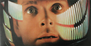
 ng logic to the attraction being a narrator of suspect reliability which eventually resolved into a first-person interior monologue (one of the strangest excuses for that too – his thoughts are suspended in inner space??), the attraction eventually resembled a very extreme interpretive montage of space age pseudo science. With minimal scenery to look at and much darkness, the brain running on much output and too little input, the emotional experience becomes synonymous with the dream state of which film is also possible of replicating. Cinematically, Adventure Thru Inner Space’s nearest contemporary is the “Jupiter and Beyond the Infinite” sequence of Kubrick’s 2001: A Space Odyssey.
The next Claude Coates venture, If You Had Wings, is the pinnacle of a certain kind of attraction in that it’s form most effectively replicates a montage. Here the montage moves from the kind of thematic unities of The Haunted Mansion and into pure abstraction, removing even the element of a set or setting in favor of projected and endlessly repeating film loops presented in logical but disjunctive patterns and united by what can be accurately described as a jingle. In effect, the form the attraction emulates is not an experience in a Haunted Mansion or even inside an atom, but a television commercial for Eastern Airlines.
And yet, finally, here is literal three dimensional montage, whereby the attraction presents an assortment of “clips” which the viewer may “edit” into any “sequence” through the act of looking from one to the next – a literal mechanized art installation which challenges even the material unity of a strip of film pasted together into a montage by fragmenting it into many strips, the form they take in the professional editing bay.
Eisensteinian theory tells us that the act of moving around even an image or two can result in an utterly different intellectual and thereby emotional cinematic experience, yet by exploding the filmed image into many filmed images, the attraction exposes the shot as the building block of the montage and the montage as the twentieth century’s most vital narrative form. In If You Had Wings, ironically long after the Hollywood vogues of things like 3-D and Cinerama which gave birth to Circlevision, the filmed image finally leapt off the screen and into the material world, if in form only.
--
If these sorts of discussions of cinematic montage seem alien to the emotional experience of the parks themselves, they in some ways are. Yet these works are built by filmmakers themselves, filmmakers who learned their craft in a narrative tradition which is just one form of cinematic potential. Eisenstein loved Disney’s films, considered Snow White and the Seven Dwarfs to be the greatest film ever made, and admired Disney’s total control of the image through animated form. His live action films following Disney’s Snow White are invariably built on the cartoon, not the play - the play being the original model for the cinema.
After all, amusement parks and cinema go back a long way. Coney Island had its’ penny arcades, the penny arcade’s Kinetoscopes and Mutoscopes being the key link between Eadward Muybridge’s famous photographs of a running horse and the Lumiere projection system, a link which Disneyland keeps alive through it’s own Main Street Penny Arcade and cinema. The link isn’t just inferred, it is spelled out for us: Photographs become Motion Pictures, Motion Pictures become Theme Parks.
Universal Studios was offering bleachers to view the action from as early as 1915, by the 1920’s there was an organized tour and by the 1950’s the famous trams were introduced. Charlie Chaplin’s 1917 studio was themed to being a row of Edwardian England cottages. During its’ aggressive expansion period of 1988 – 1993, Universal Studios Theme Parks hollered at us: “Ride The Movies!” But we had been since 1915, essentially synonymously with the emergence of the Hollywood Feature Film. Disneyland didn’t invent this, it just did it bigger and better than anyone before.


