Tuesday, May 22, 2007
Verticality
And so Disney has developed various methods of creating an artificial vertical space. There is not for nothing a projection of clouds on the ceiling of Pirates of the Caribbean - it is a simple depth trick which obscures the actual vertical height of the room. It expands space.
One of the most unique aesthetic features of the output of WED's "Golden Age" is the deployment of skylights and what vertical space they intend to create, and even stranger, the deployment of false skylights and what vertical space they intend to create.
The above image shows skylights (false ones) outside (from left to right) Pirates of the Caribbean, inside Columbia Harbor House, and finally inside Pinocchio Village Haus. There is also a second set of "skylights" in Columbia Harbor House's serving area, which links Harbor House and Village Haus with some strange, opaque connection. To my eye, the Pirates of the Caribbean ones are probably the most successful false skylights in the entire park, possibly owing to the fact that the attraction was built two years after the rest of the park and thus the designers had a better handle on what did and didn't work. More likely it is because the entire plaza area is designed to appear as if it is opening up to something; all of those bands of wood thrusting upwards towards the light; and because there is no height cheating, e.g. the structure's height you see outside is the same as the skylights you see inside. In terms of making an area bright and cheerful, even at night, it's hard to argue with these simple lights.
Much less successful are the Harbor House lights, which seem to me to be deployed sloppily in order to convince the diner that she is eating in a mess hall inside a ship. Since you can stand above this room in the same cafeteria, these have transparently been deployed for purely aesthetic effect, much like the entrance hall lights in The Hall of Presidents (right). Although both could probably pass for actual skylights, they make no effort to convince, and although the resulting effect is stately, it is not actually successful. And compared to Pirates and other examples, these skylights are as abstract as those found in Village Haus, which are the most purely visual abstraction of "the sky" found in any Disney park. They are also the least appealing "false skylights" to be found anywhere, making the area look less like a European tavern and more like the cafeteria it is. Furthermore in Village Haus only, perhaps, does it become transparent why exactly this particular architectural feature was invented in the first place: it's a vaguely pleasing way to hide flourescents.
And so, from abstraction, let us travel on into pure trickery, found in Adventureland. Both photos below are from the outdoor seating area of the Adventureland Veranda, but one is a real skylight and the other is false.
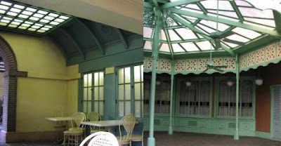
It shouldn't be too difficult to determine which is which, but the crucial point here is that both are to be found in the outdoor areas designed as the most remote seating for a Magic Kingdom eateries, and both are, in viewer effect, more or less identical. The first, especially, placed in an area likely to get sun from all sides, may be the most subtle in the Magic Kingdom, truly blending the line between inside and outside spaces. Rather than transforming day into night, as in Pirates of the Caribbean, here WED appears to be attempting to transform night into day - a far less likely to succeed and abstract concept, but here they are, making inside lights outside lights with nothing but a turquoise box and some frosted glass.
The full extent of how successful this strategy is becomes apparent when you look at authentic skylights in the same park and realize that the methods of their application are, essentially, identical.
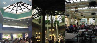
Here's skylights - real ones - from the Plaza Pavilion (Tomorrowland Terrace), Crystal Palace and Town Square Cafe (now Tony's). Notice that, especially at the Terrace, that the placement, effect, and features of the skylights are such that they might as well have been artificially illuminated, as in Columbia Harbor House. Disney seems to be using these as an signifier of class and luxury, which is why most appear in eateries, a setting most Americans want to feel sophisticated in, even on vacation. A skylight is an easy way to simply and effectively "class up" a barren area, reducing the sense of enclosure and artificiality. Let's not forget that Crystal Palace was once a high-end eatery and that King Stefan's Banquet Hall, while lacking skylights real or imagined, does feature very large floor to ceiling windows.
So when did all this nonsense start?
1966, in Anaheim, California. WED's experiments with glass enclosed sun rooms began at the Aunt Jemima Pancake House (real windows), continued on to the Victorian elegance of the Plaza Inn (again real windows), and culminated in the buffeteria known as French Market in New Orleans Square where, in 1966, as far as I can tell, frosted glass enclosures disguising simple strip flourescants passing as skylights were first used by Disney. This is a fairly logical extension of Disney's desire to control environment, progressing from real windows, where there is a chance for unpleasant (unplanned) weather conditions to be viewed, and artificial ones, where there is none. This is arguably pairs these artificial skylights with such "false portals" as The Haunted Mansion's windows which look out onto dioramas of barren landscapes. How long did the obsession last? Well...
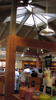
Left is an interior of the skylight-rich Lake Buena Vista Shopping Village, now known as Disney Marketplace, and for many years the store you see was known as Port of Entry. Many of the original Lake Buena Vista buildings prominently featured skylights as key aesthetic features, expanding space up as well as providing a reasonably innovative shopping experience. The faux-chalet interiors of these small and unpretentious buildings are still comfortingly human-scale today, and show more good design sense than much of, say, The All Star Sports or Coronado Springs.
Let's not forget those skylights in the concourse of the Contemporary and the lobby of the Polynesian, in The Land at EPCOT Center, and, of course, the entire Journey into Imagination development. Skylights, real or fake, meant a classy establishment. The trend continues today.
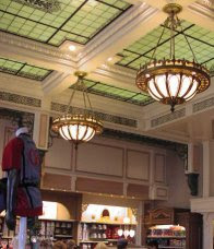
Above is the Emporium Expansion, built in 2000, almost thirty years after the park opened, but we see WDI remarkably following the aesthetic template WED favored, by placing false skylights in any area intended to be classy and expansive, day or night. A variation has evolved. When the Lake Buena Vista Village Golf Club became The Disney Institute in 1994, a huge new reception area was built which featured, not skylights at the top, but windows on all sides which served essentially the same purpose. Wilderness Lodge has both skylights and huge glass walls, and The Boardwalk (right) accents its' huge brass light fixtures with high windows which allow sunlight to flood in in much the same way as skylights do. And when the Grand Floridian was built in 1989, all that white and red had not only entire walls of glass to make sure that everyone knew it was extra classy, but, perversely, false skylight domes. Disney wasn't leaving anything to chance.
I know I'm missing a number of extinct or obscure false skylights here, but short of developing an actual thesis about this, I'd like to sum this long-in-development article by saying that this is but one of thousands of naggingly fascinating details integrated into Walt Disney World with surprising accuracy and frequency, from 1971 to today. And one final thing: anybody notice that, with no exceptions, that all of the false skylights are clustered on the West Side of the Magic Kingdom?
Maddening.
Friday, May 18, 2007
Park Mysteries, #2
Call me crazy, but I've poured over every Magic Kingdom guide published between 1973 and the opening of EPCOT and I've never found an entry for a quick service stand located here. I did learn that the dining rooms of what is now El Pirata Y El Perico housed The Golden Galleon and La Princessa de Cristal - which I'd love to see photos of sometime if anybody ever digs any up - which was then, I assume, absorbed into El Pirata at the same time Pecos Bill expanded in 1998 and destroyed much of the character of the surrounding establishments. But no juice bar. My 1980 guide lists the Veranda, its' attatched Dole Whip stand, Sunshine Tree Terrace, El Pirata and The Oasis, which is exciting until one realizes that that was next to the exit of The Jungle Cruise (and still is).
One theory is that the windows could've been added later (although they're made of the same material as other windows in Caribbean Plaza), when the photo shop existed, and could've feasibly served as pickup locations for photos once they were processed. Or maybe they were just nice windows which just so happened to have been designed with a ledge for transactions and a capacity-concious twin. I still think it was an Ice Cream window.
One thing which supports that they could've been added later: there is only one lantern hanging above the two windows and you know very well that Disney would've had two lanterns had it been intended to be a walk-up service counter area. There isn't even a covered up outlet for a second lantern.
Anybody have any ideas?
Tuesday, May 15, 2007
Adventures in Master Planning #2
Adventure Two:
The earliest example of this kind of innovative design is Harper Goff's 1955 Adventureland, which freely mixes and matches architectural styles and complex derivations thereof into an exoti
The masterpiece, or perhaps just the thesis statement, of this is a fifty-foot stretch of architectural riot in Disneyland, which sits crouched at
This short transition space is not as graceful, perhaps, as later ones found in The Magic Kingdom, but it is remarkable. As one progresses past the Jungle Cruise boathouse and the treehouse, careful examination of the Adventureland upper stories reveal balconies which grow gradually increasingly complex. The Oriental rugs slung across the railings of the earlier upper terraces slowly gives way to bamboo shades, then shortly to decorative items such as birdcages. Small cupolas appear, belonging both to
Which ultimately leads us to our adventure of this week, which is the utter failure of a transitory space, specifically, that crucial (because it is the only one) point in the Magic Kingdom where one land just ends and the other begins.
It's hard to fault the designers of Tommorowland and Fantasyland that their spaces didn't integrate: after all, the only reason this same transition works at Disneyland is because there's a 20-storey mountain between the two areas. Walt Disney World was slated for such a mountain at some point (after all, why else keep the Autopia and the Submarine Lagoon side by side if you weren't also going to drag in the Matterhorn?), but without it ever materializing, Orlando's transitory space was up the creek without a paddle. The area was aesthetically primed for it, too: Tomorrowland, the most parched area in the entire Magic Kingdom, certainly would've benefited from a few distant crashing waterfalls, and there's even a huge pedestrian pathway leading to where it would've been.What does help the transition is large open spaces, which we lost in 2004 when the sub lagoon was demolished and filled in, the continuation of the Skyway, which we also lost recently, and a very spacious two-sided walkway between the Raceway and the Tomorowland Terrace. But space alone can't fix the problem. Perhaps in 1971, before the Fantasyland Art Festival / Enchanted Grove was built, the plain undecorated side wall of Mr. Toad integrated better, but I doubt it. And placed right between the two areas, making the whole transition even more problematic, is the one Fantasyland attraction least likely to bridge the gap between Fantasy and Future: The Mad Tea Party!
There's no two ways about this one: it's just a big awful mess. At least lessons were learned: when Fantasyland Anaheim was redone in the 1980's, swiping most of the conceptual and aesthetic advances which were formerly exclusive to Orlando, the teacups were relocated to alongside the icy slopes of the Matterhorn, which is of course the only reason they were ever placed where they are in Orlando anyway. And there, next to the mountain, it works perfectly. I only wish we could've seen the match as supervised by Marc Davis, Joe Fowler, Dick Irvine, John Hench and Roy Disney.
Tuesday, May 08, 2007
Selling the Dream: Part Four
For example, he is credited with entering Disney into the realm of grown-up entertainment. With resorts like The Grand Floridian, Wilderness Lodge, The Boardwalk, installations like Pleasure Island and films like Ruthless People, this is pretty difficult to argue with. Still, this is still little more than a continuation of the expansion policy of the man he replaced, Ron Miller, who sought to push Disney properties into modern, successful arenas - like the partnership with George Lucas and Steven Spielberg, which he initiated. Since Eisner was a film executive before being hired by Disney, this is arguably par for the course. So, can continuing a preset trend be considered such a departure after all?
And yet another Eisner venture meant for adults (an extreme departure from Walt Disney World, remember), Disneyland Paris, is ground zero for the Eisner Blame Game. It's fun and easy! You can play along at home! For example: Euro Disneyland failed because:
A) It opened with a half-dozen resorts per park
B) It opened in France, home of Euro-centric cultural elitism
C) Those darn Imagineers built that park too well
Eisner-era marketing tactics included constant protestations of cultural relevance and vacant posturing about how cutting edge the product is. It is an appeal to adults, an attempt to reclaim an audience that was never lost to begin with. This is different from the Miller or Walker-era appeals to adults in that it is fake. So while we can be embarrassed or retrospectively amused by those earlier appeals, The Grand Opening of Euro Disney is downright irritatingly panderous. And if EPCOT's opening special abstracted that park into an intellectual concept, in Paris they seem embarrassed to even show us the thing.
While we can at least detect good intentions - scratch that, intentions - in the earlier Disney promotional specials, all we're left with in The Grand Opening of Euro Disney is endless musical numbers from early 90's top artists we'd probably prefer to forget. The rest of the show is spent on Main Street making an effort to sell the glamor of the opening, Dateline: Disneyland style, but where Dateline: Disneyland at least was making an effort to emulate a news broadcast, the nearest thing to the Paris property's show is an especially soul deadening episode of Entertainment Tonight.
There are annoying, pre-canned, hyperactively cut segments designed to sell the various lands, but these convey almost nothing about the lands themselves except that they have characters and rides: in Eisner terms, Kiddie Stuff. Eisner-era Disney saw a stronger demarcation between child and adult entertainments, and cutting between a Gloria Esteban concert, Entertainment Tonight style segments and a bizarre wordless 3 minute advertisement bumper for Fantasyland highlights everything that's wrong with the Eisner-era appeal: there's enough for everybody but too much for nobody.
And there is, sadly, nothing else to report on here and it goes on for 90 glorious minutes of wasted airwaves. Gone is at least the frantic madness and strained professionalism of Dateline: Disneyland or the earnest tackiness of The Grand Opening of Walt Disney World: here to stay is a soulless promotional bumper which appears to have been slickly shot and edited by consummate professionals who hated what they were doing. And it nicely sums up the deterioration of "the sell" since 1982.
--
Thanks to all who have been reading and enjoying and commenting on this series; I generally make an effort to balance the longer theory posts with these sort of entertainment ones as I realize not everybody can read densely-worded suspect blathering about Disney parks every week. So in that spirit, I hope you enjoyed reading them as much as I enjoyed writing them. All the best!
Thursday, May 03, 2007
Selling the Dream: Part Three
Enchantment is just up ahead!
The star of all stars is preparing to take a part!
You'll see what the genius has created here
And the magnificent sensations related here
And if you seem more delighted and elated here
It's because Disney people know how
To present the 21st Century!
Hooray for the 21st Century!
The 21st Century begins right now!
You are reading brilliant spin. No really, it's brilliant. For a company which I often say couldn't market its' way out of a paper bag, Disney really had all her ducks in a row twenty-five years ago, when they had to answer to the collective universe what they had just spent over a billion 1982 dollars doing in the swamps of central Florida. They did. They wrapped up one of the most astonishing intellectual arguments ever made by a collective entity in a giant Broadway musical spectacular and broadcast it all over the television for everyone to see. Watching The Grand Opening of EPCOT Center is often saccharine, sometimes infuriating but mostly awe-inspiring - even after 25 years we're still amazed that anybody could pull together such an amazing and accessible articulation of abstract concepts and transmute them into something marketable. Disney had its' best people on this one.
EPCOT is a tough sell, let's face it. Tourists were expected to get to the middle of nowhere down in Central Florida and spend a few days learning things. Thinking while being entertained? For a culture that still snickers and/or is aghast at the idea of watching a subtitled movie (because having to read - work - while being entertained is stupid), Americans hardly deserved the astonishing achievement EPCOT represented. That Disney did not shy away from the humanitarian, intellectual, and conceptual concepts at work in the park is even more astonishing.
Where a "Small World" route could have be taken ("Did you know more than 67 cultures are represented in 'It's A Small World'?" / "Did you know that 'World of Motion' is the largest Audio-Animatronics attraction ever created?"), Disney instead exceeds the abstraction of physical space seen in The Grand Opening of Walt Disney World and actually does almost nothing to sell the various attractions and their interiors. When an attraction or eatery interior is seen, it is often in a montage of other, undifferentiated images which are cut in such a way to allude to a certain theme or concept. There is no moment where host Danny Kaye stops and says "This is Spaceship Earth, which traces the history of blah blah blah." Making such a statement is one, specific kind of sell. He does, however, tell us that Spaceship Earth is, essentially, a monument to man. That is another, very different kind of sell.
With such a rosy view of the future being presented in the Future World segment, the writers of the show seem to have developed a terminal case of the cutes. Drew Barrymore is dragged in and Kaye proceeds to tell her that she'll probably be living in space one day, and that's what Future World is all about.
It's bearably sweet and stagey until they introduce a white robot who later goes to Communicore to try pickup lines on SMRT-1 (wish I was making this up, folks). The robot introduces Dreamfinder and Figment and, in a jawdropping moment, actually tells Kaye as he and Barrymore head for Journey Into Imagination "Follow her - for when it comes to imagination, a child shall lead them." Although postmodernism is a crime in EPCOT, one of the greatest modernistic constructions of the latter 20th Century, this moment is so casually didactic while simultaneously being obnoxiously affected that it seriously strains credibility.
And speaking of straining credibility, a special level of incredulity must be reserved for Disney's convoluted rationale/excuse for why Walt Disney's E.P.C.O.T., so aggressively marketed by the very same people between 1971 and 1975, was never built:
EPCOT isn't just an anything
It's everything and more!
A great deal more than anything
The world has seen before!
The perfect planned community
The splendorific sprawl
And EPCOT Center is the heart of it all!
And then, this astonishing torrent of rhetoric unleashed by Kaye in the opening minutes of the show, which really must be seen to be believed:
"What's an EPCOT? Well, that's a good question. Is it just another amusement park? No! Number One: EPCOT is the Experimental Prototype Community of Tomorrow, and Number Two: EPCOT isn't just an 'anything'! Oh, no... ...EPCOT Center is located in the center of EPCOT. And EPCOT Center is made up of two parts, which is Future World and The World Showcase. It's 2.5 miles from The Magic Kingdom, which is also part of EPCOT, which is what the entire 2700 acre area known as the Experimental Protype Community of Tomorrow or EPCOT or Walt Disney World is called. Just so there's no confusion!"
Remember when I said this was brilliant spin? So it turns out all along that we don't actually need to build Walt's crazy city because we did such a great job with Phase One, right? Albeit, Walt Disney World's master planning is nothing to sneeze at, and calling it "the perfect planed community" is not far off base. The Magic Kingdom's Utilidors, AVAC system, and technological infrastructure twenty years ahead of its' time is still much celebrated. Disney's 911 emergency number was later adopted by the rest of the country. Even the Shopping Village was designed to be pedestrian and economically friendly, deploying Walt's "greenbelt" idea to great effect and adding a lake, to boot. So while it's not out of line to claim that many of the key concepts of E.P.C.O.T. were deployed at Walt Disney World already, it's head spinning and maddening to claim that E.P.C.O.T. was already built.
Things immediately improve once we get to World Showcase, where the writers prove their skill by effortlessly selling the essential concept of why all those cute little countries are there in a theme park devoted to futurism. Although it's been much contested in print and online, it's hard to argue with:
The fragments of a miracle are falling into place
In this showcase of the entire human race...
People to people, culture to culture,
Nation to nation coming forth and joining hands
This is World Showcase, the substance, the essence,
The coming together of youth from distant lands
Growing and learning from each other
Sensing the needs of one another
A fellowship of youngsters with a special dream to share
Their different customs blending in a mixture rich and rare
The need was never greater for all people everywhere
So the Imagineers devised this wondrous plan:
The World Showcase... of the family... of man.
It's still an astonishing claim: World Showcase is a step towards world peace. Yes, you heard it folks. And it's not necessarily an invalid claim. Much time and energy is spent on portraying the still vibrant World Showcase Fellowship program, which is exactly what the song claims it to be. Although the staging of the musical number and Kaye's performance unfortunately often undercuts this message by adopting accents and wardrobe pieces which tend to make (still funny!) stereotypes of the nations presented, it's impossible to not be impressed. World Showcase is still Disney's most potent entry into the world of high culture offerings, and the writers do not sell it short. Although today most often used as a backdrop to get very drunk in, the shops and eateries are still unique and almost subliminal learning experiences.
The show cannot be accused of being subtle, but it also cannot be accused of being wrong. Twenty-five years later, EPCOT Center is undergoing a massive identity rebranding because it did not stay in step with the culture it was meant to enrich, but in 1982, EPCOT could change the world.
By the end of the show we have Kaye conducting the West Point Glee Club in "America the Beautiful". Remarkably enough, by this time the show has earned that ending, and all in a brief 50 minutes. There are missteps, there are some questionable moments, but there are, remarkably, some moments which almost reach the sublime if you let them.
What we see here is that Disney has gone from selling the park's existence and the excitement of being there (Dateline: Disneyland), to selling the entertainment appeal of the park (The Grand Opening of Walt Disney World) and finally on into selling the thematic and intellectual concerns of the park. Never again. By the time Disney got around to opening another park, post-Eisner, it was Disney-MGM Studios in 1989, where the formula had devolved into a format more like the '71 venture, of entertainment and nonsense, and the programs would continue to devolve, as we shall see. But for now, here, in 1982, the Disney promotional television program finally began to scrape the underside of art, before sinking without a trace.
The 21st Century's Now!
There's history happening here!
Before you you see how the dream
Reached its culmination
The most thrilling sight one could see
With visions of things yet to be
A brilliant design of incredible scope
Constructed of miracles, magic and hope
A new kind of joy for this weary old sphere
And the 21st Century begins right here!