I'm proud to present something I've been working towards for many years: a near complete list of every shop or establishment to inhabit the Village, from 1975 to the present. It isn't fully complete, but is nearly so, and includes a map and even cute little pictures from the 1970's to show how cool the place was. I began to compile this for Widen Your World as part of my Walt Disney World Village section there. Each main structure in the Village is assigned a letter, and the tenants in each is listed underneath. I tried to organize each logically according to its' progression, although in some cases, each list is for a certain area of the building before moving on to the next.
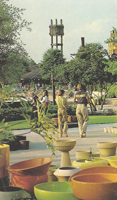
Block A:
Crews Galley
Borden's Ice Cream Shoppe
EUROSPAIN - Arribas Brothers location
Sara Lee Bakery - Northern part, later became Ice Cream Parlor
Village Ice Cream Parlor - replaced Sara Lee Bakery
Donald's Dairy Dip - Expanded from Ice Cream Parlor, took over Pluto's Dog House
Verandah Restaurant - Sit down casual. Sandwiches, steaks
Minnie Mia’s Italian Eatery – first located here, moved to Block J
Pluto's Dog House - Hot dogs, snacks.
Christmas Chalet – Moved here during World of Disney construction.
Lego Imagination Center - Took over entire space circa 1996
Block B: (Later Demolished for World of Disney)
Chalet Candle Shop - possibly related to Main Street candle shop
China, Crystal & Silver - extension of Pottery Chalet
Flower Garden – merged into Pottery Chalet
Pottery Chalet - thrown clay demonstrations, subdivided into "shops", Taj Mahal music box
Anniversary Room – fine china
Buena Vista Interiors – gave way to Christmas Chalet
Christmas Chalet - later expanded to fill Pottery Chalet
Personal Message - Books & Stationary, relocated from 2R's
You and Me Kid - children's toys, clothes, activity area
Toys Fantastic - NOT Toys Fantastique. Mattel toys, Barbie dolls.
Guest Services / Photo Drop
Block C:
2 R's Read'n & Rite'n - later moved and became Personal Message
Great Southern Craft Company - relocated from Sector D, minus photo studio
Discover – same shop that earlier occupied Block I.
Basin Soap - specialty soaps, bath products
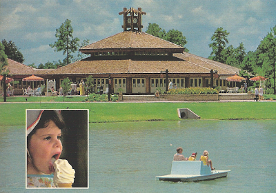
Block D:
Lite Bite – soda, burgers, snacks
Lakeside Terrace - Lite Bite in all but name
Goofy’s Grill
Ghirardelli Chocolate
Block E:
Pipe Dreams – tobacconist, became Sachet In
Sachet In - scented sachets for baths, specialty soaps
Bath Parlor - towels & accessories
Toys Fantastic – Mattel toy outlet moved here when Block B was demolished
Summer Sands – Beachware, Florida fashions
Port of Entry - import gifts
Mickey's Character Shop
Team Mickey's Athletic Club - in vacated Character Shop space
Artespana – glass blowing and cutting, Arribas Bros locations
Toledo Arts – Gold inlaying, ring carving
EUROSPAIN – merged Arribas Bros. store, name through much of the 1990’s
Cristal Arts - Arriba Bros. location
The Village Art Gallery / Colonnade des Arts
Great Southern Craft Co. – large store, includes Photo Studio
Lillie Langtry's Photo Studio - old fashioned "Dress Up" photos
Studio M – character photos, airbrushed T-shirts and mugs
Guest Services - currently located in old Great Southern Craft Co. space
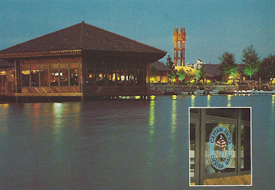
Block F:
Van Otto’s Antiques
Sir Edward's Haberdasher – dress and casual menswear
Harrington Bay Clothiers
Block G:
Captain's Tower
Character Kid’s Tower – mid-90’s clothing, plush etc.
Disney's Pin Traders
Block H:
Coffee & Pastry Window
Candy Shoppe / Candy Factory
Village Character Shop – the original Mickey-branded location.
Pooh's Place
Gourmet Pantry - expanded and moved to fill entire building
Gourmet Pantry Deli - in the original Pantry space
Mickey's Pantry V.1 - rename of Gourmet Pantry with new paint, layout
Earl of Sandwich - replaced Deli half of Mickey's Pantry
Goofy's Candy Company - replaced other half of Mickey's Pantry
Mickey's Pantry V.2 - stocks some of the Disney at Home line
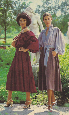
Block I:
It's A Small World After All - children's clothes
Posh Pets – became Toys Fantastique when Toys Fantastique became Sassy’s (!)
Toys Fantastique - fancy & import toys, giant dollhouse, Pinocchio dioramas
Conched Out - Florida merchandise, sea shells
Board Stiff - surf merchandise, surf boards
Discover - nature & science themed toys
The City - "hip" clothing
Summer Sands – first location, “Florida” junk
Official All-Star Café Merchandise – short lived tie-in to Wide World of Sports
Pooh Corner
Disney Tails - Pet gifts and plush
Cane, Rattan, Wicker & Suns – decorative furniture
Crafty Corner – displaced potters, candle makers, etc from World of Disney construction.
Mickey's Greenhouse - small plants, fountains, garden gifts
Mickey's Mart - "bargain" basement, Replaced Greenhouse
Carolyns Couture – 1st location, replaced by Country Address
Country Address - female casual wear
Resortwear Unlimited - women's swimsuits, active wear
Disney at Home - home decor, bedding, kitchen items, candles, cook books
Goofy's Candy Company - replaced Disney at Home. Custom dipped candies
Block J:
Heidelberger's Deli
All-American Sandwich Shop
Minnie Mia's Italian Eatery – pizza, pasta. 2nd location.
Wolfgang Puck Express – replaced Minnie Mia’s.
Carolyn's Couture - designer fashions
Michael’s Barber Shop
The Flower Garden
Shoe Time
Footlights
Plus You – women’s accessories, later luggage and travel items
Signature Shop – engraving, personalized merchandise
Miss Merrily's Madness / Miss Merrily's Fashions – contemporary apparel
Toys Fantastique original location, moved across the way and became
Sassy's - pre-teen girl's sizes
Team Mickey's Athletic Club – replaced entire complex in 1990’s
Disney's 12 Days of Christmas – replaced Team Mickey’s
Block K:
Village Post Office – relocated to old Welcome Center
Apothecary / Pharmacy – became Village Gifts & Sundries
Village Gifts & Sundries
Village Spirits
Village Cellar – subdivision of Village Spirits, in location of former Post Office
Country Address - moved from block I with same stuff when Resortwear Unlimited moved in
The Art of Disney
2Rs, Readin’ and Ritin’ – displaced here during early 90’s shuffle
The Wonderful World of Memories – scrapbooking supplies, photo frames, books
Disney’s Create A Tee – Hanes branded custom t-shirt location.
Block L:
Village Restaurant
Chef Mickey's
Rainforest Cafe
Village Lounge
Disney Cartoon Theatre - Village lounge with cartoons daily 5 - 10 pm
24KT Precious Adornments
Block M:
Windjammer Dock Shop - became waiting area for Captain Jack's
Captain Jack's Oyster Bar - expanded out into old waiting area
And a few more, somewhat more abstract comings, goings, and other items of note:
Opened as Lake Buena Vista Shopping Village in 1975
Name changed to Walt Disney World Village in 1977
Empress Lilly and Village Pavilion open in 1977
Name changes to Disney Village Marketplace in 1989
Village Playground in front of Lite Bite, replaced by
World’s Largest Perikaleidoscope in 1996, removed in 2006.
Pottery Chalet structure, part of Village Pavilion demolished in 1995.
Captain’s Tower Reflection Pond, removed in 1996 for Train Ride
Studio M – occupied McDonald’s building for a few years
Sports Tent – selling 1996 Olympic Games merchandise (!)
Sunset Cove / Margarita Bar – opened on the Marina in 1995
Mickey Fountains added in 1996
World of Disney opens in 1996
Dock Stage refurbished in 1996, 2008
Sunday, February 22, 2009
Friday, February 13, 2009
Structuring the Experience
In cinema, the filmmaker can choose to directly repeat or mirror shots over the course of a single cut or perhaps a long edited sequence; these visual "rhymes" are cinematic potential in its' purest form and can create a series of associations linking places, events or concepts in purely visual terms (as opposed to the intellectual links Eisenstein creates through editing contrasting shots). Although these types of editing tricks are most often used for special effects or trick photography, they have more subtle applications as well. Yasujiro Ozu, for example, had a special tripod made for his camera and the distinctive look of his framing as a result lends his family comedies and dramas a comfortable familiarity and pace which isn't achieved in the fabric of many of his scenes with something like rhythmic cutting. Each shot mirrors itself, on and on through the film, and the result is as comfortable as a warm sweater.
Although the themed ridethru attraction has no such ability to "cut" or "reframe", I have made the argument before that there is an affinity between the cinematic mode and the way the human eye perceives such an interactive event such as a ride-thru.... at least one where there is some degree of control over the gaze of the audience. And there is, of course, the possibility of the attraction to manipulate variables such as light, direction and vantage to create an effect of "cutting". Disney does this in their attractions surprisingly rarely, interestingly enough, as Disney prefers to create a perpetual show which never stops running. Universal, on the other hand, uses the effect quite often, especially in attractions like The Cat in the Hat with its constantly shifting lights, which is an interesting extension of that park's desire to create a more "film-like" experience. Guiding the experience manifests in Disney more in the act of lighting one area more brightly than another area, in the staging of the scene, in the placement of decoration and so on. But in the Haunted Mansion, when the lights are extinguished, it is arguably a form of a "cut", where the visual information is removed and our attention shifts elsewhere.
Disney doesn't use visual ellipsis too often, but they do use visual/conceptual rhymes and repetitions to create something like a cut, something like a link between two different concepts, and this is the item of interest today. I see these sorts of repetitions as an oft-underutilized tool of structuring the audience's experience of an attraction. Even something as benign as If You Had Wings was full of setup and payoff, as the frenzy of filmed projections reached a crazy climax on the biggest screen of them all, followed by a tranquil "palette cleanser" -- and suddenly, the whole attraction seemed to change. Now the music promised "you do have wings", the announcer reassured us "you can do all these things!", and the white flying birds and airplanes returned, closing the loop of the attraction with conceptual, visual, verbal and musical resolution. That's why If You Had Wings is remembered today but people exiting Expedition Everest or Toy Story Mania can hardly remember what happened 30 seconds ago on those rides.
Type one of visual repetition carries the plot forward; call it the practical rhyme. For example, there is very little to cue us in the Walt Disney World Haunted Mansion that the floating candelabrum we see outside the Load hall is the same one seen later in the Endless Hall, but there is a chill of recognition which creates a richer experience of the attraction than is found in versions which exclude this short scene. It is a sort of practical rhyme creates the idea that a character has moved through space or time; Indiana Jones' three appearances in the Indiana Jones Adventure, for example, or in an even more abstract sense, the children of the world who reappear at the end of It's A Small World. The controlled environment of the theme show eludes the larger reality of a show which continues running at all times and becomes, to the spectator, a progression which is defined by their experience of it, and the illusion that there is, for example, one Yeti on the Matterhorn, or one Ghost Host or whatever. To think otherwise is counter logical to the narrative mode which we have been taught to accept in filmmaking since childhood, and these sorts of repetitions drawn on that visual tradition.
The second type of repetition is a motif, a "design repetition" which is not style, but often exists more in the realm of theme. The white birds of If You Had Wings is one example, as is the pop-up book of Dreamflight. In a more abstract sense, Space Mountain's "launch" tunnel and "reentry" tunnels mirror each other... we know the roller coaster ride is ending because we go through a tunnel like we did at the start, and it's felt more than thought. The 2007 version of Spaceship Earth featured a very satisfying design repetition in it's first few months, a grid of evenly spaced lights which appeared first on the new version's in-car screens and which arrived as a very impressive payoff during the descent portion of the ride.
I suppose the remaining repetition is the most elusive, a non literal mirror which can perhaps be called the poetic repetition. This is something like a design motif which breaks out of its visual pattern and obtains a larger symbolic force in a well-conceived work; it is less the literal repetition of, say, the many skulls hidden in the woodwork of the Haunted Mansion and something more like those Ozu films where each shot is kind of similar. In Disney attractions this is the most elusive and most effective way to create a subtext, a poetic effect where the authorial hand seems to move confidently.
One basic example - basic because it is probably unintentional - can be found in the condense, Orlando version of Pirates of the Caribbean. In that version, the Hurricane Lagoon scene - with the skeleton forever steering his wrecked ship - is moved to occur right before the ride's sole waterfall. Because the figure is placed closer to the track and because he faces the same direction we face as we ride past him, the figure serves the purpose of preparing the spectators for the short waterfall to come. Indeed, when there was a skull performing a safely spiel in this location, the Hurricane Lagoon was transformed from the curious, memorable tableau it is at Disneyland into a visualization of the skull's ominous warning: "There be squalls ahead!". The boats then slip down a ramp into a pitch black cavern and emerged immediately into the Bombardment Bay scene. If the black tunnel is like a cut, an ellipsis of information, then the attraction in this moment makes a compound visual rhyme: "Wrecked Boat / Boat is Almost Wrecked", and also "Ghost Ship / Pirate Ship".
There are more intentional examples. In Walt Disney World's early days, those drumming tikis - now outfitted to squirt water - who reside near the Tiki Room were placed down in front of the entrance to the Jungle Cruise. These tikis recur in the ride of course, in smaller form, placed in the village of the natives who attack the jungle boats. As a visualization of man's intrusion into the jungle, the original arrangement of the British Colonial boathouse behind a bunch of native gods who obviously predated it can't be bettered, not only as a visualization of why the natives throw spears at white men, but as a subtle foreshadowing of what will transpire once on board the ride.
An obvious "poetic rhyme" occurred in Spaceship Earth from 1982 to 2007 as a transition point between the Renaissance and the modern age: a simple wheel Michelangelo used to transport paints up the scaffold as he painted the Sistine Ceiling appeared to the right of the ride vehicles. Almost immediately, on the other side of the vehicles, a huge wheel appeared - part of a printing press in a Civil War era newspaper factory. The two scenes bled into one another subtly, bridging a divide of several hundred years. The original EPCOT was full of these design brilliancies.
Two final relevant examples of poetic rhymes, both from inarguably the greatest attraction ever built: the original Pirates of the Caribbean, which is full of so much life, creativity, and cinema that the modern attention span hardly deserves it.
The most brilliant repetition in the ride is nearly a motif in that every important beat in the ride is divided by it, but it shares a transformative power that no other simple shape has ever been granted in a ride, which is the basic architectural arch. Although the individual scenes in the town each have an arch or bridge to divide them, the arch recurs throughout the ride, from the first to the last.
The attraction is physically perched rather strangely just inside some french doors which are appended with a sign, and once through the doors, the first visual of the ride the queued spectators recieve is through brick arches. The area on the "queue" side of the arches is a plain plastered room, but through the arches a tropical landscape and beach can be viewed. From this vantage the "magical" realm of the attraction, the boats, the riders and so on is viewed in a frame, much like a restricting frame of a painting or photograph or of a movie. But soon the line snakes up through a few arches, and it is through one of these arches that the plastered, plain room becomes the aged boat dock and the bayou. The arch is the transporting device, and being on one side or the other of the arch is the difference between being in a plain room or in a haunted bayou at night. It is the "magic portal" personified.
This sets up the later occurance of the arches in the bayou scene, where it is through these arches that the bayou will fade away - the lack of natural bayou sounds being our indication that we are now in a supernatural area - and the ghostly talking skull appears to send us down a waterfall, the skull appearing at the top of an arch, literally the capstone which holds the structuring architectural shape together. Later in the ride, as we run back up the waterfall to escape the exploding town, we pass through arches again before returning to the bayou. And finally, we pass through even more arches in the exit corridor before the bayou melts away and turns back into the civilized New Orleans Square.
Those waterfalls are the final device to be considered. Although their function is well known and understood, their subtextual effect is not often elaborated on. Marc Davis hated the return ramp and designed it out of both versions of the Pirates attractions he subsequentally worked on, but it does more than visibly transport guests out of the apparent realm of pirates. It literally closes the cycle, leaving the pirates just moments from their apparent destruction. Yet this circular structure also addresses the ultimate, unavoidable failing of the theme attraction.
As discussed above, the visual narrative tradition of film encourages us to see our progress through an attraction and the things we see as a spontanious event, unlikely to happen again, but when we ride again that's not what happens - the same things happen in the same places at the same times. Yet Atencio's script encourages us to see the burning and sacking of the city as a cursed event, a violent trauma which has been imprinted on time and which we are doomed to see, punishment for visiting that haunted corner of the bayou. And we escape, yet can return again and again to watch the cycle begin again, the pirates forever doomed to pay for their crimes. By taking the attraction out of the "current progress of time" and sending us to the "distant past", and articulating this event as going down and then going back up a waterfall, the attraction seems to imply that the dream state the successful attraction emulates was actual - after all,we return to the bayou, and somewhere below us, some time in the past, the pirates of the caribbean still play out their morality play. The ride's fatalism makes good on that first image of the pirates we do get - rotted away, dead in the sands, murdered by their own crewmates.
These examples show that the structuring repetetion needn't be something as large as a waterfall, but can be small, but every one still proves that a payoff is a payoff, and the satisfaction of a fully articulated attraction with a dramatic, conceptual and visual arc is the didfference between an actual classic and a defacto one. Disney marketing may make for us temporary classics, but the real one is a complex visual code which only reveals further layers to unlock. We are still learning from them.
Saturday, February 07, 2009
Wither Content?
Don't worry, more fun stuff is coming soon as soon as I'm able to get back out to Magic Kingdom and take some pictures. In the meantime, however, you may enjoy some of my more recent adventures in writing off-blog.
I've started posting at 2719 Hyperion, probably the most recognized and visited Disney blog. I've started off with some good old fashioned muckraking before moving on to silliness from the 1970's... pretty much the two things you find here at Passport, right?
I'd like to take this opportunity to state that the reason for this is not to neglect Passport in the future... the idea is that Hyperion will be a good place for me to post ranting about current Disney events and some more minor silliness, which will keep articles like this and this off Passport and leave this blog more open to serious, longer pieces specifically about design. It will be good for it. And no, I'm not gonna be constantly cross-linking my stuff from blog to blog... it's not content and I respect you too much to do it.
I've also been posting a bit on the wiki-format FromageHomage, and my bit on Liberty Square has begun to reach epic length. I'm still only half done with it and the formatting is a bit rough (soon I'll be putting my own photography up there too), but there's a lot of very specific information here that I don't think has been complied all in one place at one time before. Give her a look! And contribute to the site!
Subscribe to:
Posts (Atom)