Wednesday, December 30, 2009

Magic Kingdom Report Card for 2009

Please note: the following is not intended to reflect a tourist or touring-plan centric view of how Disney did this year: the various entertainment and operational cutbacks and sundry "cheap vacation" promotions have been well documented and discussed elsewhere. In keeping with the focus of this blog, the following is an appraisal of how the Magic Kingdom did in 2009 with an eye towards preservation and longevity and design. Enjoy.

ADDITIONS AND ALTERATIONS, JAN - DEC 2009

Golden Oak Outpost - This incongrouous little food outlet opened across from Pecos Bill right at the start of this year after nearly eight months of work on the berm and surrounding areas to the south of Splash Mountain, and as a food addition to the West side of the park, it's fine. I've already spoken extensively back in July about what it does thematically to the Frontierland / Caribbean Plaza transition, and there's still themeing details I enjoy, like a new paving detail surrounding the cattle pen / seating area which indicates where some walls have been taken down, and a central millstone / seating area which looks exactly like the circular, mule-drawn millstone you see in a couple of Sergio Leone's westerns. Lee Van Cleef could appear on horseback at any moment.

What is important to speak about in relationship to the Golden Oak Outpost is how it is emblematic of how Disney's old, foolish mistakes are coming back to bite them. In 1994, Disney shuttered the Adventureland Veranda and proceeded to gut its' kitchen, constructing a wall between the old kitchen and service areas and integrating the remaining kitchen area into the Liberty Tree Tavern kitchen. At the same time, another kitchen was walled in upstairs at the Columbia Harbour House, which had been just scraping by on selling baked potatoes for a few years anyway. There was even serious consideration of closing the entire Harbour House. In 2003, Eisner cut all entertainment equity from Liberty Square, which brought with it the removal of all Liberty Square characters and musical entertainment, including the Diamond Horseshoe Saloon Revue. Character entertainment took over the Horseshoe with a poorly-received Goofy themed show, and soon the Diamond Horseshoe was closed too, removing another food option from the West side of the park. Most of the time it's up to just Pecos Bill and Harbour House to shoulder the weight of lunch rush on that side of the Magic Kingdom, and based on how flooded these places can become, it's doubtful now that Disney thinks so much of having permanently removed the Veranda's ability to prepare meals fifteen years ago.

And so we now have a temporary food location inside the Diamond Horseshoe, which has been beautifully restored but still lacks a stage show. Outdoor Foods and Liberty Tree Tavern tag-team operation of food locations here. El Pirata Y El Perico apparently doesn't attract the crowds when it is open, and so we have borne Golden Oak Outpost as a fix for shouldering the burden of food rushes. An impromptu collection of food wagons in Liberty Square make up for the lack of a real place to eat between the Hall of Presidents and Pecos Bill.

In the next few years, Disney needs to get her act together and fix up the Veranda, a prime location with excellent capacity, and reopen it as a place to get a meal in Adventureland, since for most of the year, your only options are Dole Whips and Citrus Swirls and corn dogs. That's no way to run a land. As a emblem of this issue, I sort of resent the Golden Oak Outpost. But as a piece of design, it's very well done and a worthy addition to Frontierland. GRADE: C+

Tinkerbell's Treasures - This shop closed quietly early this year and returned in April or May as a surprisingly interesting remake of one of the Magic Kingdom's most appealingly quiet shops. The "Tinkerbell" portion of the shop has always been pretty nice, but the remaining half, themed to Peter Pan, has always looked closer to the children's department of a J. C. Penny circa 1984 than something you'd find at Walt Disney World. While the Tinkerbell section simply recieved an aesthetic facelift to bring it closer to the image of Ms. Bell as depicted in current CGI endeavors, the Peter Pan section has become something called Castle Couture, something like the dress headquarters for the Bibbity Bobbity Boutique (you have no idea how painful it was to type that) across the way. It's very well done, if a tad overt, complete with a hotline to the boutique at the back of the store, between the dressing rooms. As one of Disney's most profitable ventures in the parks in the last few years, perhaps the Boutique overlay was inevitable. But at least it was done well, with a refined European atmosphere inside, rich woods, and vibrant colors - far classier, in fact, than the Boutique itself. The color changing dress effect won't fool any of the little gals running around inside, but it's still a lot of fun to see. GRADE: C

Pirate's League - Speaking of the B.B.Boutique... here's the boys version, and although the necessity of it is questionable (perhaps bore out by the concept's failure to ignite the general public in the way that the Boutique has), as a piece of design it's absolute gangbusters. From a clever entrance area to a dusky, murky, interesting face painting area and a (supposedly) exciting photo area, the only thing that has doomed this project to failure is the passing nature of the current Pirate fad, already starting to die out, it seems. Disney seems willing to rise or fall on their ability to keep Captain Jack afloat, and the success of the upcoming fourth movie may be the thing that keeps the Pirate's League open in the next five years. But you'll still see a number of little kids running around in Pirate gear during any given day at the Magic Kingdom, so it can't be a total wash. If we take the Bruckheimerization of Caribbean Plaza as an inevitability due to the rampant success of a certain trilogy of noisy movies, it could be done a lot worse and much more annoyingly. Let's hope Disney has the foresight to have a contingency plan in case they need to strip out the movie trilogy themeing in the next few years and put in some Disney pirates who have proven to have had some more staying power, like Captain Hook or Long John Silver. GRADE: B

Hall of Presidents -

"You don't put music behind the Gettysburg Address.
The Gettysburg Address is music." - Charles Laughton

One of the two big "centerpieces" of Disney's efforts this year to keep the Magic Kingdom evergreen, The Hall of Presidents, historically, has attracted so little respect on Disney's part that one wouldn't think that it would constitute the most impressive resuscitation effort on property for 2009, but that's what happened. Hall of Presidents admirers shouldn't sneer - that the closure of the show for eight months would not effect the front gate profits is probably what allowed her to receive a lavish, expensive, carefully controlled update as opposed to the somewhat strained facelift that the profit-driver Space Mountain ended up with. Supposedly, nearly twice as much was spent on the Hall of Presidents, much of it being spent on her three cutting edge digital projectors. But I digress.

Back in 2008 I made a stack of suggestions about the show which I painfully carefully tried to avoid phrasing as "please put the 1971 show back in", but that's what many of them boiled down to. A lot of these concepts were based on the assumption that the show would pretty much not get a new film, which back in mid 2008 as far as we all knew was going to be the plan. But that's not what happened, and what's currently running in Florida now is perhaps best not thought of as a "new Hall of Presidents show", in the way that the Tony Baxter led Mr. Lincoln in Disneyland is a "new Lincoln show", but more of "a new show that uses parts of the Hall of Presidents". This is a bold move that I frankly didn't expect WDI to take, but it is absolutely essential if the show is to remain relevant and interesting. As much as I'm a traditionalist for WED's brilliant era of design, I'd rather see something new and well done carry the baton onward and keep these important shows drawing people in.

For the last quarter century the role of the Hall of Presidents has been in flux, since the opening of the American Adventure at EPCOT created some redundancy in concept between the two shows. The Hall of Presidents' role as an examination of the United States Constitution was further dulled by a 1993 redo which inserted paintings created for the American Adventure which covered much of the same ground. This 2009 version deconstructs the formula of the 1971 original, which the 1993 version more or less adhered to, and reconstructs the show not around the Constitution and the Bill of Rights, but around the general role of the Presidency as a spokesperson for the times. Along the way it sometimes takes the form of a Presidential trivia show, but throughout the show is remarkable in how many, if not individual scenes, important moments from the 1971 show it revives. Once again, for the first time in sixteen years, those big blue curtains part to reveal a window into history, and do so at the right moments.

But these designers were not slaves to the James Algar version of the show, and there has been an effort not only to keep what worked about the old version but put everything that seemed to be workable into a new place or new context. The show seems to be pretty similar to the 1971 version until about seven minutes in, when Lincoln sudden appears all by himself on stage to deliver the Gettysburg Address. This is not only a fantastic optical illusion achieved with moving curtains which accents and enhances the "layered" lifting of a curtain on history which was the signature style of the original show, but it frees the show of its' decades-long obligation to end the show with a Lincoln speech which summarizes the "lesson" of the presentation. There was some talk of removing the current President's speech at the end, a move which I supported, assuming that Lincoln would always wrap up the show. But in moving Lincoln's key speech to the midway point and changing it to his most famous historical speech rather than an amalgamation of inspiring passages from other speeches and letters, the balance of having the current President speak is restored. It makes sense to have spoken passages by Washington, Jackson, Lincoln, and finally our current President. And once that center screen lifts and Lincoln, apparently isolated on stage, stands to address the audience, the show throws out all the rules.

The second half of the film presentation is a little hard to assess at this point since we've only been living with it for a few months rather than years and years, and it does correct a longtime problem with the show, which is incomplete and unsatisfying coverage of events following the Civil War. By finally tackling issues like the Great Depression and Civil Rights, the show's credibility skyrockets, and had it ended following the Kennedy section of the film, it would've been sent off on a high note. But the film then goes and does something which I'm not sure is commendable or unfortunate, which is suddenly shift focus from an emphasis on the President in key transitional periods for the United States to the role of the Presidency in moments of political crisis, which seems to be a way to quickly touch on more recent events without going into a whole section on, say, Regan. I think it's a wise move to touch on the more recent Presidents in a simple way, but going heavyhanded into three-hankie territory is what happens, and I never know if the audience goes with it or not. It is sort of the part of the show that everyone coughs through awkwardly, and is the biggest disappointment in an overall ace refreshment.

The presidents as always inspire awe and fascination, and the inclusion of Washington in a speaking role work remarkably well; hearing his 'voice' in the new film and then again coming out of the 'real thing' makes the entire "great cavalcade of history" all the more awe inspiring, and seeing George Washington turn to address Barack Obama with Abe Lincoln seated between them is the sort of "only at Disney" moment that too many current Disney attractions lack. Later in the show Lincoln turns to Washington, who nods quietly in approval as the curtains close. Clinton checks his watch. George w. Bush gets lint on his coat and plucks it off. Jackson chats with Tyler thrughout the show. And James A. Garfield pats Chester A. Arthur on the back, presumably to thank him for taking over his office when Garfield was assassinated. As the show wraps up, not with the traditional Battle Hymn of the Republic, but with a soaring version of America the Beautiful, and the night sky behind the capitol dome becomes not a dawn sky stylized to look like an American flag but an actual American flag billowing in the breeze, this moment becomes emblematic of the whole show. It's not traditional, and it's therefore sort of risky. But it's easy to be traditional and succeed. It's far harder to be new and succeed. The Hall of Presidents has it both ways. It's probably Disney's star attraction of the year. GRADE: A-

Riverboat / Princess Invasion - Disney went into full-bore marketing onslaught mode this year, and it seems to have worked, even if nobody seems to know the name of the new Princess, where her show is, or the name of her movie. What people do know is that whatever it is, they're obligated to be interested in it, and one of their most publicly successful efforts this year has been importing the Showboat Jubilee show from Disneyland. Although I'm not exactly sold, as always, on the actual quality of Walt Disney World Entertainment's productions - and remember, quality is different from expense or lavishness - this one is better than most. Who knows, Captain Jack Sparrow's Pirate Tutorial grew on me as well. What is absurd and unavoidable about the show, however, is how inappropriate it is for Liberty Square. The show begins near the Diamond Horseshoe, at least, which at St. Louis is the most geographically south the Magic Kingdom gets, but proceeds through the middle of colonial Philadelphia and ends up passing a lot of other inappropriate structures along the way. At Disneyland, linked with New Orleans Square, it's appropriate and clever. But hearing the refrains of Randy Newman's jazz-inflected soundtrack blasting through Liberty Square is enough to do most of the damage for the show's credibility.

Strangely enough for those of us old enough to remember the first time this happened, the new Princess has set up shop behind the Christmas Shop with a fancy new gazebo, lamps, and lighting effects. At least it's better and more elaborate than the rickety wooden soap box Pocahontas got back in 1995, but it's essentially the same mistake: what's she doing here?

All of these protestations may be for nought, in the end, because good money has the odds on the show returning in a few months, and that's what the popular consensus seems to want. Seems like Walt Disney World has stuck their toes into Disney's Princess marketing phenomenon much more aggressively than anybody else, so we should've seen this coming... even if the idea of a jazz band marching up through Liberty Square continues to give me a nose bleed. GRADE: B-

WEDWAY Peoplemover - Yes, that's right, the Peoplemover, and it's even called that again in the new narration. The automated spiels around the park in general are badly in need of revision, and hopefully we'll finally ditch that rickety old codger on the Walt Disney World Railroad who's been hanging around for the last twenty-one years when the Toontown station becomes the Fantasyland station. The Peoplemover was no exception, and the shouted narration for the last fifteen years was no classic for those of us who grew up on the melodic strains of Jack Wagner or ORAC-1. It seems, in retrospect, that back in 1994 WDI was desperate to find some way to tie together the story of all the stuff they had put up all over Tomorrowland, and the Peoplemover was the easiest way to try to do it, by constantly shouting things that the attraction failed to contextualize or explain, like the 'Metro-Retro Historical Society' or 'Hover-burb Communities'.

Well all that's in the past now, thanks to a pleasantly low-key new narration which emphasizes the value of the things you're actually seeing, giving a shout-out to the 1964 World's Fair, Walt Disney, Progress City, and E.P.C.O.T. There's some new lights and stuff too, but the most important work was already done in replacing the audio. Short of giving us some more stuff to look at along the track, this minor effort has to be counted amongst the Magic Kingdom's best fixes this year for those of us who know that no matter how awesome Disneyland is, she still doesn't have a Peoplemover, which is about as important as the Haunted Mansion for a lot of us. GRADE: B

Space Mountain - So yeah. This one's gonna be tough, but I'd like to establish a few rules that should inform our future discussion of the Florida Space Mountain.

1. Florida Space Mountain is not the California Space Mountain.
2. Florida Space Mountain is not the California Space Mountain. It never will be.
3. Florida Space Mountain is not the California Space Mountain. Move on with your lives.
4. Florida Space Mountain is not the California Space Mountain. And that's valuable.

Fact is that the original '75 Space Mountain gets no respect for what it is rather than what it bore out. As a concept, it took WED a few years to weed the weirdness out of the Space Mountain concept, and the original Mountain still contains all this weirdness, warts and all. Open Load Area? Why not, it seemed cool at the time. Weird show scenes along the main lift hill? Heck Yes. Two tracks? Why not. Elaborate pre-show and post show? Absolutely essential. What's funny about the popular differences in conception between the two Space Mountain variations in the United States is that the Florida Space Mountain is denigrated for the same reasons the California Pirates of the Caribbean is celebrated: their excessive strangeness, their overflowing of ideas and creativity. Conversely, the California Space Mountain is pretty much similar to the Florida Pirates of the Caribbean in that they may not be as impressive or special as the originals, but they contain certain design changes and re-conceptualizations that improve on components of the overall show experience. What may not be better does show indications of being a second design iteration.

Which brings us to the huge disappointment of this year's Space Mountain redo for myself and many others, which is the lack of an onboard music system in each rocket. But after riding the redo a few times, you know what? I'm over it. Because, for myriad reasons, the Florida Space Mountain is the version which needs an onboard audio system the least.

One of these reasons is the hugely elaborate pre-show and post-show, which constitute two-thirds of the overall Space Mountain experience in Florida. The 1975 Space Mountain draws you slowly through dark tunnels, past starry windows, strange Pepper's Ghost effects, then slowly nearer and nearer the rockets, a remarkable experience which nearly makes one forget that's she's in a big weird white cone in Florida. In California, Tokyo and elsewhere you queue in the sun outside, go down two short corridors, get in your rocket and go. When you disembark you stumble down a short hallway and end up back outside in Tomorrowland, rather than ride a long moving belt past strange scenes of alien landscapes to slowly bring you back to the concrete and chrome reality of Tomorrowland. In this context the California rollercoaster needs to be as impressive, slick and nice as possible, because there's nothing else to the experience. What else do you say about a version of the ride which isn't even in a freestanding building, but housed in a halfsize facade tacked onto the back of a patio? The experience of the Florida version, taken as a whole, is immersing, intoxicating and unique.

Similarly there is some cosmic justice that the Florida Space Mountain, through error or circumstance, presents a fairly accurate version of what it was like to ride it in 1975, just as the original Tiki Room plays on in its original venue while other Disney colonies must be content with bastardized versions. When we discredit the notion that Walt Disney World history is less valuable than Disneyland history, then the lack of onboard audio in the version of Space Mountain which would benefit from it least becomes something almost commendable; history rather than heresy.

OK, so I've gone to great lengths to defend a very unpopular opinion. What about the rest of it?

It's all good. The weirdness of the ride has been lovingly restored, and those video games in the queue are fun and not too distracting from the strange and lovely atmosphere. The track has been greatly smoothed out in certain patches, although the ride is still as rough and scary as it was designed to be in 1975. That I, the rollercoaster allergic, prefer the smoothness and fun of the Disneyland track should be noted, just as much as it's important to note that the differences were designed into the tracks to begin with. The post show scenes finally make sense and don't seem to be leftovers from the FedEx days like they've been for the past few years, and there's some nice EPCOT homages in there that make me happy.

There's two final things I'd like to say about this redo. First is that the new projection domes atop the load areas are fascinating optical effects that only fall apart from certain angles, but are the nearest we've gotten so far in 21st century Imagineering to Yale Gracey's immortal and always fascinating cloud effects from 1965. The second is that the attraction now includes a command to "CHECK (the) INVISIBLE OXYGEN DOME", a line as silly and whimsical and enchanting as anything Disney has given us since the early 1990's. Bringing fun, whimsy, fascination and adventure back into a ride which was starting to feel like an operating artifact is no small feat, and so I give this attraction refurbishment huge credit. It may not have done a lot, but everything it did do was important and relevant and excellently judged. GRADE: B+

ADDITIONS AND ALTERATIONS AVERAGE SCORE: B

PARK UPKEEP AND MAINTENANCE, 2009
Huge improvements in 2009. You may need to be as detail obsessive as I to notice these things, but it seems like Disney finally remembered that they have a dedicated onsite staff of painters and woodworkers and electricians who sit behind Small World all day smoking cigarettes. In the last year windows, doors, props, set dressing, lights, gables, cupolas and all other manner of stuff has vanished suddenly from Magic Kingdom facades only to return days later looking exactly as it did before - except that they've been made entirely out of new materials. Every window and gable on the outside of the Hall of Presidents is new, for example, as are a few of the doors. Main Street's shops got new entryways a few times over this year, and lighting fixtures which were old, burned out, and electrically unsound are being slowly removed, refurbished, and replaced. That you're unlikely to notice this stuff as it's being done is testament to how well it has been done.

Set dressing has similarly been greatly improved. I talked about this a bit in July but everything from themed crates to silk flowers has been refreshed regularly, and coats of paint are becoming more and more common. Pinnochio's Village Haus has had all her facade lights turned back on, and with all those fake windows lit up again she no longer looks like an abandoned hulk at night. It's safe to say that if things stay this way and escalate along current trends, no stone should be unturned by the time we reach the park's anniversary in 2011. We're not back to those standards we had when people like Dick Nunis were in charge of the place, but to say that the Magic Kingdom looks better, fresher, and less dingy than when I was visiting in the 90's is a severe understatement.

Landscaping still leaves something to be desired, with a plethora of "leafy green and red" stuff instead of flowerbeds and flowers, but really the biggest offenders are not those who put in the flowers and maintain them, but those who are in charge of keeping trees, bushes, grass and other vegetation in check. Sightlines all across the park are compromised by excessive tree growth. A shaded, leafy glen is desirable in some places and not others, and things like the miniature forest which has spring up around Big Thunder Mountain, a veritable tangle of trees and shrubs which have engulfed a nearby Disney rock formation near Beacon Joe, and a Haunted Mansion that's starting to look more like a Slightly Possessed Shrub all need attention.

It's hard to make a unilateral call since the actual upkeep of the attractions themselves depends on department, staff, budget and resources, but I feel like things have certainly not gotten worse and possibly improved significantly in the last couple of months. Whether there has been a money infusion into Buildings Maintainence or not I can no longer attest to, but somebody out there is putting extra time and money into the Magic Kingdom. Let's hope it stays that way. GRADE: A-

COMMENTS: The Magic Kingdom is very popular, and spends a lot of time with her friends. But her schoolwork seems to be suffering for it. It seems like she's rushing through her assignments instead of doing them carefully, slowly and right the first time. With more effort and care her grades could be as good as her reputation. Does she have a happy home life? -Foxx Fur

Tuesday, December 22, 2009

Regional Squabbling!

Just a short little thought, but one that includes a question I'd like to pose.

Mr. Lincoln has returned to Disneyland, and the show is very nice, if a tad too quickly paced for my taste. The return of the Paul Frees narration, gorgeous Buddy Baker music, and Battle Hymn of the Republic finale nicely fills a few gaps where I wished the new Hall of Presidents show here in Florida stuck closer to tradition, making the Floridian re-do much more acceptable overall for me. But I digress. This has gotten the wheel in my head turning about Mr. Lincoln, The Hall of Presidents, and demographics. Here I may be of more help to the discussion than most in that I actually worked at the Hall of Presidents for a bit.

Why is Mr. Lincoln doomed to a passive, spotty audience at Disneyland? The show certainly doesn't suffer for lack of a good location - indeed it's probably the most conveniently located show in the park, located right where you must enter and exit - and neither does it suffer for an audience hungry for history and tradition, as that's what Disneylandites do best. One can't do something at Disneyland like install automatic doors at Pinocchio Village Haus without resulting online discussion and photos, but this same history-conscious audience continues to traipse right past Mr. Lincoln twice a visit with nary a second thought.

Yet day in and out the fairly similar in appeal Hall of Presidents, a show nearly 25% longer and placed in a similarly large pedestrian space, attracts huge audiences at peak hours, sometimes filling a nearly 700 seat theater several times a year. Some of it has something to do with the immortal allure of air conditioning in Florida, some of it has something to do with the mostly older and more conservative demographic of the southeast, but I'm starting to wonder if some of it hasn't got to do with being on the East Coast.

I'm actually thinking of the hundreds of times I was asked if the show was Great Moments with Mr. Lincoln, by full name, or if "Mr. Lincoln" would appear. I'm thinking of the dozens of people who told me about seeing Mr. Lincoln in New York in 1964, of how memorable it was. I'm thinking of the fact that the show in fact is native not to the West Coast, but the East Coast. Perhaps one of the numerous cultural differences we must take into account when discussing reception in one place or another is that the concept of a Mr. Lincoln show in relation to a Disney brand has rooted deeply in the East Coast, in the regional mythology, probably as strongly as a Matterhorn rollercoaster at Disneyland has rooted itself in the West Coast.

We also should take into account that most East Coast people have access to and may have visited the actual seat of our government, Washington D.C., and have access to the actual places where the events dramatized in the attraction have taken place. It's far more interesting when you've stood at Gettysburg, seen the real White House, looked at the balcony draped in black at Ford's Theater. The early history of the United States lives still on the East Coast, whereas California has always been founded by and for business. This may be another key to understanding why Californians aren't interested in sitting for Mr. Lincoln whereas East Coasters will sit to hear Mr. Lincoln's speech.

It may be turned around a bit to explain why these same Californians will fervidly defend their Enchanted Tiki Room, a show with a much more prominent placement and exterior in Florida which is mostly walked right past. The Tiki Room not only opened first in California, but Tiki culture itself is a very southern Californian thing, a kitsch culture which is proudly defended. Tiki began in Los Angeles in the 1940's and spread elsewhere before contracting back to Southern California, where backyard jungles and bamboo and Mai Tais still hold their appeal. Reversing the question yet again, this may be why the Country Bears still play to appreciate audiences in the South but were sent packing eight years ago in California, despite being steps away from the entrances to two of the most popular attractions in Disneyland.

So obviously regional culture and regional tastes enter into it quite a lot - quite a lot more, perhaps, than Disney fans seem to be ready to acknowledge. Too often online discussion of the domestic theme parks hinge on how to make the Magic Kingdom more identical to Disneyland, ignoring the fact that these parks are literally a continent apart, keep different hours, have different resources, are designed to be different, have different regional weather (the somewhat beat-up appearance of the Magic Kingdom is sometimes a result of Florida's punishing environment, which makes mince of WDI's careful work twice as quickly), and even are seen under different types of sunlight which dictates different colors and even different paint. And most importantly, they have different audiences which have different schedules and different needs.

Californians sit for the Enchanted Tiki Room because it is native Californian, distinctly so, just as Floridians find more to identify with and enjoy in Country Bear Jamboree than Californians. Some of these differences have been exploited by WED or WDI over the years - Liberty Square for Florida, New Orleans Square for California is an obvious one - but there are others we'll probably never guess at without direct access to Disney's information files. But it raises intriguing questions.

Would Superstar Limo have gone over well in Florida? How about California Adventure itself?

Would EPCOT Center have been more warmly received by Californians? Would Kitchen Kabaret still be playing today on the other side of the country?

Why doesn't anything in DCA drive attendance? Was it born with the Disney themed design equivalent of an original sin which will forever relegate it to third-rate status by Californians regardless of what it does offer? And why is Muppet-Vision 3D in line to be removed in California, but is a staple in Florida? Do East Coasters relate to Muppets better than West Coasters? Why has the Aladdin musical show proven to be far better received?

In a way this may prove to be the most fully convincing argument against cloning, Disney's current method for greenlighting attractions with a minimized financial risk. Who is Toy Story Midway Mania actually for - Right or Left Coasties? Will it be a walk on in DCA in five years but still run high capacity in Florida?

Saturday, November 21, 2009

An Aesthetic Profile of Adventureland

So here's something new for Passport to Dreams: I'm about to get really obsessive. Ready?

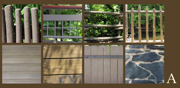
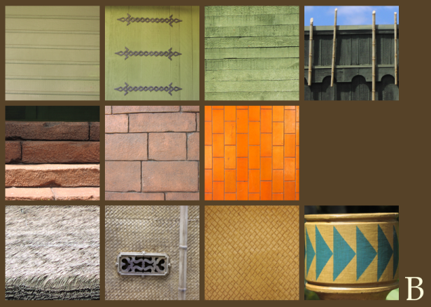
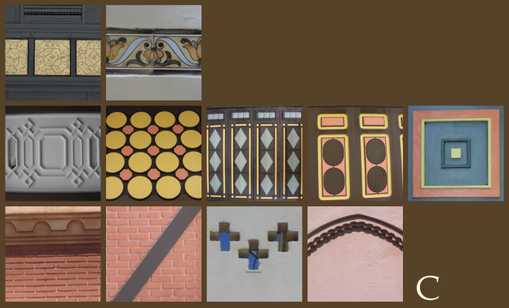
What follows is an extensive, visually oriented view of Adventureland based on the concept of getting down to the level of colors and textures instead of things like building shapes and placement. I did this by photographing literally every unique surface in Adventureland and then tediously sorting out the most representative of these "swatches", grouping them with no bias towards location and instead focusing on aesthetic unity. This allowed me to burrow down past the architectural and into color, texture, and pattern, the basest of reasons the Magic Kingdom works. It also allowed me to "get inside" Adventureland in a way I never had before and indeed I learned a lot about how the place was put together by the WED designers of the 1970's; it was like literally reverse engineering the design of the areas. I focused exclusively on remaining 1971 features for the sake of integrity and avoided going inside if I could help it.


GROUPING A:
This grouping represents what I have come to call "base Adventureland" and includes features from the Adventureland Bridge, the Swiss Family Treehouse, and the Jungle Cruise, which are indeed all aesthetically unified. I had suspected this during the picture taking process but this didn't come together until later; I had grouped everything into plain categories and everything that was left was easy to pull together into Grouping A.

Grouping A's aesthetic mode is what welcomes you upon your arrival in Adventureland, and it's important to note that the Adventureland Veranda is not aesthetically consistent with it. Instead the fences and guarding facing the treehouse, the treehouse itself and the Jungle Cruise seem to be aesthetically unified to suggest that these features which constitute the southernmost portions of Adventureland are "the jungle", the beaconing wilderness which man has not tamed. This is why the Jungle Cruise and the treehouse's waterways are almost intertwined, and in the early days one could look out from the top of the treehouse and observe the Jungle Cruise's Cambodian Ruins.

Consider also that Adventureland and Frontierland, the areas which represent man's attempts to conquer nature, are the only areas of the park where upon entering them from their main entrance we are not surrounded by manmade structures to the left and right. In Adventureland and Frontierland the manmade buildings are forced to only one side of the pathway; the other side opening up to an untamed forest and river. This is so well done it cannot be accidental.

This "base aesthetic" of Adventureland is made up of earthtones, rocks, and wood, of open, impermanent barriers holding back the wilderness. It is the mode of Adventureland which most represents what existed there before "colonists" arrived.


GROUPING B:
The Sunshine Pavilion, or, the Tropical Serenade entrance area, facade, and Sunshine Tree Terrace. This beautiful if overlooked area follows the rules of American Mid-Century Tiki Modern pretty closely and so is perhaps somewhat less interesting that the other areas of Adventureland but deserves consideration regardless. The Tiki Room itself seems to be made of green wood, held together with horizontal woven metal bands, placed on a foundation of rough-hewn red clay bricks. Everything above the foundation is lumber, logs and bamboo lashed together, sometimes brightly painted. As the green wood creeps past the Sunshine Tree Terrace northward towards Frontierland it gains some bamboo and decorative accents which transitions nicely into the shingles and gingerbread details of Frontierland, which the area once flowed seamlessly into.

The bright orange tiles below the serving counter of the Sunshine Tree Terrace are the only distinctly modern visual components of Adventureland. The decorative A/C vents (middle bottom row) and hanging lotus lanterns (not pictured) rank amongst some of Walt Disney World's most delightful details.


GROUPING C:
This area is what I would call "Downtown Adventureland", a ecclectic grouping of shops which form the "hub" of Adventureland into which the Aladdin spinning ride has today been thrust. The natives of adventureland seem to be partial to bricks and stone as much of their architecture seems to thrive on it; this connects Downtown Adventureland to the Sunshine Pavillion aesthetically. Paneled, ornately painted wood details characterize this portion of Adventureland, as does hand-crafted walls made of clay or mud with obliquely if somewhat tactily present Moorish and Persian influences.

I used to consider Grouping C (Downtown) to be indistinguishable from Grouping E - G (Veranda), but they are in fact quite obviously unrelated architecturally and conceptually. These Adventureland natives love bricks and sculpted, ornate walls and details, in contrast to the colonial architecture as embodied by the Veranda, which relies on Western-style mass-produced lumber, sheet metal, and gingerbread accents. Grouping C is further differentiated by exhibiting the use of forced perspective much more markedly than the buildings in Grouping E - G, and this use of reduced scale doesn't really begin in Adventureland until one passes west of the Adventureland breezeway, along with the first inklings of hand-formed clay walls and tiles and wood details. The Breezeway is a pivot on which turns the whole aesthetic mode of Adventureland, and this shift articulates a shift away from the Veranda complex's implied colonial architecture - which ties it to Main Street, USA - and towards the more rough-hewn, natural resources used as Adventureland travels west,culminating in the Sunshine Pavilion's exposed bamboo struts and supports and extensive use of thatch.


GROUPING D:
Some of Adventureland's most interesting paving surfaces.


GROUPING E:
The 'basic elements' of the construction of the Adventureland Veranda, with a strong accent on brightly painted woods. Note also the use of bricks, which both recalls Main Street and prefigures the bricks of Grouping C, which culminates in the red earth block foundation of the Tropical Serenade building, which has the largest and most irregular bricks of all. Also note the use of corrugated sheet metal, a Western invention which is used most prominently as a roofing material and which is also used on the roof of the Jungle Cruise boathouse, another but even less elaborate colonial structure. Adventureland articulates its' narrative of the white man in an exotic land even through its' use of building materials, and both the Jungle Cruise's outpost and the Veranda's little colonial village use lumber, corrugated metal roofing and Victorian gingerbread details.

Note also the use of wood shingles; shingles recur everywhere in the Magic Kingdom except for Adventureland, where cruder things must be substituted, and Tomorrowland, where the 1971 structures were so abstracted that they may not even have any use for roofs. But Disney visually codes shingled structures as being "cozy" throughout the park, and the single occurance of it here, in Adventureland on the east side of the Breezeway is noteable. The structure it is attached to also includes patinaed dormers and a skylight; perhaps the last and most ornate hurrah of the Western influence before the whole aesthetic strategy changes west of the Breezeway?

GROUPING F:
Mass-produced, gentrified Victorian Gingerbread used on the Veranda, which aesthetically transitions Adventureland from Main Street USA and marks this architecture as the product of the same Western culture and her value in visually pleasing but structurally worthless frills; compare these patterns to those seen in row two of Grouping C, the "native" equivalent, which are always cruder and handmade.

GROUPING G:
Structural details throughout the Veranda recall both caribbean and New Orleans influences; indeed, some of these same details can be found in New Orleans Square at Disneyland. The Veranda uses open seating areas and gusty, open-latticed balconies to set the scene and create an atmosphere of gentility compared to the tight, functional balconies and catwalks we see later in Downtown Adventureland. The colonial architecture also includes glass window panes, which vanish immediately upon crossing the Breezeway into the native-settled area. The glass recalls especially strongly the Crystal Palace, the most extensive use of glass in the entire Magic Kingdom but one which is ironically perched: it is a greenhouse situated right on the outer edge of Adventureland, where glass is a scarce commodity and plants cannot be contained by mere buildings, only held back with simply constructed wooden barriers.

Compare Groupings E, F and G with Grouping A and recall that these two aesthetic modes of Adventureland directly parallel each other in the main entrance corridor just beyond the bridge and appear to be aesthetically unified, but in reality are quite diverse. This is the brilliance and complexity of Disney's design here, to be diverse and eclectic but apparently homogenous. But just beneath the surface of Adventureland are tensions, of different cultures who beat back the brush and ultimately collided, civilization vs civilization and all against nature. This dynamic is best and most extensively manifested in the Jungle Cruise, the anchor of Adventureland, where nature reclaims explorer base camps, pits native cultures against invaders with their machines and machine-made materials, and ultimately parts to reveal the ruins of an ancient civilization she had long ago swallowed up.

This is the core message of Adventureland: that man may become shipwrecked and build civilzation anew in a tree, that he may venture into the jungle and face untold dangers, that he may even influence the animal world to mimic his language and song. But nature wins the struggle in Adventureland every time, manifested at a macro level in the failure of whole civilizations and a micro level of explorer's tents and crashed airplanes. We return from the jungle every time, retreat from nature back to the colonial boathouse, awed but defeated. The Gods of Polynesia ultimately silence of enchanted revelers of the Tiki Room, and even the Swiss Family is eerily absent from their family home.

The Swiss Family, I'm sure, is just like their counterparts far below on the street level, those colonists and natives who are lurking conveniently just out of sight, just beyond our grasp. For while the rest of the Magic Kingdom is all about inclusiveness and belonging, in Adventureland we encounter a narrative of a place where we can never belong. Those Cambodian ruins out in the jungle, invaded by explorer boats, contemplated by that Swiss Family from their jungle lookout, tell the true ending of this unfolding narrative, that the citizens of Main Street USA may wish to contain the jungle foliage in their greenhouses and crystal palaces and ornate planters, but this is one area that will never be fully civilized.

Wednesday, October 21, 2009

So You Bought A New Land, Eh?

----On the New Fantasyland----

Way back in April I posted a little number discussing the much-maligned Florida Fantasyland: where it has been, where it was, where it was going, where it could go. Reading the article now seems almost quaint as I, and others in the community, were under the operating assumption that the construction bid that had just recently then gone out for the "Little Mermaid attraction" was for a single show element plopped down across from Pooh, probably merging in the old Ariel's Grotto meet and greet which was installed there in the 1990's. When a certain famous blueprint was leaked to the internet in mid-July, the game plan changed significantly. Although Mermaid is indeed the only "ride" in the ambitious Fantasyland overhaul, it came with a potpurri of crazy ambitious ideas, fairytale chalets, castles, restaurants... it was just staggering.

It was also, probably, fake.

FAKE!

Although I went into berserk fangirl mode (kinda like this) when I saw the plans, my Disney-dar was set on 'cynical', as the company has trained me to do since 1998. But I held out one tiny little grain of hope above all others which was only possible because of my years working at the Magic Kinghdom: these plans had *too good* of an idea as to what was actually back behind that stupid little hill we've been living with for five years. The blueprints not only pushed as far back as the access road - something a Disney fan fabrication wasn't likely to take into account - but bothered to relocate all the Maintenance trailers which currently dot the sloping green field which lies where giant squid once lurked. That spoke of something cooked up by somebody who was working with practical realities instead of fangirl fantasies, so it was at least to some degree real. But how real was it? Would this be the 21st century's Thunder Mesa?

I don't need to tell you the happy ending of that question of course. What's funny is that at the end of my Fantasyland article I posited that whatever was coming to Florida wouldn't be as ambitious as what California got back in 1983. The funny thing is, I was wrong. It may not be a whole lock, stock, and barrel remake, but it's certainly as ambitious and it doesn't require all of Fantasyland to close - so both we and management win. I also complained about the pitiful state of the Skyway buildings in that article, and now the Tomorrowland one has been almost leveled. A lot changes in five months.

One of the funny things about this remake is that it actually addresses two of my biggest suggestions from the April article: that the Fantasyland alternations establish a stronger sense of place and environment, and that a lot of water be added. I'm happy to say, both have been addressed.

1) PLACE - This new version of Fantasyland will add a number of very interesting, very complex visual / conceptual shadings that I'm not sure we'll be able to fully appreciate in person until the whole thing is ready. In 2012 you'll be able to enter the Magic Kingdom, walk up Main Street, and see Cinderella Castle. Stepping through the castle, you'll be in the Medieval courtyard of today, which Dorthea Redmond's beautiful fairytale village. But past the carousel, the courtyard will end, and you'll step out of the castle's walls and into a pastoral, European countryside. Directly in front of you? Cinderella's house, rising in classical French splendor (how much of this park does this scullery maid own?!). You can actually not only go directly up to the house, but enter it, walk into something that I'm sure will look just like the Villa from the movie, and Cinderella and her step sisters will greet you. The world of possibilities of the Magic Kingdom multiplies. This new Fantasyland works in layers, just like the old invented word I throw around - Stratification.

The layers of complexity here continue to stagger me. I talked a bit about how Fantasyland suffers from having no back "wall", and WDI has seemingly answered my call for a wall.. literally. I think it's brilliant. Screening out the tournament tent styling of the 1971 work from what I'm sure will be very complex, detailed 2012 work is really the most brilliant thing about this project, creating a dynamic between castle walls / countryside fairly similar to the civilization / wilderness dynamic which informs much of the Magic Kingdom's west side and makes those areas seem so rich. The fact that nearly every castle and house you'll see in this countryside is an experience that you can enter and enjoy just compounds the feeling of being able to go off into this world forever. Huge kudos to Imagineering for this.

Herb Ryman did not paint this. Shhhh....

2) WATER - I'm always harping about water, but it's true that Imagineering has ruined much careful WED work by just plain old paving over water. From minor things like the reflection pond at the Walt Disney World Village, to dismantling fountains all across Adventureland in 2000, or the wholesale removal of Communicore Central's ponds and lakes which greatly softened the impersonal feeling of that area's "monumental" architecture, water removal at Disney just drives me nuts. I'm happy to finally see some water returning to the fold. Water will cascade down the front of the Little Mermaid show building and form a lake bisected with bridges. Water will flow from the mountain cloaking the Beast's castle and become rivers and streams by Belle's house and Cinderella's chateau. There will even be a fountain in the center of Belle's village. It's great.

------How Not to Mess It Up-----

I've honestly seen so much good work from Imagineering in the past five years that I don't want to seem like I don't trust them to pull all this off, but seeing these plans and reflecting back on what Disney has done well and poorly in the last few years, I've assembled a few important points for WDI to be on the watch for an monitor carefully:

1) DON'T SKIMP ON THE LANDSCAPE!
This seems like a no brainer but frankly Disney's landscaping in Florida has taken a huge nosedive in the past fifteen years. Everywhere flowers have been eliminated in favor of sturdy year-round, low cost plants which sometimes have some color in them, but often not. Areas which once had rolling greens and carefully trimmed landscape areas have become sandy, weedy messes, full of dead leaves for ground cover. This is especially true around the Rivers of America and the train tracks, where Disney seems to have said "It's the wilderness! Stop taking care of it!" and left behind the carefully coordinated landscape plan of old. The Haunted Mansion has been so boxed in by hedges, weeds, trees and other green debris that you can hardly see it. The only Florida park which still displays competent landscaping and floral arrangements is EPCOT, which as ever seems to exist in a graced state even as her attractions are slowly stripped of their charm and relevance.

So I say to WDI: don't skimp on the landscape. If the whole thing is going to work, we need to see Belle's house cozily tucked amidst the rolling hills of the French countryside. Aurora's hidden cottage needs to be in a real forest, not a cluster of saplings we'd expect to find in the parking lot of a new Target. The environment needs to look grown in and lived in when it opens, not ten years later. Disney needs to start searching for and relocating mature trees now, not later.

The girl will be there. The bridge will be there.
The house will be there. But will the tree be there?


2) USE A VARIETY OF MATERIALS!
The Magic Kingdom overflows with textures, colors and tones, whereas much of Disney's structural work in the past fifteen years has been stucco and rock, which is why I think this point is essential. Belle's house shouldn't be a sculpted block of concrete, but clapboard, siding, shingles and so on. While sculpted concrete and lath ages great and is low-maintenance, that isn't the way Disney did things in the 1970's and if all this new stuff doesn't seem like it was there all along and we just never noticed it then it's gonna be pretty awkward. Neither should the new areas be painted garishly and brightly: let the natural materials used tell the story in colors. It'll last even longer than throwing latex paint over a grey concrete shell and look better, to boot.

3) DON'T SKIMP ON THE OTHER STUFF!
I have no doubt that with their $300 million, all of the departments bringing this thing to life will perform their roles faultlessly. The special effects in the Little Mermaid will look wonderful. The set dressing inside the Princess "houses" will be beautiful and perfect. The pavement will be themed. The speakers will be hidden. This is a huge effort on the part of WDI - something on the scale which Florida hasn't seen in the past ten years - and all the stuff that is budgeted, assigned and planned will be great. But there's still a few things that can easily fall through the cracks.

The Pixie Hollow area has been moved to a nebulous "Phase Two" which means, in Florida, that it will never be built. As much as I'd like to see the Pooh playground torn out, it will remain, with a character greeting area just behind it. Let's not forget to take this opportunity to improve the existing playground and not forget to refurbish the facade of the adjacent attraction into something better themed. Let's also not forget that although the main Fantasyland courtyard is expected to remain untouched that it's never too late to add details, textures, and colors to the remaining upper areas of the 1971 Fantasyland facades which are still rather spartan. 1971 minimalism clashing with 2010 detail fetishism isn't going to be a pretty sight, so it's best to take this time to fix up those remaining facades.

I don't just hope or these things; I fully expect them. That's a reported price tag of $300 million; that's 25 Hall of Presidents refurbishments and 3 Expedition Everests for an area with two low key rides, two eateries, a few shops, a train station and four character-greeting-walkthrough-things. Although Fantasyland the Second won't reverse every negative change in the Magic Kingdom for the last decade, nor will it probably even affect the front gate's profit ratio, that is exactly what is so admirable about it. Disney doesn't need to try to make money on the Magic Kingdom; people have been steadily coming since it opened and will keep coming as long as it exists. But a glaring problem has been identified, a suitable plan has been hatched and supposedly money will be put towards correcting a long-standing mistake.

It hasn't been an easy two decades for Fantasyland. Two of her three most visually striking elements have been removed and her role as the sole domain of the Disney classics has been confused as every corner of the Magic Kingdom has been "synergized". If we say that the closure of 20,000 Leagues Under the Sea was day one of the ramp-up to this new version of Fantasyland, it's taken Disney some fifteen years to even announce a replacement for this neglected area of their flagship Florida park. I don't doubt that the result will be impressive. I look forward to it immensely. But it's a hard trick to pull off and now, more than ever, as the Disney faithful will be at their most discriminating, now is the time to make sure that everything is exactly as it should be.

Being the Magic Kingdom isn't easy.

Sunday, September 20, 2009

See the Village. Tonight. Part Two...

When last we left our tour of the Walt Disney World Village we were at the doors to Cane, Rattan, Wicker & Suns, wondering where to go next.


The view ahead looks like this:

Since posting this image without comment is like putting up an image of the surface of the moon given how little the current area resembles this, allow me to isolate the relevant area of the image and provide some context.


The structure we see in the most immediate foreground on the right is the Captain's Tower, an open air pavilion with a tall central spire which serves as the central landmark of the Village. The tower hosts special events such as art displays, celebrity appearances, craft fairs and so on. Darth Vader appeared here to promote Star Wars in 1977. The "Glory and Pageantry of Christmas" show, a sort of living nativity, was held here for a few years before moving to the Dock Stage. The central spire of the Captain's Tower was taken down in the mid-90's to convert the pavilion to a kids' clothing store. It was partially enclosed at this time. The pavilion was further enclosed to become Disney's Pin Traders in 2000. Much of the original structure still survives.

In front of the Captain's Tower, a number of steps can be seen descending. These ended in a reflection pond. This was filled in with a kiddie train ride in the mid-1990's.

In the middle distance on the left is the side of a shop which is now known as Pooh Corner. The original windows may still be observed to this day. This photo dates from 1976 and this shop would've been known as Posh Pets at this time. In the background on the right we see a number of orange umbrellas belonging to the Gourmet Pantry, a sort of deli and grocery store. Behind those umbrellas: a row of windows looking into The Village Candy Shoppe, stocking a similar selection as Main Street's Market House. The Gourmet Pantry would later expand to fill this entire building, which was renovated into Mickey's Pantry in 1996, and closed in 2003 to make way for The Earl of Sandwich.

In the very back of this we can see the side of what is now Disney's 13 Days of Christmas, but which then housed Toys Fantastique, an import toy store. On the right, just out of view, is Heidelberger's Deli, a dark toned little corner eatery offering dark rich German beer and large sandwiches.

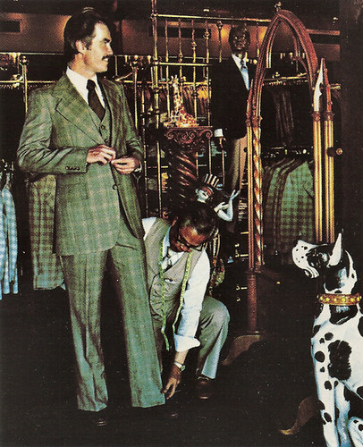
But we'll save all that for later. Let's pop into the dimly lit little chalet to our immediate right just past Port of Entry, known as Sir Edward's Haberdasher.


It is more or less what is expected, although an interior view like this is today very rare. In 1989 this little building was brightened up considerably and reopened as Harrington Bay Clothiers, as generic a menswear shop as can be imagined. The whole building was bulldozed in 2000 to make way for the Once Upon a Toy Hasbro shop.


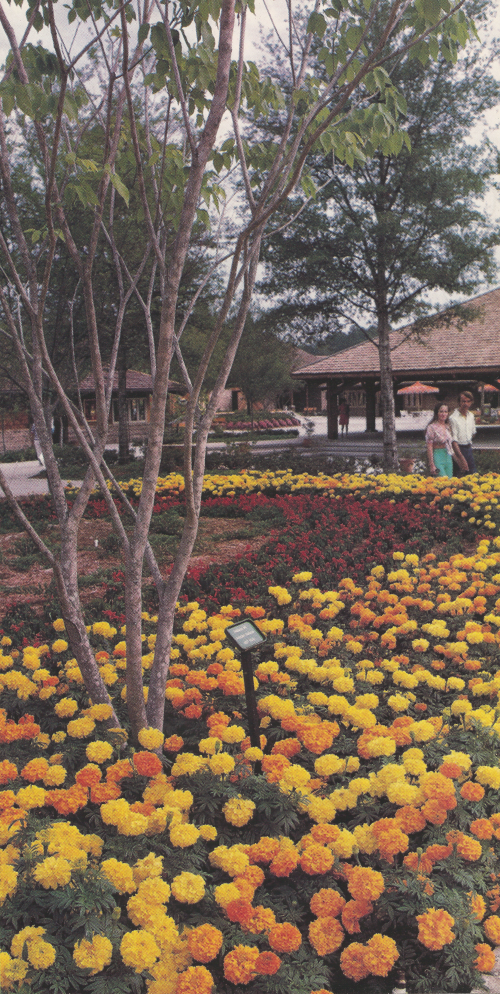
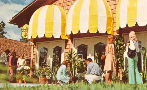
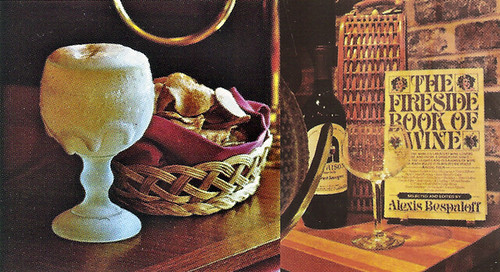
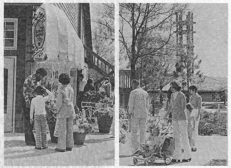
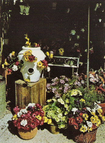
It's time to stop by the Flower Garden to pick up a fresh flower arrangement. The Flower Garden also sells cacti and is the centerpiece of the Village's yearly Easter celebration, as well as the annual Village Flower Festival, a tradition which would be expanded in the 1990's to become the EPCOT Flower & Garden Festival. Speaking of which, starting in 1979, the Walt Disney World Village is going to host a Wine Festival, with the Village Spirits and Vintage Cellar shops as the focal point of this event. Later this would move to the Lake Buena Vista Convention Center, and finally to - you guessed it - EPCOT.


Let's take another look at the Flower Garden. This later became the side of the Christmas shop. The distinctive staircase is still there, but the Captain's Tower in the background is not. This is a first year photo, look at the trees! The older folks in the audience may remember those Disney 70's strollers....


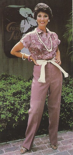
Across the way is Country Address, an upscale women's clothing shop, where Goofy's Candy Kitchen is now. Behind the Flower Shop is Micheal's Barber Shop and Shoe Time. Country Address moved around a lot throughout the 1980's and lasted until the mid 1990's, when The Art of Disney replaced it definitively. This promotional picture gives us a rare look at its' original sign:

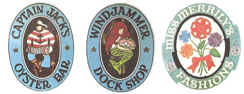
The Village's distinguishing feature was, in fact, her beautiful craftwork signs.


Captain Jack's dropped the oysters in 2000 and became simply a "restaurant"; the Windjammer Dock Shop vanished in the 1990's when Captain Jack's expanded its seating into its old waiting area and the shop became a very narrow reception room. Miss Merrily's Fashions is the second name of a designer clothing shop known as Miss Merrily's Madness; it catered to hip young girls.

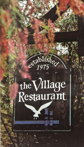
We've reached the far end of the Village. Time for dinner at one of the best restaurants on property!


The gull on this sign is also the inspiration for the logo of the Village itself, a silhouetted bird flying across a blue circle. The open dining room of the Village Restaurant is big on sunlight, skylights, and false trees.


See that recessed seating area at the back on the left? This gentleman is being treated to an unexpected fashion show, direct from Country Address! Did he buy that pipe at Pipe Dreams earlier today? The restaurant is tastefully decorated with the same weathered bricks which the rest of the Village is built with, with burnished wood tones and blinds.

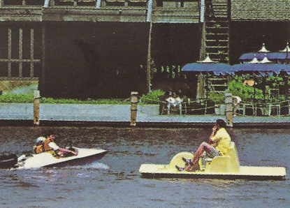
One bank of windows look out on a private canal which divides the Village from the Townhouses of the ambitious Lake Buena Vista community building effort, and the hotels of Lake Buena Vista down the way - Old Dutch Inn, TraveLodge, Howard Johnson's and others. The other windows look out on the Village Lagoon, and diners can watch guests paddle by in rented boats. This view is also shared by the Village Lounge, a hot spot for Jazz performances at night.


Night falls on Lake Buena Vista. Aren't you glad you took the time to enjoy this quiet corner of the World?

"YOU HAVEN'T SEEN ALL OF
WALT DISNEY WORLD
UNTIL YOU'VE SEEN THE VILLAGE

The Shopping Village. Walt Disney World's newest addition. So different. So unique. So exciting. Only the Disney people could've done it. Just ten minutes away in the Host Community, Lake Buena Vista.
At the Village, you'll watch Old World craftsmen at work with pottery. Crystal cutting. Toledo gold engraving.
You'll discover European and Oriental antiques. Candle crafts. Custom-blended tobaccos. Designer originals. And posh pets.
You'll savor the flavors of imported beers in frosted mugs. International cheeses. Oysters on the half-shell. Fresh-ground coffees. And tasty homemade candies.
You'll explore 29 cedar-shingled shops and four distinctive restaurants clustered on the banks of a beautiful blue lagoon.
After you've seen the Magic Kingdom. See the Village. Today. Or on your way home tonight. Open every day 10 till 10."

- Walt Disney World Village promotional flier, 1975.

---
Appetite readied for more Walt Disney World Village? Here's some further readings:
The Walt Disney World Village List - every shop, in chronological order.
Widen Your World - my writeup on the history of the Village for the internet's definitive WDW history resource.
My Flickr Account - with hi-res versions of all of these photos.

Sunday, September 13, 2009

See the Village. Tonight. Part One...

Since I've become something of the current expert on the Walt Disney World Village, due to my many years of interest in it and my obsessive desire to catalog every shop which ever put up a sign there, I've decided to put up a special treat tonight. The Walt Disney World Village does *move* me in ways that much of Walt Disney World does not, partially because I experienced so little of it when it was in something near her original state, and partially because I feel that it is the single most indicative element of Walt Disney World to be tampered with. Where once there was a funky, unique, forward-thinking little part of Walt Disney World, Eisner swept in and transformed it into... a pretty ugly outdoor mall.

But I'm not here tonight to complain about the Village now, I'm here to honor what it was then. Since many current Walt Disney World frequenters know about as much about the Walt Disney World Village of 1977 as mankind does about the dark side of the moon, I hope this pictorial tour will help bridge the gap between the abstraction of "1979 = Walt Disney World Village, 2009 = Downtown Disney Marketplace" and the actual sights, sounds, colors and textures of a true Walt Disney World extinction. No major component of the Florida Project has been obliterated as fully as the City of Lake Buena Vista, so let's enjoy a look back in time to another era in Disney design.


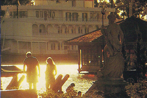
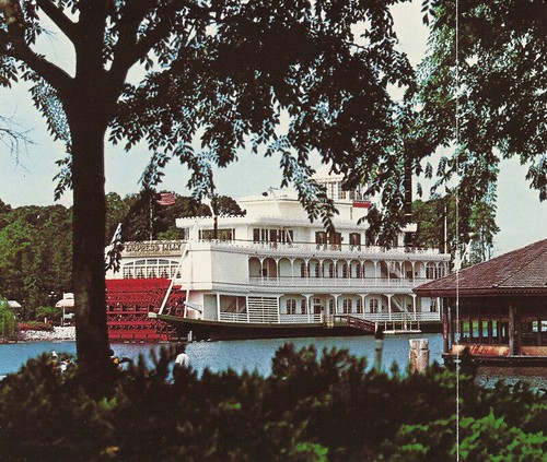
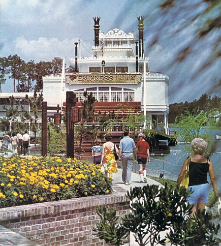
The Empress Lilly opened in April 1977 along with a new restaurant complex on the northern shores of The Village Lagoon, an already manmade waterway which required extensive digging out to "anchor" this massive building which housed no less than five restaurants and four lounges. Unlike the Mark Twain or Richard F. Irvine in the theme parks, the Empress Lilly was the real thing, a full-sized, graciously-appointed riverboat, her red paddle always turning, ready to steam out into the Florida wilderness at any moment. While this view can still be had, from near the front of what is now Team Mickey's, what should be especially shocking to current Walt Disney World visitors is the untouched Florida wilderness behind the Lilly instead of the supremely ugly expanses of Pleasure Island and Saratoga Springs. This is the way she was meant to be seen, a striking manmade wonder amid natural splendor.

The dock you see on her side, since converted to be outdoor seating for her current tenant, is where silent, peaceful flote boats from the nearby Lake Buena Vista Club would tie up to let passengers off into what was then known as the Starboard Lounge, a quiet little nook where one could look out across the water at Captain Jack's Oyster Bar. This was a privae boat service connecting only to that dock; everyone else would have to take a motorized boat to Cruise Dock West, near what is now Rainforest Cafe but which was then The Village Restaurant.

Let's go in for a closer look...


This shot just kills me. This view is totally gone now, one of Walt Disney World's greatest vistas. In the distance on the other side of the lake on the right are visible the Club Lake Villas, the second stage expansion of the Village Resort. These unassuming little structures would last until 2002 as the Disney Institute "Bungalows". Take some time to admire the gorgeous craftwork lanterns, hung on sturdy posts, which once proliferated along the waters' edge of the Village Lagoon. That little buoy barrier surrounding the Empress Lilly's paddle is still there, despite Levy Restaurants' removal of the paddle in 1996.

The sign reads "The Empress Lilly - Port of Lake Buena Vista". The top deck of the boat facing us housed the "Texas Deck Lounge", a huge bar with "tub" seating and a spacious outdoor deck facing the Village and points beyond. The windows just one level down hide from us the Empress Lounge, the waiting area for the exclusive gourmet Empress Room, with live harp music nightly. And those bottom windows, so near that churning red paddle, provided a great view to diners at the Steerman's Quarters, a premium steak house. The Empress Lilly was renovated (gutted) in 1996 by Levy Restaurants, who today operate it as Fulton's Crabhouse. Disney signed a twenty year lease with Levy, so the restoration of the Lilly to her original state is not likely in the future.

If we turn around and walk back along that footpath just a bit, we'd see this:


Those two old folks on the right are just leaving the Verandah Restaurant, having just enjoyed a leisurely, casual dinner. Perhaps the gentleman ordered the prime rib special, or maybe just a sandwich. They're now descending a brick-lined flight of steps, while those two older ladies examine the menu. If one doesn't feel like partaking inside the large central area of the Verandah, there are counter-service sweets available to both the left and right of the hexagonal building. To the left is the Village Cone Shop, and to the right is the Sara Lee Bakery.

The building which once housed the Verandah still exists, although the steps have been eliminated and the pedestrian walkway now runs on the same level as the old couple on the right. It now houses the Lego Imagination Center, and the little hexagonal side room which once housed the Cone Shop was leveled. The space for the eatery on the other side was retained and is now where kids can fill a bucket with LEGO bricks. The main door to the shop is now nearer the former site of the Cone Shop. Where the front doors on the Verandah were is now a series of displays of LEGO dioramas.

In the very background of this picture we can see the Pottery Chalet, the tallest building in the little cluster of shops which made up the Village. Let's go inside!

Now, about the Pottery Chalet.


It wasn't really a single shop so much as a collection of many sub-stores, some of which had to do with pottery, and some which... didn't. It had an open courtyard on its' south side with shop space all around. In the middle of the Chalet was the potter, a live person working a potter's wheel. Much of the pottery sold in the shop was thrown right at the Village, and a custom pot could be made for you as well. If you look closely at the image above, you can see that in its' early years the Pottery Chalet was open in the front. Only later was it glass enclosed.

Inside the Pottery Chalet has a collection of all sorts of items... the best way to succinctly describe the Village's mega-store was that it was devoted to "housewares". One could buy everything from candles to fine china.

Here we are in the courtyard of the Pottery Chalet complex. Such gorgeous pottery! Disney's even thoughtfully included plants in many of these pots. See that little garden cart over on the left? Let's go examine that closely.


Unlike on Main Street in the Magic Kingdom, these are real flowers. The Walt Disney World Village was intended to serve locals as well as the future residents of Lake Buena Vista, the city which would grow out of the "downtown" of the Village.

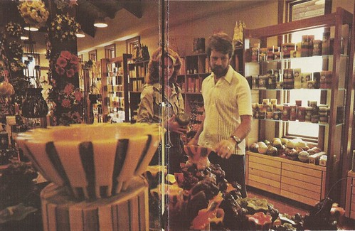
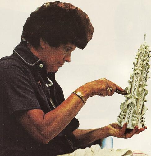
Here's a very rare image of the interior of the Candle Chalet, which was unfortunately printed across two pages from a 1977 World Magazine. It may not be a pretty scan, but you can actually see inside the shop, which nobody has done in over twenty years. As you can see, these candles were quite elaborate. Many of the best of these were carved onsite by craftspersons like this lady here...


Who of course, like many of the artists at the Village such as the potters, florists, crystal carvers and gold inlayers, held ongoing demonstrations. Some of the candles carved and sold in the Candle Chalet were also available in the Magic Kingdom in the Wonderland of Wax store on Main Street.


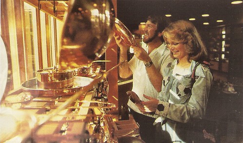
Our couple has found the kitchen wares section of the Pottery Chalet! The guy in this picture looks much happier in this part of the store... the Pottery Chalet also sold place settings, linens, flatware, and even kitcheny brick-a-brack.

These folks are enjoying some down time nearby, outside the Chalet at the Dock Stage, with its' stepped viewing area. The building in the background is likely the side of Lite Bite, the Village's burger-and-fry outlet. Also visible on the left is one of the Village's many "Mediterranean" statues which dotted the picturesque Lagoon.

The Pottery Chalet slowly was consumed by the Christmas Chalet in later years, and was eventually demolished in 1995 to make way for the World of Disney. This also involved destroying the original Dock Stage and rebuilding it with bleacher seating. That incarnation went away earlier this year as Disney built a new, covered, high end stage where once the sedate Dock Stage was. The first picture of the Pottery Chalet above is now impossible, even if the Chalet were still standing, because the stage would block your view.

Lite Bite was later renamed the Lakeside Terrace, then later Goofy's Lakeside Terrace, and was finally replaced entirely by the current Ghiradelli Soda Shop. The layout of the actual building is reasonably untouched.

Let's continue past Lite Bite along a shaded sidewalk, past the Village's eccentric playground, past the Village Art Gallery (not displaying Disney art, by the way). Eventually we come to this eccentric looking shop:


This is the north-facing facade of a shop which was known as Port of Entry, selling a variety of import stuff, sort of a precursor to the many shops of World Showcase. In front of Port of Entry was a narrow little vendor which was given her own name: Cane, Rattan, Wicker & Suns (get it?). This sold a variety of wicker furniture, which was quite popular in the mid 70's. Around the side of this building is Pipe Dreams, the Village's adjunct of the Main Street Tobacconist, which both sold and repaired fine pipes. Past that: The Bath Parlor, a high-ceilinged, white walled paradise of bathroom decor and towels.

Port of Entry had become Mickey's Character Shop by the late 1980's, probably due to Port of Entry's extreme redundance in light of EPCOT Center's opening in 1982. This store paved the way for the World of Disney. The building which once housed Port of Entry is today home to Team Mickey's Athletic Club.

The sun is starting to go down on the Village, but we must sadly end our tour here.... until next week. See you then!

--

Appetite piqued for more Walt Disney World Village? Here's some further readings:
The Walt Disney World Village List - every shop, in chronological order.
Widen Your World - my writeup on the history of the Village for the internet's definitive WDW history resource.

Thursday, September 03, 2009

To Luau Cove!


A new side project of Passport to Dreams.... see you there.

Friday, August 28, 2009

EPCOT is Pretty!

So here's something new to this blog.

In something like the spirit of my photospread of the Polynesian from a while back, I'm offering something unusual (for me) today: a video. It's a five minute little piece which was actually shot by myself and my boyfriend as a test of the capabilities of our new HD camera. It's long on atmosphere and short on content, but I hope you all will enjoy it as some filler, until the next amazing post here at Passport to Dreams. :)

For best results view in full frame and let it all load first... the HD-ness of it often causes jitter or flicker in some connections which is not in the source file itself. Enjoy!

LINK TO VIMEO

If there's enough of a response to this, I may look into starting to make available online a lot of other material like this, so let's hear what you think, viewing public!

Sunday, August 16, 2009

Who Lives Here?

No individual work exists in a vacuum, despite the sometimes best efforts on the part of writers such as I to pretend it does. I often write exclusively about the work of the theme park designers, the integrity and intention and effect of the piece as if it exists in nothing but a black sound stage with a silent audience that responds exactly as they should. This is for very particular reasons. The first is that published critical thinking and writing about the Disneyland model of themed design is focused tightly on the sociological aspects of the piece. I am not a sociologist and find little interest in the subject - I am an artist and I'm writing about what I know. I find that in texts about Disneyland or, especially, Walt Disney World, the artistic value of the place is often taken for granted - either positively or negatively - with little further dialouge to address the significance or contribution to the artistry of the work of the designers. The integrity of the atmosphere of something like Disneyland makes it easy to treat as some sort of unified work with an explicable meaning, but rising as it does from the collective efforts of hundreds of individuals, a unified meaning and purpose behind such a work is at best unintentional.

We should not totally exclude the experience of the spectator from the diagesis of the piece. The theme parks are meant for people; anybody who has experienced the cold and unique desolation of a Magic Kingdom with no patrons in the wee hours of the morning understands fully how the entire operation's illusion of warmth and vitality depends on the prescence of music, spectators, employees. The Magic Kingdom is a ghost town with lights burning in every window to welcome home that long dead Walt Disney. But there's not even a firehouse apartment behind the window, just a black cloth and a lamp shade on a box. The effectiveness and the shallowness of the illusion is quite chilling the more one thinks of it.

There is a German word which describes what the Magic Kingdom does so well which we have no satisfactory equivalent to in English: Gemutlichtkeit. It means something like "comfortable" or "cozy" but it means more, indicating a sense of peace, belonging, relaxation, and acceptance. The Magic Kingdoms create an atmosphere of Gemutlichkeit, yet - and this is the essential dynamic - it is a place that we cannot truly ever belong to, because there is nothing there. As such we are never residents, always visitors to a place we'd like to stay if it weren't for the fact that all the play money is nailed down in the till and the real residents circulate motor oil instead of blood.

The actual role of the spectators in tradional WED design is rather vauge; since we are distanced from the show both by its' "better than reality" nature and our unconcious contract with Disney in which we suspend disbelief just enough to pretend to believe, walking into Fronteirland does not make us pioneers. We are walking cobntradictions right there in the middle of the most thematically homogenous enviroment imaginable. But if the theme show can't and doesn't try to resolve the role of the tourist as visitor to an enviroment which precludes them, we may look deeper to find certain indicators of who may be the true intended audiences for Disneyland-style parks.

It may be recognized that there is a class structure inherent in the fabric of the park itself, perhaps nowhere more obviously than in Adventureland, the realm of the "arm chair adventurer". Embodied in the bold architectural mishmash of imagery in this area are elements from Asia, Africa, Polynesia, the Caribbean, and elsewhere - frankly, anything not middle American or central European in nature is portrayed as "other". This certainly implies a white middle class viewpoint, the class in America in the middle of the 20th century who resurrected the phallic Tiki Gods as the new Baccus of middle America. Since Adventureland itself in both East and West coast versions derives heavily from this cultural phenomenon which began in 1949 with the success of South Pacific - itself a reflection of the tales that many fathers were bringing home to middle America about the south seas following World War II - this is not unnatural.

I think that the Harper Goff Adventureland of 1955 brought even more overtly a specific maleness to the table, with its' exotic but still hard edged buildings, a cantina, and the Jungle River Ride. It's commonly repeated factoid that this creation was heavily influenced by John Huston's The African Queen, which itself is a tale of hard men in a hard place. Humphery Bogart in that film is not the suave Rick of Casablanca, but a poor man with a cheap boat. The hardness of Huston's vision of man vs. nature found its' way into Goff's Adventureland, with the sunbleached buildings and dark bars that come with it.

In contrast, the 1971 Adventureland belongs to Marc Davis and Dorthea Redmond, and they both brought considerable feminizing influence to the concept. Redmond's beautiful yellows and reds, her gentle beauty and quiet mysticism gave Adventureland a quiet dignified beauty related more to Fantasyland than a jungle river port, and Davis brought his visual charm and interest in "native" cultures of Polynesia and South America. These are both still middle class, caucasian viewpoints, and somebody from South Africa or Asia would feel no more at home in Adventureland than anyone else. It may be a Fantasyland, but it is a white man's Fantasyland, a playground of implied cultural dominance. Even The Enchanted Tiki Room, a Polynesian showplace, is hosted not by any sort of representative of the "local culture", but by caricatures of non-Americans... all Western: Ireland, Germany, Mexico and France.

If Adventureland is Fantasyland for caucasians, then Main Street USA is the playground of capitalism. Everything is booming in Walt Disney's turn of the century America, quite the opposite from the Marceline Missouri without even a paved street of Walt Disney's youth. The actual period of American history which Main Street represents includes not only ragtime and gingerbread details, but also the Long Depression, a brutal series of economic scares which lasted from 1973 to 1901 and which created the decaying Victorian home which is the American conception of a haunted house due to the high rate of abandonment of new real estate during this period. But business is great on Disneyland's Main Street, with every suggested tenant above the Market House doing implied great business. It's the nostalgia of the turn of the century combined with the actual boom times of 1950's America to create a complex and totally fact free version of what a small town American main street would've been in 1900. Both of these "implied perspectives" color perceptions of the Magic Kingdoms, then as now, but do help guide us to an appropriate "reading" of our defined "role".

As important to the fabric of Disneyland is its' suppositions about race and class are its' suppositions are national identity. Werner Herzog lists it in his recollection of places where everything "about" America comes together, along with places like Wall Street and Graceland. I certainly think that Main Street is a particularly American conception, aimed at Americans. And while Europans may admire the charm and eloquence of the "statement" of Liberty Square, the statement is still divorced of the cultural resonances in has for American audiences.

Tomorrowland, in its' native state, was a big gleaming showcase of American industry, homelife, and progress. Although we may not find much futuristic in the 1955 lineup of Tomorrowland offerings, all of the exhibits were corporate displays and the lineup of names must have ben impressive: Ritchfeild Oil, American Motors, TWA, Kaiser Aluminum, Dutch Boy Paints, Monsanto, etc. We can easily add in a dozen more names of companies who have supplied exhibits to Tomorrowland throughout the longevity of it's original concept: McDonald-Douglas, Eastern Airlines, RCA, Goodyear Tires, AT&T, General Electric, and so on. This is quite a catalouge of American Industry, and it makes good on the promise of rampant capitalism above every shop on Main Street. There is an invisible line which moves West-East across Disneyland which inscribes a timeline of American progress; from Fronteirland to Main Street and on to Tomorrowland. If Fronteirland takes place around 1825 (dated so by me for its' relationship with Davy Crockett), Main Street around 1900 and the original Tomorrowland around 1985, that's 160 years of American history represented in a tiny little area. If we add in Liberty Square then the number gets bumped up to 210. It's harder to argue against the idea of inherent Americanness of the Disneyland model than for it.

In this way Magic Kingdoms are, especially since one has not been held in the United States since 1984, the true Universal Expos, which can be built as lasting American cultural ambassadors anywhere in the world. Japan wanted the American-ness of the Magic Kingdoms; France resented it. But it's in the bloodstream of the piece. It's a mark of the quality of the design and the universal appeal of the concept that the Magic Kingdom model appeals to audiences other than the white middle class Americans it was designed to echo the most core values of.