Now Available! My newest book!
Showing posts with label Adventure Thru Inner Space. Show all posts

Tuesday, July 09, 2013

The Tomorrowland Problem

"'Course I'm respectable. I'm old. Politicians, ugly buildings, and whores all get respectable if they last long enough."
 - Noah Cross, Chinatown

Every so often I'm asked to write an analysis piece on New Tomorrowland, the Tomorrowland reboot from 1994 in Magic Kingdom. I'm even somewhat interested in trying, but the fact remains that I am not the person to write that article, because New Tomorrowland was never my Tomorrowland. It never meant anything to me besides garish decorations and disappointment; it never got inside me in any meaningful way. And so I knew I couldn't discuss what was good about it without sounding condescending.

I also knew if I waited long enough, the "Tomorrowland gap" would close itself, once somebody just a few years younger than I was when Tomorrowland was still "New" - young enough to see its strengths over its weaknesses in ways I couldn't - came along.

The newish blog "Progressland" has stepped up to bat and filled that void, in admirable fashion - I suggest that any and everybody read "The Future That Never Was" whether they be convinced of the greatness of the area or not. New Tomorrowland was nothing if not ambitious, in ways that Disney seems genuinely incapable of being today, and no moping and complaining from any number of Unnamed Bloggers on this very site can take that away from it. And so this article is not going to be about New Tomorrowland, but it is going to proceed directly from the notion that the area was, in the final analysis, a failure.

Maybe not an artistic failure, but it was a failure to realize its stated goal, which was to create a version of "Tomorrowland" which would not require wholesale removal within twenty years. Twenty years are coming up now, and New Tomorrowland starting to look pretty shopworn and dire.

I call this The Tomorrowland Problem: how do you keep up with the future, when Tomorrow keeps becoming Today?

It's an issue which Imagineering thought they had licked back in the early 90s. Surely the fatal flaw, that bungled line of code in Tomorrowland's essential DNA, is that it's trying to predict a realizable future. Instead, they thought, we shall predict an unrealizable future, one rooted in the ideas of the past. Surely this will add the charm back in, add the thing that the rest of the Magic Kingdom has and Tomorrowland lacks.

Conceptually, the idea is sound - in execution is where it went all pear shaped. But we shall come to that later. It's time to unpack the Tomorrowland Problem.

Ugly Buildings

We ought to start, I suppose, by coming to terms with what Tomorrowland is on the basic level of visual identity. And by "Tomorrowland", of course, I mean the "white" Tomorrowland that still mostly dominates Disneyland and dominates over half of Magic Kingdom. So long as WDI isn't going to slap a new skin on the outside of the iconic white Space Mountain and significantly change its visual identity, it seems that as various "tomorrow" fads come and go - browns and earth tones, bolts and sheet metal, green lights - the area keeps backsliding to its pure "white" incarnation, even if the actual shades of white are an ever-evolving project. Space Mountain seems to always control the look of the area.

But when you go looking for descriptions of Tomorrowland, nobody really seems to even agree on what they're kind of buildings they're looking at - search online and you'll find everything from Googie, Industrial, Institutional, Streamline, Futurist, Brutalist, and every genre of "Modern" from Neo-Modern to Mid-Century Modern and Post Modern. Let's take a close look at some close contenders:

Googie - Googie architecture was a regional phenomenon of Southern California following World War II which today we would probably call "entertainment architecture": structures which sought to tap into the cultural zeitgeist by using modern shapes and construction materials made possible by the war to evoke spaceships and aerodynamic shapes. Googie appeared on coffee shops, bowling alleys, diners and all sorts of structures generally considered Suburban Blight throughout the 50s and 60s, and following the maturation of Generation X was generally considered, along with Tiki, to be desirable for its evocation of a bygone age.

"White" Tomorrowland was not Googie, although some aspects of the two styles are complimentary - both invoke space flight, moon rockets, and optimism. What's interesting is that when Disneyland opened in 1955, Tomorrowland very much was built in the Googie vernacular - and all of this was torn down and rebuilt in 1966, before Googie had even really become unfashionable.

Today Googie enjoys a very strong reputation, so it's an easy shorthand in written analysis to describe the 1967 and 1971 Tomorrowlands as Googie as a way of legitimizing them, but it is not an appropriate fit.

NOCA, San Antonio, Texas - Vintage San Antonio
Streamline / Streamline Moderne - Streamline Moderne is famous as a style fashionable from the decades predating Disneyland, so what is it doing here? Well, conceptually, Tomorrowland owes a lot to Streamline architecture, even if our received visions of Edward Hopper diners and the glam era of rail travel don't quite seem to connect.

Streamline Moderne is often mistaken for Deco or Art Deco, which is ironic because Moderne was supposed to be an architectural revolution rejecting the concepts of Deco. The idea was that Art Deco was only a mildly updated version of the Victorian and Art Noveau fads from a generation before: a style which used the iconography of the machine era but not its ideas: true Art Deco architecture still is, even after all these years, an eyeful. Streamline Moderne was supposed to strip away all that shellacked-atop layers of decorative detail, a symbol of bourgeois conservatism, and create truly modern structures. Streamline buildings are quite severe, almost plain, save for their distinctive horizontal lines and ridges, almost like aerodynamic grooves.

What's interesting is that as Victorian styles turned into Art Noveau, which turned into Deco, which turned into Streamline Moderne, which itself turned into Googie, traces of each step remained along the way, and Tomorrowland combines them all like a cocktail - keep this in mind, which we will return to eventually.

Club Moderne, Montana - Wikipedia
Futurist - if you want to provoke a fight amongst architecture enthusiasts, ask a group of them whether a famous, sleek building - say, the Chrysler Building in New York City - is futurist, deco, or modern, then sit back and watch the carnage.

Futurist architecture, in its strictest sense, is an Italian genre with - troublingly for Americans who wish to follow Walt Disney's lead and identify Disneyland with Democratic institutions - a strong hint of fascism floating through it. Futurist manifestos will forever be written and re-written because the Future is an ever-evolving horizon-line, but the imposing, institutional quality Tomorrowland inherited in 1967 can be traced to Italy of the 1930's.

What's interesting is that the more you try to define the "Tomorrowland look" you realize that it doesn't look like anything -- except itself, and that this itself accounts for its longevity even while it dates the area immediately. There's just no nailing it down with any definable terminology we have available to us, but all you have to do is describe any building as "looking like Tomorrowland" and a host of relevant associations spring to mind. In looking for probable contemporary sources for Tomorrowland's look, besides the World's Fair of 1964, there is this:


The "Theme Building" of Los Angeles International Airport from 1961.

Why the Theme Building strikes me, besides its local nature and date of origin, is that it goes so much farther than Googie or Futurism ever went: it goes really far out there to create an organic suggestion of line and motion flowing free. So, following the example of the Theme Building, I have decided to call Tomorrowland's look Theme Architecture.

Not so much because it is strongly themed, at least not in the way that the Enchanted Tiki Room or Plaza Inn are themed to a specific place and time, but because the architecture itself suggests themes - futurism, dynamism, the conquest of frontiers. This is Theme Architecture, not themed architecture.

What's interesting is that as Theme Architecture combines aspects of many other styles, many examples of those disparate styles are today treasured as classic contributions to world art. Buildings that were once considered ugly and torn down en mass are today restored and preserved. It took around twenty to thirty years - about two generations - which is right about the time when Disney began to tear out their Tomorrowlands.

Is it possible that Disney tore out their Tomorrowlands just on the threshold of when those ugly buildings were about to become respectable?

The Dangers of Specificity

What, then, is the essential component that causes visions of the future to date badly? Popular culture has been generating new ones every few years, and each new edition is more or less an extrapolation of current trends and varying degrees of pessimism. "The World of Tomorrow" has always been a rich ground for social critique, given the theoretical - if always remote - possibility of that future coming true. However, one of the defining traits of visions of the future is that they inevitably get it wrong. After all, if somebody actually accurately predicted the future, say, 70 years out, it probably wouldn't be a widely digested text, because we'd see it as more of a documentary than anything we define as "Sci-Fi".

Indeed, one of the most important appeals of "futures" past is that they got it wrong. We like to look back from our privileged vantage point and see what they got wrong, what they got right, and how the fantastic predictions and obsessions of a past generation are still relevant to us today. The fact that Tomorrowland is always becoming Yesterdayland is, in fact, absolutely essential to its appeal.

And once we say that, once we float the notion that most valuable future visions have been remembered despite presenting a dated version of the future, the scope of the "Tomorrowland Problem" starts to narrow exponentially. The question becomes now how to present a future that never dates, but how to present a vision of the future which dates gracefully.


Magic Kingdom's Tomorrowland of 1971/75 was never meant to last forever - in fact, it was dated the second it opened. Rocket/Flight to the Moon, a cornerstone Disneyland E Ticket, became science fact while the Florida version was still a hole in the ground, and it happened only a few miles from where Disney was building, necessitating a quick swap-out in 1975, adding some whimsy and changing the destination to Mars. And while in the 50s the Rocket to the Moon was a fairly serious depiction of what space flight could be like, by the 70s Mission to Mars hostesses were already asking viewers to bring "their imaginations", offering hopeful apology for something already so obviously old fashioned. One wonders when Walt Disney would've pulled the plug on it had he lived even, say, four more years.

It's that darn albatross again!
No age will ever be the past generation's future age, and an accurate prediction of any future is difficult to pull off, but one of the reasons Disney's "white" Tomorrowland ran dry so quickly is because it was presenting a nearby, realizable future, one promoting ideas and services from contemporary companies.

Furthermore, Disney's "Tomorrow" was weirdly narrow and specific - Carousel of Progress was a rotating furniture gallery tracing the increased automation of a dozen home furnishings like, say, ovens. Adventure Thru Inner Space, besides being a crazy head trip ride, ended up being as much about Monsanto chemicals, fabrics, and home wares. Circle-Vision only made sense when it was new, as an answer to things like Vista-Vision and Cinerama. If You Had Wings was an airline advertisement. Nobody knew just what America Sings was doing there. One of the reasons the EPCOT Center attractions dated much more slowly is because they were big picture dialogs - not about what new high-strain fiber Monsanto was brewing up, but about the history of the whole of man's technological progress. Probably the only attraction ever put into Tomorrowland that never needs anything but aesthetic updating is Space Mountain, because the scale of its concept is so abstract - Space is Weird, and Fast.

Specificity has its advantages and disadvantages, although the disadvantages outweigh the advantages the longer the product is supposed to last. In the era when films, for example, were supposed to enter and leave theaters in a year or two, then specificity could be a virtue - "torn from the headlines" tales of war feats, criminals, and social concerns were important selling points of many movies. Theme park installations, a sort of mutation of cinema, were sort of an early version of home video... the product would be preserved so long as people paid to see it. Whereas films were expected back then to retain their value for a relatively short span of time, theme park attractions can and have been running for going on three generations, assuming that their themes and ideas are universal enough to seem ever-new.

For a comparable example, look at Destination Moon, a film from 1950. Today, Destination Moon is almost completely obscure, although Tomorrowland fans should proceed directly to it - lavishly produced and one of the most expensive independent films of its era, Destination Moon was, for 1950 audiences, an epochal film which opened the flood gates for screen Sci-Fi. Producer George Pal would go on to make such pivotal genre pieces as When Worlds Collide, The Time Machine and War of the Worlds.

Although rights disputes kept Destination Moon off TV and video for generations, the popular appeal of it today is somewhat questionable anyway - Destination Moon is "hard" SF, without any space cruisers, wookies, or death rays. In fact, it's nearly a documentary, although one from an alternate dimension where the first space shot was made in 1950 and funded by industrialists - the government has to buy their technology to stay ahead of the Reds.

Besides the social context, however, Destination Moon is eerily similar to how it was actually done in 1969, and makes for gripping viewing. It seems to be the true inspiration for John Hench's 1955 Rocket to the Moon, for one, including the idea of making the actual count-down and lift off the dramatic center of the action. Disney's roughly similar Man in Space shows which provided the "official" televised foundation for Tomorrowland look like fairly obvious Destination Moon retreads in retrospect. And in fact, just like Destination Moon, the Man in Space shows were not available for generations - not due to rights issues this time, but because Disney probably correctly sensed that the commercial possibilities for them were limited. Both are extremely detailed, technically oriented discussions of theoretical space launches that we now know were only very close to what actually happened; that's not going to be an easy sell for audiences. Audiences kinda do need those spaceship battles and death rays to keep them interested sometimes.

Moreso than maybe any other film, Destination Moon ought to be the poster child for the Tomorrowland Problem: your product can be detailed, exciting, technically brilliant, and influential, but when you only just fall sort of predicting a realizable future, obscurity eventually follows. Audiences seem to want their Sci-Fi wrapped in weird places and technology, and being totally wrong in your "predictions" may just be the key to longevity instead of being mostly right.

Daveland

Two Defining Examples

To further explore the dilemma, I'd like to pick on two widely seen, evergreen examples of Sci-Fi film making which influenced not only Tomorrowland and New Tomorrowland, but legions of films which came after.

There are, in my opinion, only about a half dozen key Sci-Fi films which permanently informed our vision of "The Future". Some of them forged new ground, others summed up the genre and set it on a new course. Two of the most influential - Star Wars and Close Encounters of the Third Kind (1977) - are outside the realm of our discussion of the "Tomorrowland Problem" for obvious reasons - and Star Wars is self-consciously set in a fairy tale world anyway. The fact that there is now a Star Wars ride actually in Tomorrowland itself points more ironies than I care to elucidate.

Two other seminal films, 2001: A Space Odyssey (1968) and Blade Runner (1982) did have a measure of influence on both Old and New Tomorrowland, although that influence was largely visual. A discussion of their relative complexities and messages, especially 2001's totally abstract modern myth or the ethical limits of corporations and technology found in Blade Runner and echoed in Alien Encounter seems to demand more elaboration than the scope of this article permits. Both use a measure of real-world prediction to carry ideas of identity (personal or cosmic) in a film of primarily visual pleasure.

Top: 2001: A Space Odyssey; Bottom: Express Monorail on Flickr
Top: Space Mountain Bottom: 2001: A Space Odyssey
Top: Blade Runner, Bottom: Tomorrowland 1994 (photo by Tom Bricker)

Instead I'd like to look at the two granddaddies of the Sci-Fi cinema, Fritz Lang's Metropolis (1927) and H.G. Wells' Things to Come (1936). Both films are visually spectacular and dramatically ludicrous cinematic monsters which were insanely costly in their day and huge box office train wrecks. Both films rose out of relatively poor reputations to become some of the most influential films ever made. But while one is one of the most recognizable and widely seen films of its time, the other has largely been forgotten by posterity, beloved by only a small legion of admirers. I believe that by looking at these two films in detail and as representatives of the problems inherent in depicting the future, we can nail down the basic challenges facing Tomorrowland.
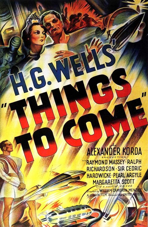
Interestingly, you can't even make sense of Things to Come without Metropolis, since H.G. Wells explicitly intended Things to Come to be a refutation of Metropolis. Things to Come is exactly what it says on the box: it is Wells' predictions, as a historian and futurist, of what the world can expect in its next 100 years. Specifically, it's a very accurate depiction - almost a documentary - of an impending real-world disaster, which slowly veers off into speculation as Wells shows how the troubles of mankind can be eradicated by a coming new world order. Things to Come is basically Wells' blueprint of how to save the world, and the film is his how-to guide of how to rebuild following the global disaster.

I'm going to summarize Things to Come in its entirely here because most people have not seen it and an understanding of its overall message is important to have on hand. This isn't really a movie you can "spoiler" - the events are less happenings and more excuses for characters to pontificate - but even so, if you insist, the next three paragraphs can constitute "spoilers":

Things to Come opens in 1940 in Everytown (London). Everytown is on the brink of war with an overseas nation, a war which many predict will never come (sound familiar?). War beaks out on Christmas Eve and Everytown is shelled nearly to rubble. The war becomes a drawn out battle of attrition which lasts twenty years and reduces most of the Western World to desolation. Near the end of the war, the unidentified enemy unleashes a toxic gas which causes a plague - The Wandering Sickness - which decimates half the world's population. By 1966, mankind is back at a point analogous to the Dark Ages.

Following the end of the plague in 1966, feudal warlords take control of territories, determined to rebuild and continue hostilities. Unknown to them, in Basra (!) the surviving scientists and engineers from the old world are building airplanes to form Wings Over the World - a benevolent technocracy which removes these dictators with the harmless "Gas of Peace" and unites the world under a single flag. From there, Wings Over the World rebuilds civilization harnessing all of the earth's natural resources as a series of futuristic underground cities where war and want is eradicated.

By 2036, mankind is engaged in a fierce debate about the ethics of a moon launch, while a disgruntled artist rallies a mob to stop the manned space flight and demand a return to the old ways, where life was passionate and short. The launch is thwarted and the first living humans are shot out of a giant rifle (!) into space. The film ends with an impassioned discourse on the destiny of mankind to inherit the stars.
Okay, if you could read those paragraphs without laughing at several points you are a stronger willed person than I. Yet despite the absurdity of the film, both in summary and while watching it, the film is completely serious about the grave nature of these predictions. How the film ultimately loses modern audiences is that, by positioning itself as a straightforward prediction of events which we know very well did not happen, the film proves to be consistently, sometimes bizarrely wrong.

For example, in the terrifying and gripping opening sequences - the parts of the film which do seem spookily prescient, almost a documentary of the near future - a great deal of debate occurs about the role of war on technological progress, a concern that Wells, the great pacifist that he is, places no stock in - he introduces a buffoon who continually reassures us that there will be no war, and whose rejection by the main character is a salient dramatic point. This blustering comic character does bring up the idea that wars can be a start to great technological advancement, which the noble main character immediately rejects - this same character will soon go on to become part of Wings Over the World and rebuild society. Only the characters who take Wells' position are depicted as being remotely sensible.

From our perspective, we know that World War II, in fact, was a spur to technological progress, and that these military projects eventually gave rise to the Information Age, which most futurists never saw coming. We know that the war did not last twenty years and that the immediate fallout was the Cold War and the space race, which put man on the moon some seventy years ahead of Wells' predictions. Space Race technology fueled innovations in home furnishings, food, drink, clothes, communications technology, the computer processor and that very same technology that put men on the moon was used by Walt Disney to make tiki birds sing and flowers croon.

Much of the unintentionally comic aspect of Things to Come rises out of the gap between the film's urgent messages of warning and our own knowledge of what did actually occur. A portentous title card looms out of the rubble of Everytown: 1966, and as the film fades to the last vestiges of humanity scrambling through the wasteland, we smile and imagine teenagers listening to Revolver in their bedrooms.

Despite this, H. G. Wells' faith in humanitarianism shines through every frame of the film, making Things to Come simultaneously absurd and exhilarating, reassuring us even as it depicts the total destruction of our way of life. This makes it prime Tomorrowland material, even if Wells was a genuine futurist while Walt Disney was more of a industrial optimist: Wells wants to tear down all national and personal distinctions while Disney believes in the power of capitalism to achieve a future utopia. Interestingly, they seem to arrive at the same place, with Wells' Everytown of 1936 bearing more than a few passing resemblances to Walt Disney's Experimental Prototype Community of Tomorrow. There are even moving sidewalks which remind us inevitably of Peoplemovers. And while Disney's estimation of the need to start fresh is less extreme than Wells' wiping clean of the slate, the idea of staking out virgin land in the swamps of Florida is not too different, in the end, that Wells' escape via international disaster.

Things to Come, 1936

Walt Disney's EPCOT, 1966
In fact, if Things to Come is unwarrantably but understandably obscure today, it may have more to do with the fact that the film's constant emphasis on its seriousness and specificity makes it seem like a fantasy to modern audiences even while its rhetoric and warning insists that it is not and thus creates an unbridgeable gap: What is the point, we ask? Audiences generally follow the film through its Christmas Eve, wartime and plaque scenes - The Wandering Sickness sequence looks like a primitive precursor to our modern zombie movies - but start to tune out once Wings Over the World, who strike us today as nothing but fancy Nazis, assume control of man's fate.

If it plays best as a total Buck Rogers fantasy, then the immediacy of Wells' message is lost. Once we lose Wells' message and think of Things to Come as being set "once upon a time" instead of "happening at your house tomorrow", the effect is diluted. Despite a fantastic new edition of the film by the Criterion Collection, Things to Come is likely to remain a remote and faintly ridiculous cult item, a warning from the past of a future that did not come anywhere close to reality.
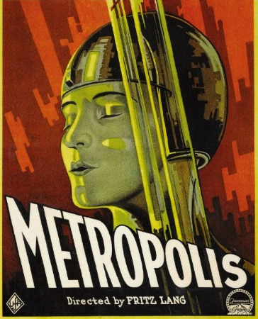
In contrast, let's look at Fritz Lang's Metropolis, perhaps the most famous and accessible of all films made in the silent era. Metropolis tells a story set in a gigantic city of skyscrapers where the rich idle aimlessly in arenas and gardens of light while the poor labor below in an underground city where they slave on dangerous machinery. The son of the god-like master of Metropolis falls in love with a Virgin Mary-like Maria who pleads the workers to peacefully wait for a "mediator" to bring the city together. Discovering this, the master of Metropolis goes to a mad scientist who has created a humanoid robot. They agree to kidnap the saintly Maria and disguise the robot as her. The false Maria incites the workers to riot, and they attack and destroy the machinery of Metropolis, inciting a biblical apocalypse. In the end, order is restored and the son of the master of Metropolis steps forward to be the mediator between management and labor.

First, you probably noticed how much simpler that story is, despite Metropolis being a full hour longer than the longest available print of Things to Come. What you may not have noticed is that Metropolis is not set in the future. Ironically, despite being one of the most influential works of science fiction of the 20th century, Metropolis isn't so much about the future as it is about modernity in general, and Germany of the 1920s in particular. The film is an allegory for contemporary society, and indeed Germany in the 1920s actually was spiraling into a real life apocalypse. This is why Lang and his team of designers don't include many key elements of the visual lexicon of science fiction, like crazy vehicles - the cars and planes of Metropolis look like cars of the era. The clothes look like 1920s fashions instead of jumpsuits or Things to Come's weird toga-robes. Yet weirdly this "fashions of 1927" effect also enshrines Metropolis in its own timeless look: the fashions look just universal enough to belong to anytime in a way that "futuristic clothes" in many SF films only yank us out of the period.

But really, do we need to look any further than the very first page of the novelization of Metropolis, written by screenwriter (and Mrs. Lang) Thea Von Harbou?

"This book is not of today or of the future. 
It tells of no place.
It serves no cause, party, or class.
It has a moral which grows on the pillar of understanding:
'The mediator between brain and muscle must be the heart.'"


So far as I know, the first author to propose seeing Metropolis as an allegory rather than as a Science Fiction film was Tom Gunning in his book "Fritz Lang: Allegories of Vision and Modernity", and when we take this tactic, a number of questions which otherwise seem unanswerable begin to fall into place. For example, the lack of traditional SF trappings beyond the robot: Metropolis' robot may have inspired C-3PO, but it has only a few minutes onscreen before it is turned into the "false Maria". Similarly, the film's overall structure counterpoints very sleek, modern visions with very ancient ones - catacombs, the Tower of Babel, the Moloch god of sacrifice (Von Harbou seems to have lifted this from Paradise Lost), a Grimm's fairy tale cottage, a church, the Biblical apocalypse itself. Metropolis combines and codifies all of the impulses of its day into one meta-text of modernity, everything from abstract sculpture to Mendelsohn's Einstein Tower.

The Einstein Tower, Potsdam
Despite its numerous chases, explosions, and special effects, its message seems to be no more complex than this poster, which could be seen everywhere around Berlin in the 1920s:

"Berlin, stop and think! You are dancing with death!"
Metropolis, 1927: The dance of death
The poster's imagery of a young woman and a bare skeleton is even closely repeated in the film's famous catacombs sequence.

This, then, is the basic root of the bulk of the complaints the film has raised over the years, including by H.G. Wells, who took offense to its ludicrous action-adventure pulp. Wells was convinced that audiences would leave the theater insulted that such a wildly improbably version of the future was being presented -- but then of course depicting any future was never Lang's goal.

And here's the kicker, the big joke: we are a lot closer to Lang's future than Wells'. While Things to Come may evoke unintentional laughter, Metropolis brings shivers of recognition. We do live in a world sharply defined between haves and have-nots, of riots and organized protest. Our lives are governed by technology and we are being replaced by our creation. Our cities don't look like the organized, air conditioned, plastic Everytown of 2036, but like Lang's modernistic hellscape of concrete, glass, traffic jams and elevated highways. And despite what we may like to pretend, those old impulses and that old religion keeps bubbling up through the cracks of civility like the destruction of the workers' barracks. We all live in Metropolis today, and this is why this film, nearly ninety years old, still obsesses and enthralls audiences to this day. Wells was blinded by his belief in his infallibility and missed the mark almost totally; Lang just wanted to make a movie about robots and invented a crazy fantasy to justify it, but he correctly read the course. This is why Metropolis is, paradoxically, both much more dated and much more relevant than the somewhat comparable Things to Come.

It's also why 2001: A Space Odyssey seems ever relevant. Kubrick and Clarke didn't correctly predict everything - their 2001 depends on the everlasting continuation of the Cold War - but in the end, their monolith is a vision that never ages, because it's nothing but a black board, a visual placeholder for something unfathomable. Similarly, Lang's Metropolis looks like nothing else so it doesn't date. Both films deal with abstract ideas more than they do with the practical possibilities of, say, inventing new textiles or determine what a 2036 airplane would look like.


Because here's the key lesson: all the great movies set in the future aren't about the future at all. This is the Big Point that Tomorrowland keeps missing. Ideas, fashions, cool shapes, colors, all of those variables change, and even ugly buildings and politicians can, one day, become respectable. But all great Sci-Fi and any great Tomorrowland must be built on thematic concerns, not visual concerns. We can keep painting the buildings different shades to match the fashion of the moment, but if the basic buildings underneath that paint don't express something universal, the problem will just keep on renewing itself, like a mobius strip.

Humans don't really change all that much, and this is what the best SF material understands. We are not the world we create. This is why the most dated SF material isn't dated because it fails to invent a crazy enough world, but because it is based on an outdated view of society. A truly timeless Tomorrowland needs to address everlasting human concerns.

What Tomorrowland should really be about is people, and the problems we face as people. This is why so many of EPCOT Center attractions (the ones WDI closed in so much haste) still seem so far ahead of us while Tomorrowland always seems so far behind us. More than any other area of the "castle" style theme parks, Tomorrowland, at its core, doesn't need to be about predicting "the future" so much as the timeless and tireless human struggle. The whole "future" thing is just a shopworn literary conceit - it allows us to imagine ourselves out of the narrow space of our bodies, this theme park, our lives, and allows us to imagine ourselves as beings of the infinite. We can take a God's-Eye-View on our progress as a race.

That's why the "Theme Architecture" works so well. In a theme park which depicts diverse locations and styles, the "Tomorrowland look" is a loophole that allows us to pass easily into abstraction. It's not a British colonial boathouse, an American wild west saloon, or a medieval European village; Theme Architecture is line in motion, architecture as vision. It should challenge us to think outside of the boxes in which we place ourselves. And Tomorrowland, and Space Mountain, like any church, is white, and covered in spires, all of them pointing up.


To heaven? Or beyond the infinite? What is our destiny?

Wednesday, October 31, 2007

In Doorless Chambers, Part Three

What It Does: Back to Basics

“For about two or three years, [The Haunted Mansion] was kind of a ‘dead duck’ really. These guys worked on it, but they couldn’t sell the idea the way they had it… all that work on a story bogged the Mansion down to the point where it just wasn’t done.”

“What I remember was Walt’s attitude about these rides at the time. He felt they were a medium where you gave experiences… a flash of this and a flash of that… everything within a subject matter. I know that the Enchanted Tiki Room, for instance, was a place of great discovery for people. Here were people seeing something that they really did not expect. There was this element of surprise as first one object came to life, and then something else, and then the whole room was moving and singing. That experience told me an awful lot about what these later attractions, like The Haunted Mansion, should be. Rides should be what people don’t expect them to be, and it doesn’t have a lot to do with continuity of story. […] When we did Nature’s Wonderland, we didn’t have a story from beginning to end. What held the ride together were the animals and the interesting situations, and that made it work. That was what Walt believed and I never disagreed with him. He didn’t like the earlier direction [The Haunted Mansion] was taking when they were trying to tell a story.”

~ Marc Davis, to The E Ticket, Issue 16, 1993 (my emphasis)

The most significant piece of writing on the Disney parks in the last fifteen years is “The Myth of Story”, posted by Tangaroa at online journal Re-Imagineering, some of WDI’s most literate and astute critics. In it, the history of Eisner’s creative takeover of the possibilities of the medium is traced to the story-heavy attractions of today, where plotlines are complex and never necessary. Compared to WED’s output of the Golden Era proper, from 1966 to 1982, a very different aesthetic is at play, and the difference is similar to the lyricism of the late silent film vs. the awkwardness of the early talking film. WED was designing a totally different art altogether.

The easiest way to analyze the effect of the WED-era designs is to concentrate on the indivisible elements: to evaluate once something has been removed, whether or not the attraction still has artistic unity. Once you’ve removed everything you can, those essential items left over are the indivisible elements; they cannot be broken down any further and still yield an essentially similar result. The value of Coates’ supernatural void is that he was attempting to refine the attraction down to an essential, indivisible element: darkness, movement, sound, and very selective visual cues.

I’ve spent an awful long time describing the essential elements of design in the attraction because once you start to evaluate all of these in concert; to consider Crump’s swirley abstract patterns, Coates’ spatiality, Davis’ recognizable faces and figures; does it actually begin to become apparent that that is really all there is to it. Once one accepts the Mansion as a series of events which fulfill a mathematical formula of which we are given a thesis introduction to in the first room and which the last room fulfills by force of pure volume, does what the Haunted Mansion is all about come into focus. It’s not about ghosts or séances with head mediums or sounds or effects, and it’s not about dead brides or hitch-hiking ghosts or even Paul Frees’ narration. What the attraction is honestly about on the most basic level, the point where it cannot break down any farther, is the manipulation of gaze.

So let’s return to the thesis the show supplies us once again.

When hinges creak in doorless chambers

And strange and frightening sounds echo through the halls

Whenever candlelight flickers where the air is deathly still

That is the time when ghosts are present

Practicing their terror with ghoulish delight…

All of these things the attraction has supplied, in pure form, by the time spectators disembark, and by announcing its’ intention, fulfilling a mathematical gratification which is set up early on (one ghost, two ghosts… …nine hundred and ninety-nine ghosts) does Atencio’s script become essentially a kind of footnote version of the attraction: often an annotation, never an explanation. Those angles and shadows and the ideas they create is the substitution of a storyline.

Or, to put it another way, the only plot of the attraction is event, not precedent.

A Model for Study

So what, then, is the basis on which we can analyze the work? After all, since an early age many of us have been continually exposed to mainstream ideas like the importance of story, the significance of story, the structure of story, and how stories are created and shared. According to these scholars of varying credibility, the Haunted Mansion oughtn’t be one of our key cultural experiences in the United States; it has no Joseph Campbell-esque plot arc which is supposed to be how ALL stories work. Yet here it is, totally self contained, plotless, and fully satisfying.

Therefore the Haunted Mansion may prove that things needn’t have stories, and the ultimate extrapolation of this, in a themed design perspective, could be that any object viewed from a stationary location and lit from a variety of shifting light sources - if presented in the proper order - would be as thrilling as any story: that stories, essentially nothing but a pattern of gratification, can be further reduced to being merely a pattern of raw information. Although this sounds extreme, think of something as innocuous as EPCOT’s Fountain of Nations, which holds spectators spellbound. Is it not a related, if not on some primary – indeed mathematical - level, an identical reaction?

This idea is, of course, an outlier in terms of actual attraction design, which is why I say that the two attractions which most embodied something close to an avant-garde aesthetic in their use of those indivisible elements were If You Had Wings and Adventure Thru Inner Space. But there has never been and never will be a wholly avant-garde attraction, a succession of nothing but indivisible elements and intentional contrariness; the public would revolt. Besides, the comparison between Disney rides and authentically avant-garde art isn’t really appropriate or desirable, since there are other artistic, cinematic modes which we may use as a model for understanding the pattern of comprehension which the Haunted Mansion conveys.

In the cinematic tradition of narrative, one possible model is later films of John Ford, where the story is a succession of small events hung along a line which is essentially purely conceptual, i.e., “Wyatt Earp is a sheriff” begets My Darling Clementine, a succession of small but potent pastorals of life in the old west. Because Ford’s interest was often rarely in the service of a plot and because he is never hurried with his camera, his work has often been called poetic, an impression mainly deriving from his preferred story structure, which is to say, as little of one as possible. But Ford, America’s greatest historian, had another trick up his sleeve, which is the identification and exploitation of a myth. Ford’s basic building block is an American event, figure, or idea, and the story is essentially a succession of riffs on the idea, either working with or against the myth. One model is Young Mr. Lincoln, another is She Wore A Yellow Ribbon, and so on.

So if we see the Haunted Mansion as taking for granted a cultural concept – the default idea of a haunted house – and doing a succession of riffs on the idea - exploiting, inverting, or reassuring our idea of what may constitute a haunted house - then the Haunted Mansion is essentially of an identical structure of Ford’s ideas of story. These “riffs” are basically exactly Davis’ idea that rides should be what we don’t expect them to be, and the execution of the ride constitutes the part of his statement where they “don’t have a lot to do with plot”. A lot of ink has been spilled over John Ford, but despite his story structure, the dullest of the dull story pundits have never once called him out as being less than a great story teller despite his total abandonment of traditional modes of narrative.

Why it is important to have a model for understanding this structure is that The Haunted Mansion is its’ own model; it isn’t based on attractions, attractions base themselves on it. So if we can identity the organizable pattern of information as having a conceptual precedent, then the doors to further comprehension not only of the unit, but of its later progeny are opened.

And so, a model having been established and explored, let us apply that model to the attraction and really break down what it does. And the answer is: surprisingly little, and everything all at once.

Let us consider, for example, however briefly, Coates’ much maligned supernatural void concept. The thing that individuals who oppose this concept often miss which Coates - the design and layout man he was and the environmental design artist we think of him as - understood, is that darkness – utter, stark blackness – is not the absence of material, but the presence of all possible material. A badly exposed piece of film doesn’t turn transparent, it turns pure black because it has been exposed to the visible light spectrum, ie, all colors. Why his ideas on attraction design are unique is that he understood that darkness was not only the natural state for attractions to exist in, but that darkness held not nothing, but the potential for all things.

His supernatural void is the ultimate indivisible element because it was not a lack of information, but all possible information entering at once, unorganized. It may be not the ultimate, but perhaps the most astute, moment in an attraction which is nothing but an scrambled mass of information entering the consciousness of the spectator; the Haunted Mansion proposes a succession of visual questions to which there are no possible answers, no possible forms of gratification.

The problem (or the beauty) of this is that this just isn’t how people work, and spectators are likely unprepared to run into such a contrarian aesthetic in such a supposed vapid playground as Disneyland. The human desire to organize raw data and the data’s utter refusal to be organized in such a way means that the attraction suggests an infinite number of repercussions and relationships which simply aren’t intentional: we enter the Haunted Mansion and hear organ music, later we see a ghost playing a big pipe organ in the ballroom. Are they the same ghost? Of course not: the organ music in the entrance was non-diagetic tone, intended to be felt more than heard. This doesn’t stop any sane person from connecting the (illusory) dots.

Because these things are by and large unintentional, because the attraction is a raw stream of data which, due to its’ evolution, has a maddening fleet of cyclical ideas and images, means that these unanswered questions become a succession of open ends which aggravate the spectators in such a way that obsessive observation is the result; we ride again and again and look again and again for heretofor unobserved details because the whole structure of the attraction tells us “there can be more, there must be more” when all those dark corners can offer is black painted plywood and dust. It is a puzzle which cannot be solved because the makers never bothered to write the solution.

Further Confusions

The problem is that this artistic precept is anathema to WDI’s current cultural climate where Story is King, and it’s frankly opaque to much of the public who rides the Haunted Mansion looking for that illusory Something More. And so WDI seems to have made up WED’s mind for her and decided that the Haunted Mansion certainly does have a very complex story, that all those echoes and coincidences certainly are intentional, and they have allowed the fans to lead them.

Because the show does what it’s intended to - which is create a continuity of events with a mythic subject presented in an very precise order in order to create a certain conceptual and emotional climate – the result of all this is that fans, not understanding that their attraction may be no more complex than the sum of its’ parts, and their imaginations fired by the infinite possibilities of this visual pattern, have begun to formulate ideas about it - some natural, others rather bizarre.

One of these is that X. Atenio’s gravestone tribute to Yale Gracey outside, referring to him as “Master Gracey”, means that Gracey was the name of the ‘master’ of the house, and that since our Ghost Host naration in the attraction is omnipresent and welcomes us to the house, that he must be the master of the house, meaning that Master Gracey is the name of the Ghost Host who is the owner of the house (get it?). This idea has been validated by WDI in the last few years, helped notably by the mounding of earth in front of Gracey’s tomb, and the 2003 film’s use of the name “Master Gracey” for it’s Ghost Host role. All of this ignores that Atencio almost certainly penned the epitaph with an eye towards 19th century parlance, where “Master” meant:

“A youth or boy too young to be called ‘mister’” – Merriam-Webster

So although the Ghost Host may refer to himself as “the lord and master of this Haunted Mansion” in an improvised, rejected take, he is not necessarily named Gracey. Referring to the Dorian Grey portrait effect in Orlando’s foyer as Master Gracey is a little more acceptable, but Master Gracey is probably not the man hanging atop the stretching gallery – that’s the Ghost Host, and if you want to see what he looks like, both shows in America offer repainted versions of the piece of character art Marc Davis labeled “Ghost Host”, where he is identifiable by his long white hair, noose ‘round his neck, and axe.

This single misunderstanding is taken for granted by nearly everyone, including the most well intentioned of people, but is indicative of the kind of problem solving people tend to do for the attraction, rather than let it work on its’ own considerable merits.

WDI hasn’t helped matters by installing a new attic show scene where a bride, identifiable as being named Constance through a prominently-displayed wedding banner, has chopped off all of her husband’s heads and stands around with her axe amid all her stuff and gloats. The scene practically hijacks the entire attraction in favor of a tone not necessarily out of place, but certainly different than, the rest of the show. Davis supplied endless gags of wives murdering their husbands. One changing portrait concept of his had a woman embracing her lover suddenly knife him in the chest; in another concept (repainted for Walt Disney World’s moving eye portraits), a woman is standing behind her husband and starts strangling him. The portrait in the stretching gallery of the widow who has axed her husband is the strongest remnant of these ideas in the final show, so the new effect is not out of place in that capacity.

The problem with the scene is that it gives a single ghost a name, an identity, a voice, and a back story, something that never happens in the rest of the show (the unfortunate inclusion of the Ghost Host outtakes in the Anaheim show in 1995 where he identifies Madame Leota by name doesn’t count since they aren’t meant to be there). Worse, WDI has confused matters by replicating staging of the Marc Davis stretching portrait in one of the wedding photos, but the bride appears as a young woman, not the matronly widow seen earlier in the Davis piece, so she logically can not be the same character. And by the way, did she live in the house? Did she own the house? If it’s a retirement home for ghosts, how did all her stuff get up there? In name of increasing continuity, a simple gag has been mangled into a confusing contradiction requiring more thought, not less.

Constance replaced the enigmatic bride figure designed by WED, who at least was immediately visually identifiable as a lost bride in the gothic tradition through her lit candle. The original incarnation(s) of the bride figure retained her mystery and followed the rules of the rest of the attraction, but the new version destroys all the mystery which is really the heart of the show, the mystery that ironically begot the new version, leaving nothing to the imagination.

Summation

Story is antithetical to the Haunted Mansion, and all these ideas floating in the ether, promoted by WDI, created by fans, confused by later generations of designers, aren’t increasing our ability to appreciate the attraction; they’re destroying why people became interested in the first place. These ideas actually undermine the attraction they’re meant to support, but at the same time they are created because the attraction is successful at what it does. By feeding us raw information, by following Walt Disney’s artistic concepts about what a themed show should be, and by building a visual pattern which suggests much but reveals little, the Haunted Mansion has survived scrutiny by generations of spectators.

That thread of a concept which I spoke of, that Fordian through line of myth and mystery, cannot bear much weight before it will eventually snap; the mysteries of the show, the reason it works, cannot be elaborated. The show is a visual pattern and there is very much to be learned still from her very essential, indivisible elements: shape, direction, space, vantage and darkness. It is the show that does everything that themed design has been able to do in her 52 years, and the artistic unity of idea and expression in her should be maintained at all costs. Those things which were not intended by the design team cannot be taken seriously and must be rejected in our view of the attraction. In short, we should defend the Haunted Mansion against herself.

Disney journalist Jim Hill has recently said about one of the Haunted Mansion’s details:

“By the way, much has been made about WDI's decision to remove that wedding band used to be embedded in the cement near the Mansion's Mausoleum / exit area (Okay. I know. It wasn't really a ring. It was just a piece of a stantion that got snapped off at ground level that -- over the years -- people then began saying was a wedding band. Now let's not let the truth stand in the way of a good story, okay?)”

I say: let’s not let a story stand in the way of a good design.

Friday, October 19, 2007

In Doorless Chambers, Part Two

What Was Built

And so in 1968 WED set about inserting, into the 1963 façade Walt Disney originally built, their first attraction without him. Speaking of Walt, it may or may not be prudent here to say that much of the items in and around that ’63 shell may be the net total Walt Disney in the attraction: WED stayed true to his dictum that the inside look neat and well tended and that there be a stretching gallery of Marc Davis portraits. From there, the attraction spins off in another direction and the fact that these early scenes are limited to the opening minutes of the attraction shows just how little was concrete before the idea of the Omnimover was decided on.

The remarkable resultant attraction is strong for what everyone contributed, rather than the work of one individual. Possibly due to the atmosphere in WED post Walt Disney, work years and years old was revised and included… Ken Anderson’s bride survived, as did his ghosts in mirrors and vanishing ceiling gags. Rolly Crump’s great designs for his Museum of the Weird, whose only proponent was Walt Disney and which was hastily cut, were resurrected by Coates and Davis as a remarkable visual counterpoint to the more literal gag-based scenes presented throughout the ride. The rest of the attraction bides its’ time between Yale Gracey’s effects, Marc Davis’ gags and Claude Coates atmospherics.

Speaking of Walt’s Big Hollow House, although he was wrong about plenty of stuff in Disneyland including the idea that everything needed to look brand new (WED had begun practicing aging as early as 1965 on New Orleans Square), the original Haunted Mansion’s stately exterior is one of its’ primary assets. Intricate enough to be charming and inviting, large enough to be imposing enough to give the spectator second thoughts, ascending the steps to the front door of the house is like traveling back in time to the romantic old South. The tall iron gate contrasts the beautiful exterior, creating a disjunction which raises a question – why would such a beautiful place be closed off? - which has been vulgarized by the subsequent Imagineering generation’s addition of funeral bunting, a hearse, and even more gravestones. The Haunted Mansion is just inviting enough to be scary for no good reason – just like houses we’re afraid of as children often are.

Walt Disney World’s Haunted Mansion, by contrast, plays with a different but no less valid set of aesthetics and has the considerable benefit of having been designed by someone who actually worked on the attraction that finally opened inside. Ostensibly based on Dutch Gothic style mansions in upstate New York, Claude Coates’ brilliant design modifies two elements of the style of the era: by moving one of the wings of the house forward rather than continuing both straight across, and by adding extra gothic decorative elements and extra corners and angles, the impression of a historically accurate mansion just this side of sinister is conveyed. Although no one element of the house is inaccurate or even implausible, just enough areas jutting forward on the edges of the house and just too many decorate elements on the roofline give what is actually a fairly restrained basic shape the impression of being jagged.

Early designs for the house showed an even more period correct Georgian mansion which gave the impression of being sinister simply by having too many terraces and chimneys along its’ roof, a nearly subliminal evocation of a mouth full of teeth. The final version has Federalist details like the ornate decorate touches on the roofline and above the front door, but is clearly a fantasy evocation with additions like a Victorian sun room and catwalks. Although, as at Disneyland, subsequent maintenance of the exterior has made far too obvious what was once subtle with its’ immaculately maintained façade and lawn, Coates included two subtle details as a clue for what was inside: a roofline terrace consisting of vaguely humanoid little shapes looking like skulls and spiders, and a bat weathervane on the roof. Oh yes, and that wolf howling from off in the distance. Today, with its’ weedy front lawn and heavily aged bright orange bricks, it’s total overkill.

1971: "What's that big house over there?" / 2007: "Oh, it's the Haunted Mansion."

Once inside and on the ride, the tensions between the ideas of Coates and Davis, and the necessity of Gracey’s effects, results in an attraction with a split personality, a front half frontloaded with place setting and atmosphere and a second half with a lot of gags and wild characters,

Davis’ gag sketches are constructed in such a way that the scenes have a number of compound jokes which are designed to play out in full for a certain period of time, something Coates and Gurr’s Omnimover design never really allows for, and which Davis would regret for years (all his subsequent attractions would be in slow-moving boats or on stages). As a result the spaces his ideas are allowed to appear in in the Haunted Mansion tend to be large, open areas where clusters of activity can appear in pockets, like a graveyard or a grand ball. In these scenes the settings tend to fade out significantly compared to the obsessive emphasis on details which marks the early portions of the ride. On one hand this is by intent in order to emphasize the gag structures; on the other it is such a huge disjunction that the Séance Circle is an utterly black void of a space where the two styles meet and we are allowed to essentially reset our expectations.

What’s interesting about this is that Davis drew a lot of gags which could’ve been included in the show, little details like a hunter’s rear end getting bit by a tiger skin rug and lots of different ideas for the Séance Circle, a show scene Yale Gracey would probably ultimately design. He also drew a lot of spooky characters which provided the basis for portraits throughout the first part of the ride; it’s as if the team wasn’t so sure what to do with his gags so they repeated the thing that worked in Pirates of the Caribbean: get the (ghosts, pirates) drinking and have them just all through a big decorative space where the eye can wander from one to the next.

The accumulation of Davis gags was probably always intended to be the payoff for the attraction. Tony Baxter describes the Haunted Mansion as “everything that ghosts do”, and the way the attraction is structured is that we enter expecting to see ghosts, get a lot of atmosphere, and then see ghosts doing things, and have therefore experienced a payoff which is essentially mathematical: we infer that there will be ghosts, there are ghosts, and then we see those ghosts in increasingly large quantities.

These scenes may be the most impressive in the attraction, but they are not the heart of why it works. As in Pirates of the Caribbean, the attraction is frontloaded with a massive amount of Claude Coates atmospherics and Yale Gracey “stunts”. Davis must’ve recognized this as being the key element as well for, given the opportunity to redesign Pirates of the Caribbean for Tokyo Disneyland, he more or less left in all the opening caves sequences, only abridging or revising a few short segments.

The opening few minutes of the Haunted Mansion is what makes it the Haunted Mansion; all of the establishing atmosphere and sense of place which gets put on the back burner as soon as Davis takes over is why we’re convinced we’re in a real old house and not just a lot of scenes of ghosts and effects. This is why the Walt Disney World version is even better than the Disneyland original; the Coates/Gracey effects sequences give the attraction a sense of structure and pace; of repeating elements which is analogous to the Disneyland Pirates of the Caribbean.

For example, although Disneyland’s portrait hall immediately before the load point does foreground the attraction’s interiors with a sense of physicality which is slightly sacrificed in Orlando due to the ethereal, gliding nature of the motion of the doombuggies, there is a serious design error in the room: the two negative bust effects at the end of the corridor are not only a traffic bottleneck, but are placed in such a way which allows the viewer to essentially figure the effect out rather shortly. Had the effect worked as intended Gracey and Coates and Davis would surely have kept them as a walk-by effect; rather, they have been relocated to an Omnimover show scene, placed at a greater distance, and placed in a room which is mathematically perfected so that no such perspective which would give away the illusion can exist. That the room is also subject to some minor but effective mechanical gags and a well written snippet of Atencio’s script, which the other versions of the show are poorer without, helps.

The Orlando show provides two neat structural repetitions. In an early scene, a floating candelabrum is seen high atop a stairwell under which the doombuggies pass. Later on, the Disneyland scene of a candelabrum hovering in an endless hallway is repeated. This short scene actually gives the sense that ghosts are moving about the attraction, a sense of a reoccurring character, something that Disneyland lacks.

Disneyland’s Endless Corridor is a save. Originally, sound effects of heavily footfalls and such would move down the corridor towards the buggies, causing a nearby suit of armor to rattle as the footfalls approached. The gag was probably too long in duration to actually work as the doombuggies sped by, so the sound effects were turned off and a floating candlebrum seen in the séance room on the attraction’s blueprints was installed in its’ place to distract from the not very effective Endless Hall scene (you can the model of the scene, sans candlebrum, in the Disneyland Showtime television show from 1970). This is why Paul Frees commands “Shhh… listen!” in this scene, referencing a removed effect, something which no doubt bothered Coates and his team to no end. So that first, short scene in Orlando is actually a setup for a scene which was never fully resolved to the designers’ liking in 1969. As for the Ghost Host’s dialogue, Coates moved a speaker playing Jimmie MacDonald recorded sound effects from 1963 to this area, giving guests suitably spooky sounds to “listen” to.

(A side note on “Shhh.. listen!”: in 1995 Disneyland added a number of Paul Frees dialogue snippets cut from the 1969 show to the Corridor of Doors. These were later removed in 2005, respecting the original designers’ wishes, but for ten years the Ghost Hosts’ “Shhh.. listen!” was doubly confusing as it was in Anaheim - for in the original version of the show where once there was an aural sound effect, is only a repetition of the entryway’s Gaylord Carter-performed funeral dirge. This, at least, was a setup for the rich tapestry of sound effects which followed in the Corridor of Doors, but by adding these bits of dialogue back in, the Ghost Host was commanding guests to listen intently to… an organ? It didn’t help that the writing and delivery of these lines was well below the standards of the rest of the show and utterly superfluous, and nobody was sad to see them go.)

The other pretty brilliant scene in the attraction is a short but effective corridor of Marc Davis concept art paintings which appeared immediately after the new floating candlebrum setup scene in Orlando; continuing the “haunted portrait” motif stolen from a dozen Gothic novels of the 19th century. The opening scene of the revised show is an allusion to Wilde’s A Portrait of Dorian Grey; followed by the stretching room scene of haunted portraits, and finally ending with nearly a dozen portraits of various inhabitants which actually follow you with their eyes.

The effect was subtle but disturbing, and placed in conjunction with the candlebrum set-up before, the library with perfected negative bust effects after, and then a short but potent transitional scene of a ghost playing a piano before picking up the Disneyland show, a more subtle sense of ghosts having to become accustomed to visitors is achieved: don’t forget that in the second scene of Disneyland’s ride we already see skeleton hands prying up a coffin lid, a visualization of ghosts the show hasn’t earned yet. At Walt Disney World, a number of subtle “did I actually see that?” effects lead up to a big moment of seeing a shadow of a ghost, then a larger moment of starting to hear the ghosts in the endless corridor and then seeing physical evidence of the ghost in the coffin’s attempted escape. The fact that the house is larger in Orlando is insignificant compared to the fact that the show is more textured and our experience of the haunting is better paced.

Speaking of that short scene at the piano, what follows is one of the most misunderstood in the show. It is pure Claude Coates, and is the largest expression of his ideas about the house being able to melt away into a black void. It is, basically, a big black room where there are some big spider webs, and the Load Area of Disneyland is basically the same show scene. The scene was perhaps relegated to the Load Area of Anaheim because, although easy to pull off, looking at nothing is hardly exciting or scary. On the other hand, Coates had achieved remarkable effect with next to nothing a few years earlier in Adventure Thru Inner Space, so the fact that an extrapolation of his ideas about minimalism appears in the Haunted Mansion is logical. Although the scene was not very effective, Coates was using the formal qualities of the ride system – it’s relentless, unnaturally smooth forward glide – to cause a sensation of ghostliness. Letting the house just vanish into nothingness is actually pretty interesting, if for no reason than that Coates did it and it worked. The Grand Stairs in Orlando were probably an attempt to make his ideas more accessible by adding big rubber spiders and a short-lived skeleton to the big webs which he put in Disneyland’s load area.

Strangely, these ideas are most effective in the Disneyland original at the moment where the ground begins to slope away before entering the Endless Hall scene; with no big spider web and no rubber spider to look at in the otherwise identical scene in Florida, there is no point of reference, and spectators find themselves suddenly turning and plunging down in total darkness while floorboards creak eerily (possibly those ones famously mentioned by Walt Disney) from the blackness. It’s the most frightening moment in the show.

Indeed, if the entire attraction can be seen, on a basic level, as moving through a succession of portals, through arches, and under curtains, then the most important variations in the attraction is mostly distance, height, direction and vantage. Throughout, our sense of direction is manipulated and directed up, directed down, directed into distances that recede into the infinite, directed very close to us (we look back into the dark graveyard and are startled by ghouls which pop up very close to us). The library in the Florida show is actually canted at a rather extreme angle and the props are anchored to appear as though the room is resting at a normal angle; the effect is subliminal but gives the scene a disturbing quality. It’s the same kind of effect seen in the caves on Tom Sawyer Island but there, it tricks your perspective on running water. Here, where the tilt is felt rather than seen, it’s for pure effect.

The Unfinished Scenes

Perhaps because the show was WDI’s maiden voyage into the great de-Walted wilderness, not every scene in the final show is as fully rounded as one would expect. Here, as in Pirates of the Caribbean, X Atencio’s assignment seems to have been to come up with a decent explanation of all the nonsense the spectators would be seeing. In Pirates he came up with a time travel story; at Mansion, it would be a retirement home for ghosts, allowing any and every ghost imaginable to reside there.

This freeness is indicative of the atmosphere of the creation of the show as these unfinished scenes are, as well as accounting for much of it’s’ effect. But the unfinished nature is part of what makes the attraction what it is. One such unfinished scene is the Endless Corridor, a concept which never fully worked and was abandoned. Another would be Claude Coates’ void with its’ giant webs and creeping fog: the scene never really worked, and he needed another evolution of the concept before it would. But there it is in the show, and although the original Grand Stairs scene is now gone at Walt Disney World, at Disneyland spectators can still enjoy Coates’ supernatural void in both the Load area and Séance room.

One element which veers towards the improvisational are Gracey’s projection effects. Rolly Crump describes how the effect was essentially invented by Gracey one day on lunch with a loop of film and a bust of Beethoven; although they’re in the model, there is no real concept art of the singing busts in that arrangement in that scene. Little Leota, too, may have been more or less an afterthought. The loop of film for this last effect is labeled “Ghost Hostess” and Paul Frees has an outtake where he continues, after his famous “999 happy haunts” spiel:

“If you should decide to join us, final arrangements may be made at the end of our tour. A charming Ghostess will be on hand to take your application.”

If this is a reference to the figure then the effect was almost certainly scripted, but then again Marc Davis confirmed shortly before his death that the hitch-hiking ghosts gag was a last minute addition. And of all of the mountains and mountains of concept art for the Mansion, there is no art of five singing busts singing lead in the graveyard, no concept art of a tiny woman at the exit, and only a few pages of Davis concepts for ghosts to follow you home – a half day’s output at his rate.

The most famous unfinished scene is the attic; a short transitional scene which has attained a level of infamy due to the ghost “too scary” to be included in the final show. That is, of course, the legend, and a more accurate description would be that it’s the effect that never worked. The removal of Davis’ hatbox ghost in the early stages of the attraction’s test and adjust period means that the attic scene was a complex lead-up to only the setup of a gag in the person of the bride, and one moved from its’ original position, at that. What was put in place was a lot of pop-up ghouls which, at least, provided one of the original most frightening things in the attraction: as the ghouls came up loud screams would fill the entire room and echo down the corridor into the ballroom vantage point. This authorette clearly remembers these screams echoing down the hall somewhere around the banquet table and the suspense they created.

Influences

The Haunted Mansion, merely by the act of being a haunted house, drags in dozens of cultural connotations and connections like one of Dickens’ specters dragging chains. Aside from the volumes of Gothic and fantasy literature and culture already absorbed into the ether and deemed acceptable content for ghost fiction – haunted portraits, Victorian mansions, coffins, hangings, and ghost brides – also invoked are a number of works of the period.

The Mansion is a remarkably “modern” – modern meaning circa 1969 – attraction, including gags on dunebuggies, referencing “swinging” wakes, and a theme song which takes the form of the sort of jingle one might expect in a Frankie Avalon beach movie, complete with funky guitars. Moreso than any other attraction of its’ period, The Haunted Mansion makes more overtures towards being what we today think of as “hip”.

These references at least seem to have aged well or are, at least today, impenetrable to us, but there are other, more overt references to outside work.

Above: the Cocteau, depicting ideas which resulted in the exit crypt lighting fixtures, moving busts, portrait corridor (an image taken from Paul Leni's The Cat and the Canary, 1927), and Crump's 'living architecture'.

Below: Two scenic pieces found in the final show, plus a detail from a Crump concept.


Jean Cocteau’s 1946 version of Beauty and the Beast, besides being the basis for a lot of the ideas found in sanitized form in the 1991 Disney version, was a major influence on the work of Rolly Crump on the attraction. Although his Museum of the Weird ideas retained a ghastly edge by using identifiable human limbs and faces, it was designed into more comical skulls and bats by the design team in control of the interior. Crump’s design legacy in the attraction takes the form of a number of humanoid faces worked into the interior elements as and the ghostly torch holders at the exit of the show, primarily derived from Cocteau, as well as the ghoulish Grandfather clock transitional scene before the séance room, strongly patterned on a Crump concept which itself seems to have derived from the 1933 Mickey Mouse short “The Mad Doctor”.

Certain elements of the dark humor of the attraction seem to have an antecedent in the good natured if slightly tacky films of William Castle, where ghosts and ghouls are presented in comic situations interspersed with more disturbing, serious stuff. Yale Gracey and Rolly Crump would’ve been going to see these spook shows in the late 50’s and early 60’s as primary sources. According to Crump, Walt Disney actually went with them to see 13 Ghosts, which offers as a plot device a lowering bed canopy, one idea retained in early stories for the attraction which featured a murderous Blood family as the source of the haunting.

"No live organism can continue for long to exist sanely under conditions of absolute reality; even larks and katydid are supposed, by some, to dream. Hill House, not sane, stood by itself amongst its hills, holding darkness within; it had stood so for eighty years and might stand for eighty more. Within, walls continued upright, bricks met neatly, floors were firm, and doors were sensibly shut; silence lay steadily against the wood and stone of hill house, and whatever walked there, walked alone.”

Shirley Jackson’s The Haunting of Hill House, published in 1959, and its’ film of 1963 directed by Robert Wise, seem to have been the primary source for the frightening Corridor of Doors scenes in the attraction. As realized in the Wise film the ghosts of Hill House move down corridors making a horrendous banging sound, turning door knobs, and, later in the film, a door “breathes” outward as the ghosts try to enter a room. It’s not too much of a stretch to imagine the design team seeing this and basically lifting the entire premise for their show.


The other significant influence is a scene where a paranoid woman imagines a textured wall resembles a hideous face while she hears strange noises in an adjacent room; it’s not hard o imagine this is the starting point for the famous wallpaper pattern credited to Marc Davis. Even the other wallpapers throughout the attraction seem to have been chosen for their resemblance to faces.

--

Next week: more Haunted Mansion stuff!