Now Available! My newest book!

Wednesday, September 26, 2007

Vanishing Walt Disney World, #2

For better or for worse Walt Disney World has been consistently doing what it was built to do: change. Although the passing of a major attraction or show will these days be greeted with a flurry of photos and video, so that we can rest assured that future generations will have good quality copies of El Rio del Tiempo to puzzle over, each month more and more original, minor establishments are quietly closed or remodeled into something newish.

It is in the spirit of these fleeting locations, which are often the ones which we most wish for extensive documentation of, that I offer this new feature, attempting to capture at least passable representations of recent losses or eminent ones, as well as provide a forum for the pooling of resources among readers of this Blog.


Impending Fatality: Mexico Leather Shop

Probably one of the least likely to be mourned of locations currently on the chopping block is this unlikely and unmemorable little shop on the east interior wall of World Showcase's Mexico pavilion. If you don't remember it it's because it's been closed for years and only recently reopened with an assortment of jewelry and leather handbags.

And yet EPCOT's World Showcase has been getting a lot of work recently, especially those pavilions nearest the entrances, and the May refurbishment of El Rio del Tiempo into Gran Fiesta Tour was just the first of a reworking of the Mexico showcase into a higher capacity venue. One of these plans is to close this shop and reopen it as a limited seating.. Tequila bar.


Inside the doors you'll find a rectangular little shop done in pastel browns, yellows, and earth tones. It is, as you can see, small and functional without being very charming. The first picture is looking immediately to the right once inside the doors, then a detail of the rack display on the wall to your right, and finally looking back at the doors.


This shop was, like all the World Showcase shops, not without its' charms, such as this stencil detailing, but by and large rather bland. There was, in 1982 at EPCOT Center, for all of its' wonderful shops full of exotic and scientific wonders, a few which seemed rather plopped down in an unoccupied corner. If anybody here actually remembers Broccoli & Co. at The Land, they'll understand. Still, today I wish I had a few photos of that place too. I'm sure that in 1957 nobody would be especially impressed by extensive photo documentation of the Crane Bathroom of Tomorrow, either...

--

RED ALERT ITEMS: Things I need a number of photos of, recently deceased.

Robinson Crusoe's, Polynesian Resort, 1971 - 2005
Captain Cook's Food Court
Robinson Crusoe's was a significant final holdout of the Polynesian Village of 1971 and primarily offered overpriced mens' wear in its' final years. It was located in what is now the arcade. Across the way, where there are currently spacious bathrooms, was a children's clothing store. Both were open air and remarkably untouched for 34 years. The 2005 opening of the large new BouTiki shop in the lobby made both of these outposts of the original Polynesian superfluous; Captain Cook's, originally a bar and then a food court, expanded and swallowed both up. Photo documentation of the last few years of all three of these locations desired.

News From Civilization
Another lost Polynesian Hotel shop, which sold a lot of generic Island themed junk and some Lilo & Stitch stuff in its' last few years, is currently a Wyland Gallery. Much like Concourse Sundries & Spirits, it was a functional hotel shop.

GENERAL ALERT ITEMS: Probably lost to the sands of time?

Interior photos of The Golden Galleon or Princessa de Cristal, Magic Kingdom Caribbean Plaza

Interior photos of Pecos Bill Cafe, pre 1998 refurbishment, Magic Kingdom Frontierland

Interior photos of the Tricornered Hat Shoppe, Magic Kingdom Liberty Square

Interior photos any pre-1996 Disney Village Marketplace establishment - the older the better!

Have something you're looking for? Ask and I'll add it to the list!

Sunday, September 09, 2007

A Retraction:

One of the things about trying to seriously study the parks is that, even after years and years of going to them, and going regularly, I'm still going through this material and these concepts by myself and thus much more slowly than other self-appointed "scholars" of other media: say, film or music. As such my relationships to things and ideas about them have no "check"; no external force with a differing opinion to show up and shove something I should've been seeing right up under my nose. Even now I look back at things I posted here a bit over a year ago and I'm embarrassed; I recently tried to pull something years old out of mothballs and I realized while proofing that it was literally impossible to make it meet even the low standards of blog publication.

Usually a concept comes to me with the writing out of an article; as such, I may have to write about something two or three times before I start to figure out its' intricacies. So here's my first full-on retraction on this blog.

Last December I posted the reasonably popular "Liberty Square: Successes and Failures", which I think is still a pretty good overview of what's wrong with Liberty Square. Back then I believed Adventureland to be the best land in the Magic Kingdom, and the essay reflects it. But over the past few months my relationship to Liberty Square has evolved and I'm starting to see more good than bad in it. But a few weeks ago I finally saw something that really tipped the scales for me. But first, here's the relevant passage of what I wrote in December:

There is furthermore no revised “weenie” at the end of the street; the location of Disneyland’s Riverboat landing has not been revised. But Orlando’s river is located several feet below pedestrian level. Since the riverboat unloads a full level lower than it loads for capacity purposes, it has lost a full ten feet of height from street level. Thus, it can’t loom over anything or impress anybody: it doesn’t look any larger than its’ loading platform!

Yeah, exactly.

Imagine my embarrassment when I realized that you're not supposed to see the Riverboat from Liberty Square proper - after all, the Hall of Presidents is dated 1787 and, per Magic Kingdom 'dated building rules', this is a pretty clear indication of the time period we're supposed to be in. Riverboats weren't really a big part of America until well into the 19th century, and so standing in front of an 18th or 17th century building and seeing a stern wheeler would be, if not intellectually, then emotionally false, regardless of its' value as a crowd draw. The Liberty Belle even has three levels, third decks not having been added to Riverboats in America until Texas joined the union. The third level is thus called the Texas Deck, and so the earliest possible date the Riverboat attraction may exist in is, historically, 1845.

And so the three level Riverboat is hidden by having the boat load on street level and unload well below street level. An appropriately sized building covers it from the Eastern side where it most needs it to be screened out, and a tall spire atop the landing structure integrates subtly to hide the smokestack protruding behind - and it hides it so well that when the boat is docked, it's pretty hard to tell the boat is there at a passing glance!


With and Without Riverboat.

This is pretty extensive effort just to hide a Riverboat in plain sight, but aside from the historical reasons noted, why bother to do it? The answer is in the buildings of Liberty Square herself. Liberty Square is foremost an area constructed of complex textures, and the tale it tells is one of America's westward expansion east of the Mississippi. Traveling from north to south, the first structure one encounters would be the Haunted Mansion, Columbia Harbor House and surrounding facilities, which are primarily stone and brick structures at ground level with above eye level wood embellishments and features.

Liberty Square: Stone with Wood Embellishments Left: Heritage House. Center: Sleepy Hollow Refreshments. Right: Columbia Harbour House.

But entering Liberty Square from Main Street the structures are very heavily stone and brick, with minor wood transitory facades interspersed to create a mild pattern of stone interrupted with wood. Once one gets near the Hall of Presidents, which is the tallest and most wholly brick building in the area, as was the custom of very old Eastern development, the back side of the old Silversmith shop gives way to a wood structure, and a definite pattern emerges: wood, stone, wood, stone, eventually becoming predominantly wood structures with minor linking stone embellishments by the time one gets around the front of the Liberty Tree Tavern.

Liberty Square: Wood with Stone Embellishments.
Left: From Silversmith to Liberty Tree Tavern: Stone, Wood, Stone, Wood
Center: Liberty Tree Tavern: Wood, Stone, Wood
Right: Liberty Tree Tavern to Diamond Horseshoe: Wood, Stone, Wood

So why is this crucial? Because by now spectators have moved downhill, the Riverboat landing has moved away from our perspective on the Riverboat, and the box hedges are starting to part to reveal the Liberty Belle and Aunt Polly's by the time we get to the Diamond Horseshoe area. This area is meant to recall a later time period, when St. Louis was the "gateway to the West", the Mississippi was a major line for Riverboats of all shapes and sizes, and it would no longer feel unnatural to have a Riverboat visible from this perspective. The boat even (intentionally?) covers the Haunted Mansion up until we're almost out of Liberty Square and into Frontierland, so prevalent have the clapboard structures become. Here, wood is the main element and stone foundations are little more than a minor architectural flourish. It is at this point that spectators leave behind St. Louis, cross a bridge over a little babbling brook tellingly called the Little Mississippi, and enter the predominantly timber structures of Frontierland's west.

The Mississippi Section

Even the fences have transformed from the austere wrought iron of the Haunted Mansion and Old World Antiques shops to the unpretentious, whitewashed beams which more accurately reflect the Midwest area this short stretch represents. In this sense we can posit that the half whitewashed fence and Harper's Mill on the far side of the river are the key transitional points to the old West narrative of Frontierland, just as the Liberty Tree Tavern with its' Old Virginny feel is on "our" side.

Furthermore the Riverboat and Keel Boats, which both originally loaded from Liberty Square, have always been Frontierland attractions in spirit. And so our view of them is being concealed until this very specific moment, the keelboats having been loaded from well below pedestrian level in northerly Liberty Square. You may have boarded them from Liberty Square proper, but they aren't even visible until you're into this "river traffic" part of the land.


Liberty Square from Frontierland.

I've spoken before of the idea of three dimensional montage, how moving from one area to the next creates a succession of linear impressions analogous to the succession of linear impressions achieved by complex montage. I've resisted the idea of this being applicable to non-attraction spaces such as Liberty Square due to the controlled interior space of something like Snow White's Adventures allowing for period of blackness, of "blank space", and thus increased control of the gaze.

But here is the one facet of something like this discipline I believe WED did perfect in open space: the reveal, just like the way the castle is first blocked by a railway station, then a tunnel, and then a Main Street USA. Here's a micro example to the castle's meta: examine closely the way that the offending Riverboat is screened out, examine carefully how it is only revealed to us at the exact moment it must be, and consider carefully the complex orchestration of elements of the Riverboat, the Haunted Mansion, and the Hall of Presidents, and only then will just one part of the staggering Walt Disney World design accomplishment crystallize.

Saturday, August 25, 2007

The Long, Lonely March

So while the Columbia Harbour House in Liberty Square is an example of Disneys' ability to create compact space which feels totally separate from the outside world of the park in the form of the utilitarian shop or cafeteria, there is another theme design first at Walt Disney World which rejects the traditional wisdom as to what a functional space can be. It's the first immersion queue, the dark and haunting Castillo del Morro at Pirates of the Caribbean.

Some perspective must be used here. We must firstly remember that Caribbean Plaza, which still seems to me to be perfection itself, was an impromptu addition to the Walt Disney World lineup. As such the way it fits perfectly between the Enchanted Tiki Room and Pecos Bill is nothing but a feat of gargantuan brilliance by a team of belabored designers trekking uphill with an absurd timetable and budget lashed to their backs (it is said that Card Walker approved the whole of the area - attraction, shops and taco stand alike - for half of what it cost to build Pirates alone in 1966). Using every trick at their deploy is something of an understatement as to how labyrinthine layout and rhyming structural styles (Spanish colonial becoming Spanish Southwest? A Polynesian temple tower" rhyming" with a Caribbean clock tower? Brilliant!) were combined to turn a very small patch of land into a fully developed extension of its' key attraction. To drive home the enormity of the task one only needs to walk from the exit of Country Bear Jamboree to the far Western end of Pecos Bill and say to yourself "this is how much room you have to build Pirates of the Caribbean."
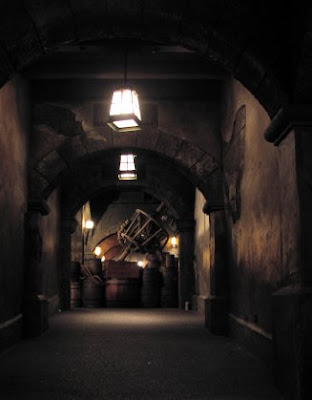
We must also remember that although we now throw the term "themed queue" around loosely to refer to anything like the experience of transversing the wait areas of Pirates of the Caribbean or Indiana Jones Adventure, that the idea of a themed queue has existed since 1955 - certainly Harper Goff's original Jungle Cruise boathouse qualified as a themed queue, much moreso than those elsewhere in Disneyland. But the innovation of the Castillo del Morro show scene is that it totally dispensed with switchbacks, turning those ropes, poles and chains into solid stone walls. This is the legacy of the design team in this attraction as this is generally our criteria for calling any queue themed or not - do you walk down a big corridor? - and based on this, we must regard latter generation queues, like Indiana Jones, not a progression or refinement - but an aesthetic extrapolation. Castillo del Morro established all the rules.

In the process of adapting the ride itself: much was lost, which we can see in hindsight as a crippling blow to the attraction, as much of the effectiveness of the brilliant original was the languorous pace and how slowly and seamlessly three realities seemed to submerge into one.

But this, again, requires some perspective because in 1973 it wasn't yet a proven thing that Pirates of the Caribbean had to be that way: WED was about to build the attraction which proved it. And so the rules were totally changed for the Orlando version. With the removal of the Blue Bayou leg of the attraction, the primary storytelling device which carries the bulk of the time travel conceit, the attraction would be set in the "present" and guests would enter the story just before the still-live Pirates begin their attack.

And so the time travel part of the equation was left up to the structures themselves to carry; just as spectators are swept from British Colonial outposts to Polynesian oasises in Adventureland, they could now be carried away into the romance of the old Caribbean simply by walking a handful of yards. I believe there is an implicit suggestion of time travel in the facade itself, which is as not as much of a significant time slip as the Disneyland versions, but is still significant.

Until recently, you may remember, the facade featured a pirate parrot 'neath the text "PIRATES OF THE CARIBBEAN" on the north-facing exterior wall who acted as a "barker" for the attraction. Outside a number of tattered, cannon blasted Jolly Roger flags were hung up, and atop the roof, the cannons were still firing. This clearly implicates that the buccaneers have already taken the fortress, a self fulfilling prophecy of the end of the attraction (remember, the only version where the Pirates actually win!). Passing through the entrance arches and towards the entrance of Castillo del Morro is, then, the time travel, resetting the narrative arc and making the journey from end to end of the building the same narrative "closed loop" which the Disneyland version conveys so successfully (and which so validates the form of the attraction itself - since it is a narrative which is closed on either end, we can ride it over and over again and endlessly experience the same events!).

Of course the firing cannons were lost in the 2006 refurbishment due to technical reasons, but they are a key element in the interior logic of the space and we must keep them in mind. In 2007 the Jolly Roger was replaced with a Spanish flag, which better suits the "there is no time travel" story Caribbean Plaza tells and completes the removal of the subtle element of time travel I have outlined above which was the net result of the removal of the Barker Bird parrot at the entrance.

And now, a more specific breakdown of elements of the first immersion queue.


1. Simulated Nightfall
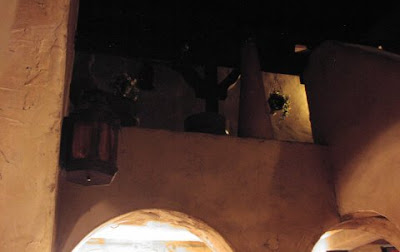
Disneyland's Pirates entranceway has gotten a lot of flack since the opening of the version in question, despite the fact that it is a brilliant visual thesis statement on the entire formal mode of the attraction's disjunctions of space and time. But let it be said that one of the things Disneyland's Pirates accomplishes in its' entryway is a precise simulated sunset, where spectators are pushed farther and farther away from the bright California sunlight and emerge into the nighttime bayou. Since the essential aesthetic mode of Pirates of the Caribbean is unchanged at Walt Disney World, Castillo del Morro does this same feat in a much larger but still brilliant space, the extended plaza in front of the attraction entrance which gradually dims the sunlight, replacing its' bright glow with the simulated skylights casting false sunlight, which will again transform into the dim glow of incandescent lights and, finally, firelight.

Alongside this space is a "hidden" courtyard which used to spill vacationers out of the House of Treasure giftshop with its' own little forced perspective upper balconies - the most effective in Caribbean Plaza due to the extreme angle the courtyard forces you to look up at them, really tricking your sense of scale. This courtyard, and the one across the way between the old Princessa de Cristal and Golden Galleon gift shops, really are as good as anything New Orleans Square can offer. WED really learned from Herb Ryman's "pocket" concept - if there's vacant space between establishments in your area just make them out of the way transitional areas rather than yet more break rooms or offices. A well placed, quiet courtyard is worth a million of the more traditional false portals in expanding a limited space into infinity, creating a "stratified" visual experience.

But calling the court hidden is a kind of misnomer, because you're meant to see it, to look at it, even casually glance at it as you march onwards into the dark fortress. It is a setup, saying to the spectator in no uncertain terms, that space is tricky, that you will be expected to look not at one space but all those which abut it to get the full experience of the attraction. As a pocket, as a portal, and as a thesis statement about the attraction which it prefaces, the Castillo del Morro plaza is as key a movement towards the ultimate goal of the attraction as can be imagined.

2. Layout and Design
Once inside, the complexities of design really begin to pile up, so let us first preface this section with a bit of perspective on scale; please click below to expand a diagram.
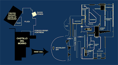

As the scale diagram shows, the Pirates entrance plaza and facade does not take up significantly more space than the queue and double load area. Thus, there will be a dramatic narrowing of the potential for movement once the guest enters the Castillo proper. One way that the fortress queue feels massive, indeed endless, is how tightly the corridors and rooms twist around each other, yet none is visible from the other, giving a sense of progress but an extreme sense of misdirection. The tactile sensation of being lost is conveyed fully through having the spectator constantly navigate sharp turns and hairpins, but failing to make significant progress in covering ground.

This is why the queue for Indiana Jones Adventure is a very different kind of experience, because you endlessly are allowed to move forward, always moving towards the destination. Here, you feel as if you may have gotten yourself in trouble.

Increasing the sense of disorientation is the use of ramps. The Entrance Tunnel which leads to the first of three "inside outside" interior courtyards slopes up dramatically and is heavily crammed with arches, effectively restricting the spectators' view of the top of the ramp from the bottom of it. From here the queue splits into two different sides; one which will proceed through the military side of the fortification, with dungeons and cannon nests, and the second which will proceed through the side of the fortress the soldiers would likely have inhabited, with a banquet hall, peaceful interior courtyard, fountain, and gunpowder pit. While the inhabited portion of the queue remains level (increasing the sense that it is used for living space), only sloping down at the very end to bring guests down to the load point, the Dungeon side is trickier.

Once the top of the entrance ramp is reached, the queue immediately and dramatically slopes down to ground level again. This is done to reinforce the idea that guests are descending into a lower area of the fortress, although no net elevation change has actually been achieved! Since walls and doors block out any frame of reference for the actual height of the area, subconsciously the brain has been prepared to accept that it is now in a lower area of the fortress.

Then, the ground begins to ascend again, because guests are approaching the original, famous Chess scene, Marc Davis' brilliant gag of two skeletons forever locked in check in the dungeon. This being Florida, only so much space can be dug into the ground to give a proper dungeon, and so once again the floor rises to take advantage of what little vertical space can be exploited in the (already elevated!) queue.

At this point the ramps have brought us from ground level to a second level, then back to ground level, then back to the second level, all while convincing the brain that it is deep underground at this point. The rest of the queue on the Dungeon side is an ascent to a third, top level so that the boats can pass underneath the queue, then a quick slope back down to a ground level load area.

There are a number of fascinating repetitions of scenes and visual cues throughout: for example, although the Inhabited part of the fortress is replete with locked racks of guns and swords, it does not feel as imposing as the Defense part of the fortress, which features tall, vaulted ceilings and rough hewn rock, not the plastered walls of the soldier's side.

Both feature interior courtyard scenes, but while the Defense side of the queue is an ascent to a gun nest overlooking the load point and a ship under repair, the Soldier side is a beautiful courtyard with a staircase and a trickling fountain with a forced perspective scene above of a nighttime alcove with hanging plants. Both feature a music track of a lonely musician strumming his guitar, appearing in this peaceful little courtyard to suggest a bored night watchman. It appears in the Defense side emanating from one of the cells which rings the Chess scene, suggesting a prisoner spending his final days alone in the dungeon. Identical music, two diametrically opposed effects.

Rarely-seen views of the Chess scene.

3. Plot and Effect
For two complimentary sides of the same coin, each side of the queue has a totally different effect on the audience. In the Soliders' side of the Castillo, with its' signs of abandoned inhabitation everywhere, a feeling of loneliness takes effect. It is a long, lonely, confusing trek.

The Defense side however, with its' subconscious effects of going underground, the side which is placed nearest those firing cannons on the roof, the side meant to withstand an invasion, is scary. Both queues wrap around a little box of a room which features some supplies for the fort, in which is placed a speaker which plays the sounds of the Spanish preparing for an attack interspersed with a recording of the attraction's signature song "A Pirate's Life For Me". When the song plays it echoes down through those corridors just right to make you believe that the Pirates of the Caribbean could be around any of those innumerable blind corners, itself a brilliant setup for the attraction itself. But it is scary, and the skeleton imagery featured on the Dungeon side drives home the fact.


But both sides, with their stone walls, barrels of gunpowder, rifles and cannons are replete with constant reminders of impending violence, that the Pirates are indeed coming. Rather than the lively fortress the exterior gun battle and bright Plaza prepares us for, we get signs of inhabitants who have all suddenly run off somewhere, leaving behind only a night watchman and the dead and dying in the prison. In creates a tension between our desire to see the titular pirates and our apprehension at actually unexpectedly encountering them, which crystallizes in the load area, where we pass a torchlit cave and hear Pirates burying treasure, and our apprehension again deferred. As the boats scoot out of the load area and into the cavern they pass the open water and we see for the first time the reason we have been so strangely alone: there's the pirate ship out in the harbor, the pirate ship we'll encounter again in just a few minutes.

All of this is a significant reconstruction of the same narrative paces of the Disneyland version of the attraction by the original design team, so much so that although on the terms of its' predecessor it is not really a success, on its' own terms - the terms that really matter to the interior life of the attraction - it is a more radical reconstruction of Pirates of the Caribbean attraction than the later generation, much lauded Paris version.

What the Castillo del Morro queue is, is that it is a chronicle of the town which the pirates invade, an elaborate half-narrative setup through which we must pass in order to see the rest of the story. In this way it is arguable that the Plaza and Queue of Pirates Orlando is an admissible attempt to shift the storytelling techniques of the Anaheim Queue and Blue Bayou into practical space, which is a pretty brilliant way to do the same thing as the original on very little of the budget of the same. That the Castillo del Morro queue arose out of practical necessity is inarguable, but it changed the rules of the game forever and as such it must be considered the great queue, the original that was the enabler of one of WDI's most interesting narrative tools.


Wednesday, August 15, 2007

The Anti Food Court

One of the things Walt Disney World's designers were able to do in its' spatial design which has not been able to be effectively replicated at Disneyland before or since is a very particular way of breaking up space to give a good number of interiors and exteriors a sense a peace or remoteness. This is not just the quiet dignity of the New Orleans Square or Liberty Square shops with their intimate scale and unpretentious decor, but the most seemingly isolated of areas where it's hard to remember you're even in a public space, never mind a Disney park. Disneyland's nicest example is by dint of design, Walt Disney's New Orleans Square apartment. There are a few others.

One of the key efforts directed towards the Walt Disney World project was increasing the sense of insularity which began with Walt Disney's berm and eventually led to Disney purchasing more property than it likely ever will know what to do with. Once the outside world has been screened out, what's the next logical step? Screening out the Walt Disney World resorts, which is why Main Street's Exposition Hall is where it is. And from there? Screening out the Magic Kingdom itself.

So WDI started deploying a variety of methods including the false portal, a window or door which leads to nothing but what the designers want it to. This creates desired but impractical space. The Magic Kingdom is a masterwork of angles and how to screen out undesired elements, and through manipulating sightlines, almost any intrusion can be removed. This erases undesirable but physical space. What else do you do? Put up frosted or stained glass, and by then practically anything you want gone will vanish into thin air.

The Columbia Harbour House in Liberty Square is one of those astonishing spaces of seemingly limitless peace within its' dark stained walls, yet it is sandwiched between three major attractions, two major paths and is one of the largest food courts in the park.

Sometime around the opening of New Orleans Square, which featured the most restaurants and shops per capita of any space in Disneyland, WED began to rebel against the notion of a "food court" and change the rules as to what could constitute a major cafeteria. Cafeterias, by nature, are large, plain, open spaces which exist to shuffle diners in and out as quickly as possible. They must be large and open to facilitate sightlines and help the diner find her seat quickly. So how do you make a cafeteria which fulfills all the physical, practical needs of a cafeteria but which subverts its' apparent form?

It all has to do with managing awkward spaces. How to transform a big warehouse painted black on the inside into a variety of interesting locations and settings is the endless challenge of themed design, and short of setting the bulk of the attraction outside and at night (Pirates of the Caribbean anyone?), various methods must be used to suggest a variety of interior divisions without any actually existing. The Haunted Mansion used a variety of arches, wall treatments and curtains to accomplish this, and this is more or less the extent of what the Columbia Harbour House has at its' disposal to accomplish the same task. Harbour houses were public houses where sailors and shipmates would drink and sleep, a theme which calls for a number of subdivided rooms. Columbia's answer to this is to keep the space open for the utilitarian purposes of the cafeteria the building actually is, but dress areas as if the dividing walls have simply been removed (below).

click for larger

This logic is so extensive that you can actually figure out where the hallways and rooms would be if the publick house were divided correctly; another trademark of Walt Disney World cafeterias is that they generally offer about a thousand ways in and out of them from different angles. The Columbia Harbour House has what must be a record five entrances across two lands, and each has what is clearly an entrance hall.

click for larger

This foyer entrance, copied from a thousand New England houses, is authentic feeling in every respect, including leading directly to a door which leads into a kitchen, as is the custom in houses of that area and era. Compare this entrance to the one from the Harbour House and one from Pecos Bill's Tall Tale Inn and Cafe below, and consider that neither of these three are what is considered the "Main Entrance", and you'll begin to see how the network of entrances and exits that these establishments entail by apparent necessity have been turned into remarkably well conceived transitory spaces. The Harbour House entrances are both spitting images of entrances common to taverns dating from the nineteenth century and the chandeliers and vaulted beamed ceilings of Pecos Bill remind of an especially nice Mexican manor house.


This is, of course, a storytelling device - nobody wants to feel like they've shuffled in through the cook's entrance - but the point is that it's hardly necessary. Even today most Disneyland eateries stream guests in and out through a fixed entrance and exit, but The Magic Kingdom builds cafeterias which could very well be what you always expected to find if you were to break through one of those hollow facades the rest of the land is comprised of. They implicitly extend the space of the land by filling in part of a matrix which is mostly hollow, but which we believe to be full of spaces just like this.

The spaces inside the Harbour House transform based on what area of Liberty Square is visible from them; the nicest room is the one facing the river on the south side; what I always called the "Captain's Room" for its' tasteful white wood paneling and patterned wallpaper. It's also nearest the big anchor hanging off the facade over the street and reminds one of coastal cottages off Cape Cod in Massachusetts.


click for larger

The "room" West of it features the same wallpaper but dark paneling and fewer windows and faces inland, looking directly over to the Hall of Presidents through the square, house-style window while the circular (watergoing) window in lined up perfectly with the riverboat landing.

One of the stranger features of the Harbour House is a number of rooms and features which seem to be making an effort to remind one of being onboard a ship. Although this isn't necessarily out of theme with the house itself, it is out of theme with how these harbor houses were actually built! These two rooms, plus the detail on the walls themselves (one of Walt Disney World's prime examples of "get me a lot of [nautical] brick a brack"), makes the otherwise handsome Harbour House a bit flakey. It must be said, however, that the two rooms are very well done. One is a spitting image of a galley, complete with doors to the kitchen and false skylights. The other is a rather unique little room which pedestrians on the street level actually walk under to pass between Liberty Square and Fantasyland.


click for larger!

The windows on the south-facing Liberty Square side are traditional windows set at waist height off the floor, with the north-facing Fantasyland windows being much smaller, almost miniature. While the room is symmetrical, the Fantasyland side seems to slope down much more abruptly while the Liberty Square side seems almost normally shaped. Reinforcing this impression is the square paneling with square placard hung on the Liberty Square side, while a white door with a rounded top embellishes the curve of the Fantasyland side. This is, in some ways of thinking, a literal embodiment of the duality of the room, with the "square" side on the side of history and the curvier, lilliputian side playing up the fantasy angle.

Moreover, besides all of these patently brilliant touches, the Harbour House seems, on certain late afternoons when the glut of tourists have departed with their children in tow, to be a kind of zen perfection, a pocket of sanity where one can climb high and watching the comings and goings of Liberty Square but not participate. Then most of the strange eccentricities of design and the imposed requirements of the place's actual function can be forgiven or forgotten and the best details can come out: the spatial arrangements and variations, the sedate music, even the hardwood flooring made with irregular little nails all builds to what is probably the finest and most atmospheric in fast food themed design at Walt Disney World.


Friday, August 10, 2007

Vanishing Walt Disney World, #1

For better or for worse Walt Disney World has been consistently doing what it was built to do: change. Although the passing of a major attraction or show will these days be greeted with a flurry of photos and video, so that we can rest assured that future generations will have good quality copies of El Rio del Tiempo to puzzle over, each month more and more original, minor establishments are quietly closed or remodeled into something newish.

It is in the spirit of these fleeting locations, which are often the ones which we most wish for extensive documentation of, that I offer this new feature, attempting to capture at least passable representations of recent losses or eminent ones, as well as provide a forum for the pooling of resources among readers of this Blog.

Impending Fatality: Concourse Sundries & Spirits

Although the nearby Fantasia shop has already gone the way of the dodo, Concourse Sundries & Spirits, a funky little alcove in the Contemporary Resort that feels as if it hasn't noticeably changed since 1971, is currently on the chopping block. This functional, minor and unpretentious store still feels, in 2007, like something more at home in an airport. Time has, in short, passed it by, and given that in recent years Disney has been aggressively upgrading its' resort facilities, time is clearly limited for Concourse Sundries & Spirits.

This neat sign is made of neon, but the plastic in front of it is printed with tiny dots, so when you get near the sign, the neon behind becomes "pixelated."

Two views from the door, to the left and right. Notice the tobacco and liquor is still kept in cases set into the point of sale - by 2007 Walt Disney World standards this is incredibly unfashionable. The area to the left of the M+M dispensers, which once stocked magazines and newspapers, is now all Disney publications and DVDs. It is indeed a sad day when a Sundries shop becomes just another Emporium. The M+Ms are covering up what was once a door into the Fantasia shop, now an arcade.

In the early 90's the Eisner administration made an effort to "Modernize" the Contemporary by making it over into a place with lots of swirly colors like Mauve, Purple, Tan, and Turquoise. As part of this effort Chef Mickey's was moved into the Grand Canyon Concourse, which was stripped of much of its' Southwest theme. The Top of the World nightclub also became the high-end California Grill, the only fully successful venue in the whole effort, so much so that the aesthetics of the California Grill are being extended to the entire hotel. This carpet is a significant leftover of Eisner's "Contemporary '94" design effort. It's a good example of how strange his ideas about "entertainment architecture" were. Regardless, this carpet is supposed to make you feel "fun" and is, besides all that, a historically significant item.

The back of the store, complete with a funky mailbox and a few coolers.

--

RED ALERT ITEMS: Things I need a number of photos of, recently deceased.

Robinson Crusoe's, Polynesian Resort, 1971 - 2005
Captain Cook's Food Court
Robinson Crusoe's was a significant final holdout of the Polynesian Village of 1971 and primarily offered overpriced mens' wear in its' final years. It was located in what is now the arcade. Across the way, where there are currently spacious bathrooms, was a children's clothing store. Both were open air and remarkably untouched for 34 years. The 2005 opening of the large new BouTiki shop in the lobby made both of these outposts of the original Polynesian superfluous; Captain Cook's, originally a bar and then a food court, expanded and swallowed both up. Photo documentation of the last few years of all three of these locations desired.

News From Civilization
Another lost Polynesian Hotel shop, which sold a lot of generic Island themed junk and some Lilo & Stitch stuff in its' last few years, is currently a Wyland Gallery. Much like Concourse Sundries & Spirits, it was a functional hotel shop.

GENERAL ALERT ITEMS: Probably lost to the sands of time?

Interior photos of The Golden Galleon or Princessa de Cristal, Magic Kingdom Caribbean Plaza

Interior photos of Pecos Bill Cafe, pre 1998 refurbishment, Magic Kingdom Frontierland

Interior photos of the Tricornered Hat Shoppe, Magic Kingdom Liberty Square

Interior photos any pre-1996 Disney Village Marketplace establishment - the older the better!