


"The truth of the matter is the only new towns of any significance built in America since World War II are Disneyland in Anaheim, California, and Walt Disney World in Orlando, Florida. Both are 'new', both are 'towns', and both are staggeringly successful." - Peter Blake, Animated Architecture, 1982Authenticity: the Slippery Slope
Last time, we discussed the history of Disney's failed urban planning project, Lake Buena Vista. This week, we'll be looking at the newest effort to keep the area relevant, but first, a brief detour into semantics. I'd like to discuss what, exactly, makes a place or thing "authentic" versus an imitation.
This subject is central to the very concept of theme parks, but has hardly ever been discussed. It's been invoked by every cultural critic who's written on the subject - implying that being built by an elect group of people with a plan and goal as opposed to being built by unrelated people with no real plan makes a place any less real. But does it?
"Authenticity" is a slippery slope once you actually start sliding down it, and nowhere else is this more evident than in the realm of architecture - architecture being, after all, the main thing that theme parks are made up out of. Let's look at one example: the Philip Chapin house, in my hometown of New Hartford, CT:

Today, we fawn over this sort of thing as an authentic example of Victorian architecture. In its day, it would have been seen as the most ghastly form of nouveau-riche tastelessness. A ludicrous modern imitation of an Italian villa, what was seen in its own day as a sham and fake has become authentic with the passage of time.
Another example, closer to home: Schloss Neuschwanstein in Bavaria, or King Ludwig's Castle. It's commonly cited as the basis for Sleeping Beauty Castle in Disneyland:

Yes, it's a real castle, but it's also a ludicrous fake, constructed by a wasteful king in the Victorian era to evoke romances of the holy grail and the operas of Richard Wagner. It was built with what then qualified as the most modern of amenities, including heated running water, toilets, an electric bell system, a modern oven, and including such suspect embellishments as reproduction tapestries and an indoor cave.

When we think of it this way, the space between Ludwig II's private theme park and Walt Disney's fiberglass castle becomes very narrow. They're both widely viewed and beloved by visitors who care not a lick for "authenticity" because both are designed to evoke powerful symbolic associations in the minds of their visitors.
So what makes something authentic? Once enough time passes, will Disney's fiberglass castles be suddenly, magically conferred respectability? Or is it a slipperier thing - is it belief? Does something become "Authentic" because its viewers believe it to be so?
Of course the sort of people who are eager to confer upon theme parks and their like - shopping centers, planned communities, restaurants - the label of "Fake" are those who have the most to lose by failing to control such labels: those who need their opinions to carry the weight of authority. Sometimes the label can be extended to "appropriation", i.e. theft of something held to be integral elsewhere. But even trying to establish what's "real" and what's "fake" is often an exercise in futility, as we shall shortly see.
I think that's good. Theme parks may be manufactured according to strict aesthetic guidelines, but to me that's a crucial distinction, because that is what makes them compelling. What one person sees as "fake" can just as easily be labeled "artistic". And in the case of something like Disney Springs, where the distinctions have broken down to an extent that the distinctions become meaningless anyway, there is a fascinating case study.
Inventing Space
Even if the notion of authenticity is a slippery slope, there is already a built in resistance to confer the blessings of cultural approval on Disney. One way this manifests is a resistance - supported by Disney - to deem the parks objects of historical interest. so far there has been no general acceptance of the idea that a theme park is certainly related and in some ways basically analogous to the traditionally approved manufactured settings - fine dining establishments, museums, theaters, or national parks.
I've thought long and hard on this subject and to me the only workable definition of a "themed" enviroment is one which has been subject to the act of curation - in which certain aspects have been enhanced, or removed, to obtain a specific aesthetic, often symbolic effect. Museums build narratives out of the mess of history; theme parks build narratives out of the harmonization of imaginary spaces. National parks, so often sold as representing an "untouched" area in a specific state of historical preservation, are also subject to the act of curation - by removing or demolishing any aspects of the protected area which would break the illusion of being "unspoiled" (for more on this see Terence Young, Theme Park Landscapes: Antecedents and Variations).
And yet, I would argue that ideologically and historically speaking, Disneyland, EPCOT, and Magic Kingdom are as central to the American identity as Yellowstone or the National Mall. If they weren't, then there would be no implied threat in Disney co-opting American history in things like The American Adventure and Disney's America. Through sheer popularity, citizens have conferred importance and historical relevance on Disney theme parks, bypassing the gatekeepers of culture.
The minute that we open our minds to the possibility that non-sanctified history is still basically historical, the more the complexities of Disney's manufacture of history become compelling. Disney Springs is a key place to see this at work. Here, real and imagined history weave into a tight web. Let's dip back into our historical narrative of Lake Buena Vista from last week and pick up some threads.
Faux History
By the time Downtown Disney had added its West Side addition, it was a patched-together thing, laid out as three distinct units that made sense on their own but made no sense together. Traffic flow between the three areas was already best described as impractical, and the opening of Pleasure Island to foot traffic only made the situation worse.
Something would need to be done, but what? And how could all three distinct areas be tied together cohesively? In the past, the solution to improving themed areas which were lacking in appeal came down to two options: re-skinning, or demolition. Tomorrowland 1994 re-skinned the offending area, isolating the problem in its aesthetics. New Fantasyland and Disney California Adventure demolished, preferring to start over in a more traditionally appealing aesthetic mode.
At Disney Springs, the approach was, uniquely, to lean in to the mess of conflicting styles and agendas. Areas which already were aesthetically appealing, such as the Marketplace, only received minor facelifts and foot traffic improvements. Pleasure Island's industrial aesthetic could stay. The largest offenders at West Side could be covered up with industrial details or slated for later demolition. Tying the whole thing together is a new "Downtown" area and central water feature.
In other words, by refusing to paper over or demolish the inconsistencies of Downtown Disney, Disney Springs embraces them as the whole darn point. By my count there's at least seven aesthetics at work in the area, and they have been used to signify, rather than try to remove, the pains and competing ideologies of the growth of its imagined community:

Pre-Modern Cracker Houses and Ranches

Industrial Revolution tin sheds

Industrial Revolution "old brick"

Early 20th century Spanish Revival
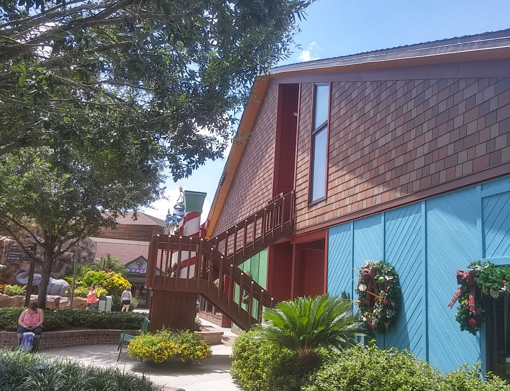
Mid-Century Craftsman/Chalet

Post-Mid Century Modern

Post-Modern "Whimsical"
And here's where the story begins to become almost perverseley convoluted. Lake Buena Vista represents an abandoned attempt at a "Planned Community". The downtown of this planned Community - the Village - was actually constructed. As a result, even before the notion was legitimized by this new expansion, Downtown Disney already represented the problems of real cities - namely, having a well planned downtown with a bunch of suburbs stuck onto it more or less randomly, causing no end of traffic problems and infrastructure strain.
This new expansion seeks to resolve the problem by building a new, sleeker, more attractive downtown away from the original urban center. Wait, hold on -- where have we heard this before? Oh, that's right, we've heard it in real life - it's the story of every mall that has ever been built.

It even basically looks and sounds like these new "Town Center" outdoor malls which have sprouted like mushrooms in major urban centers. Below is one not far from Disney Springs - "The Grove" at Winter Garden Village. The Grove even contains faux-historical landmarks, a hotel sign above empty space, and signs honoring "local" Winter Garden residents. It is a manufactured downtown, but treated and used as a legitimate one by local shoppers. and what did we say about authenticity up top?

"Inside" the story of Disney Springs, are are supposed to understand that the new Town Center represents the "original" downtown area and the original Village is now a later suburb, yet the mind spins. We've now got a mall built next to a downtown that is pretending to be an yet older downtown - inside a huge mall.
Where Downtown Disney more or less tried to keep pace with whatever the current conception of "cool" is, Disney Springs instead aligns itself with the mode of representation traditionally most successful to Disney - the past. Instead of a murky Florida lake, the area is now centered around a "natural spring" - really a pretty, and pretty elaborate, swimming pool. Surrounding the Spring is brand new - but supposed to be old - Florida vernacular architecture. 35 years ago, this area was a swamp outside the Village. 3 years ago, it was a pile of dirt, yet here now stands "The Oldest Building In Disney Springs."
Yet it's just this sort of absurd, working backwards, built up layers of signification that gives Disneyland and Magic Kingdom their great sense of history. And while perhaps there's nothing deeper to the historical approach of Disney Springs than the generational shift towards all things "retro chic", the new style at least will have the benefit of aging gracefully instead of constantly trying to chase whatever is "cool" in this decade.
Yet for the committed Disney historian, the rabbit hole goes deeper. Throughout the new area, there are numerous small call-outs and references to Disney history, in this case usually tied up with both the real history and imagined history of this part of WDW property, such as this brand new building intended to be an early 20th century converted vegetable market, built by "Buena Vista Steel":

One could easily write off these details as the product of an unimaginative design team dipping into Disney's rich heritage to insert yet more meaningless tributes to past glories. But, in Downtown Disney, probably the number one area in WDW where master planning failed, the authentic history of poor legacy designs becomes disguised as the artificial history of the spreading of a town.
 |
| "Buena Vista Steel" |
In this sense, Disney Springs opens up a feedback loop akin to the ironic mutation of history seen on Buena Vista Street at California Adventure. There, shops and facilities named after old school Disney characters are said to have inspired a young Walt Disney to create... those same old school Disney characters. It's become an absurd IP game of musical chairs where history and fantasy have melded seamlessly into a mobius strip of influence.
I can see an average visitor being genuinely bewildered by this. Disney has replaced real history with slightly different artificial history and left audiences to sort it out. They've messed with similar elisions before - in the original development cycle of the Haunted Mansion, the ride was said to be a real haunted house transplanted to Disneyland. And since 1955, this plaque at Disneyland has been quietly bewildering readers, assigning great historical import to a random bit of metal:

But as far as I know Disney has never quite created an idea that requires this many layers of fiction piled up on each other, and if the result is aesthetically underwhelming, it's conceptually dizzying. It's like taking everything one step further and claiming the Walt Disney actually grew up on Main Street USA and built the rest of Disneyland around it. Both versions of the area are fiction, but there's a crucial distinction left unsaid.
Then again it's only worth fussing over conceptual distinctions like that if people are actually legitimately fooled, and I have little concern about that happening. Still, the resulting product, with its intermeshed history, fantasy, fact and fiction is truly evocative and conceptually bizarre.
The Fake Real Fake City
Going in another direction, let's return to the Town Center. Around the Town Center are a number of buildings designed to resemble converted houses. There's a few Cracker houses, an old ranch house (D-Luxe Burger), a Googie house (Blaze Pizza), and what is said to be some kind of ice house (Sprinkles) (the owners, presumably, having long ago fled to the suburbs). But most of the Town Center is built to recall Spanish Revival architecture - tilework, whitewashed stucco, wrought iron, and red tile roofs.

Any seasoned Orlandoite will recognize immediately what this is an imitation of: Rollins College in Winter Park.
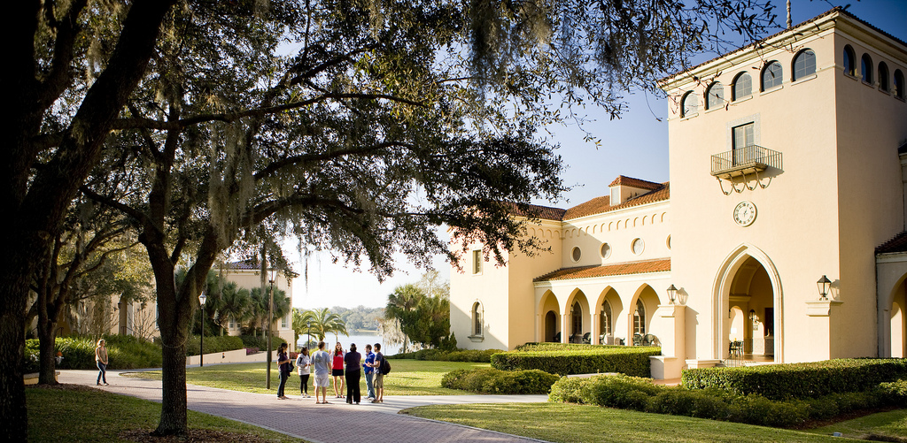
Okay, so let's talk about Winter Park.
Winter Park, a suburb north of Orlando, has become for many the cultural center of Orlando, with brick lined streets, high end dining, winding canals, and the famous and expensive Park Avenue. Despite all of this, it is in some ways a fake city.
Winter Park was begun as a suburban development in 1885 to take advantage of one of Florida's many land rushes and a new rail line. With strict limits on housing style, varieties, roads, and walking paths, it was one of America's earliest planned communities. It was Celebration 110 years ahead of schedule.
So yes, Rollins College may be old - 1885 - but its beautiful architecture is not authentic old Spanish. Strictly speaking, it's artificial. Of course, in architecture circles, they have a word for this - Spanish Revival, which sits neatly alongside Gothic Revival, Italiante, Renaisance Revival, Queen Anne, Second Empire, Romanesque, and other styles of American architecture built to resemble something they are not. But it's just as correct to say that Rollins College was built themed to Spanish Florida, with its conquistadors, fountains of youth, and romantic tilework.
The fact is that maybe the most distinctive single thing about American architecture is that we have always and forever loved building themed to other things. That's why we were the country that created Coney Island and Disneyland. These places weren't some kind of perversion of a pure cultural legacy, but simply the logical outgrowth of what we've always done.
Don't believe me? Let's go back - back to when the United States was brand new, and take a look at Federalist architecture:

Those cool little pavilions around the front doors, the white columns, the emphasis on symmetry, the mullioned gables, and half-rounded fan lights? We didn't invent that - we stole it from the ancient Greeks and Romans, and stuck it onto our little saltbox houses in the nationalist frenzy of the post-Revolutionary War. The borrowing from ancient Greece was no accident - they were a famous Democracy, just like America.
Thomas Jefferson caught onto the fad and took a trip to Greece to check out what was left of their architecture, and when he came back he applied the Grecian "golden ratio" to American houses and created Jeffersonian Architecture:

See those white columns? The weirdly out of place pediment? The five-part structure of the house? The relentless symmetry? Yeah, Jefferson stole that from the Greeks. You can see it at Monticello, of course, but the symbology of ancient world Democracy is the reason why Americans have always enjoyed slapping neoclassical embellishments onto our nationalist architecture:


It's theming by just another name. And once you accept that something in the American national character just compels us to build stuff that looks like other stuff:


...the distinction between Main Street USA and real Victorian architecture begins to look like nothing but a blip. Less time passed between the era depicted on Main Street and the opening of Disneyland than passed between the construction of Rollins and the new Town Center. The Town Center, for those who only know Florida from Walt Disney World, may not scream "old Florida", but it's as legitimate a copy of the original fake as the fake itself was legitimate.
Town Center is a mall that pretends to be the original downtown of an artificial community, built beside the real downtown of an abandoned planned community, built to resemble a successful planned community just a few miles away.
Reused Reuse
Or, we could talk about Pleasure Island. "Inside" the story of Pleasure Island, it was a manufacturing center for the Pleasure family in the first part of the 20th century, which was wiped out by a hurricane (the same one which destroyed Typhoon Lagoon, in a likely coincidence). The island was re-claimed by Disney and renovated into a nightclub district, all of this to flatter Michael Eisner and his love of 80's style "Urban Reuse".
As far as I know, Pleasure Island was the very first time Disney built structures in which their signifying facades were intentionally at odds with their contents. Even the monumental abstraction of something like Future World's The Land was intended to signify what could be found inside; haunted houses contained haunted houses, pirate forts contained pirate rides.
Pleasure Island asked you to separate form and content in a way that nothing else at Walt Disney World does. Mannequins was a purpose-built facility housing a nightclub, disguised as a reclaimed tin shed-style industrial manufacturing building. Today, "Inside" the story of Disney Springs, it's a reclaimed bottling plant which just so happens to contain Morimoto Asia, a high end pan-Asian restaurant.
In this way, the building now housing Morimoto Asia even more strongly resembles its obvious inspiration: The Cannery Restaurant in Newport Beach, CA, which revolutionized restaurant design in the 80s by reclaiming a disused cannery and leaving its industrial equipment in place around the dining rooms as pieces of sculpture.

Yet this invented history paints over the real history of the building - as a nightclub called Mannequins, one of the few Pleasure Island nightclubs to run from opening to closing day. Nearby, Jock Lindsay's claims to be a converted airplane hangar from the 1940s, and it's tough to tell them apart, despite Jock Lindsay being new construction. It's pretty tough to recognize most of Pleasure Island, honestly, unless one is very up on her Pleasure Island history. Nearly everything there was knocked down and rebuilt, leaving only minor traces behind.
For about ten years, seemingly everything Disney built was rooted in some kind of meta history of abandonment and reuse - to Pleasure Island we may add Blizzard Beach, Typhoon Lagoon, parts of Animal Kingdom, and much of California Adventure. Inside the parks, at least, much of this didn't jibe well with Disney's audience and so has been stripped out, especially at California Adventure.
Disney Springs is one of the few places left where this sort of thematic games playing is still in evidence, and it has fakes upon fakes upon fakes all reflecting back at one another, like a hall of mirrors. For just one example: a brand new building on "The Landing" aka Pleasure Island, housing a new upscale restaurant STK Orlando, has a distinctive, seemingly arbitrary shape:


Imagineers didn't have to look at old photos to get that idea, because that structure still stands today, on Church Street in Orlando. That's right, it's Church Street Station, and through the 70s and 80s it was a nuisance to Disney management as the entrance to a famous pay-one-price, gated nightclub attraction. To compete with Church Street Station, Disney built....... Pleasure Island, the current location of this reproduction. History doesn't simply repeat; it devours itself whole. Good luck not getting lost in all that.
This is why Disney Springs seems to collapse in on itself conceptually, forever pulling to some center point where fantasy and fact collide, like the house at the end of Poltergeist. There are so many layers of real, but obscured, and invented, but promoted history floating through that place that it's impossible to keep track of.

What I do know is that there are things in Disney Springs, Lake Buena Vista, and Downtown Disney that are beautifully present simply for their own sake - in the end, the only reason that matters. There's the way the afternoon Florida light filters in through the artfully arranged clutter in Jock Lindsay's Hangar Bar, who for some reason knew Indiana Jones, but whose bar feels authentically old in that moment in a way you usually have to go to Key West to enjoy. There's the Empress Lilly, impressive for her own sake, who is shortly getting her smokestacks and paddle wheel back, a real bit of history being returned to us. There's even an honesty in D-Luxe Burger, that brand spanking new old ranch house, in that it quietly and casually reminds Disney guests that once upon a time a long time before a certain theme park was built there wasn't much to Central Florida besides cattle pasture.
It may be fake, and not look very much like the real thing, but there's a honesty in the spring inside Disney Springs too. It's the first time in the 50 year history of Walt Disney World that Disney has seemed to say to its visitors: "Hey, you know, there's stuff in Florida, too, and it's good enough for us to build a fake version here for you.". It's the first time that Disney's home state has been warranting of the sort of representation extended to, say, Canada.
And there's the catch, and why the theme seems to maddeningly fold in on itself, bigger on the inside than the outside. It isn't themed to some other place, but to right here. Disney's mess of a planned community in Florida has embraced its identity as... a mess of a planned community, in Florida.
It's Floridian, and maybe part of being Floridian means being an an elaborate fake, like Charlie Kane's Xanadu deep in the tropical jungle of the imagination. Imagined, fantasized, pre-planned, corporate, artificial, deeply weird - that's Florida, and it's true inside Disney's bubble... and true outside it, too.
--
Do you enjoy long, carefully written essays on the ideas behind theme parks, like this one? Hop on over to the Passport to Dreams Theme Park Theory Hub Page for even more!


