
Upon arrival in 1971, Walt Disney World had many design brilliancies. The US Steel manufactured rooms in the Polynesian and Contemporary; the Utilidor; the Magic Kingdom itself. But overriding many other interests in the 1970's Walt Disney World, for me, is the graphic design of the era. In the Resort's fleeting first ten years, the company consistently turned out amazing graphic design, tastefully realized and stripped down in simplicity. The overall logo for the resort is one example: its' stylized montage of castle, Contemporary tower, monorail and sailboat effectively realizing all of the spheres the Resort was intended to offer (in early 1970's souvenir books these were even named things like The Lands of Magic, The Land of Hospitality, The Land of Recreation, etc...). Yet many components of the overall experiences each had their individual little icons.
As anybody who's been paying close attention to the nonsense which is the rotating banner at the top of this page will notice, I'm not only fascinated with WDW 70's graphic design, but I love to recreate the graphic art digitally. This allows me to "get inside" the design in a way that merely looking at the design simply cannot allow - seeing the curving line is one thing, but constructing it is another, and it's often the difference between merely liking the design and actually understanding it. So yes, everything you're about to see is a digital reproduction I have created using vectors.
Here's just one example I'd like to elucidate upon:
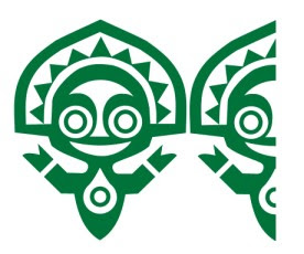
This cheerful little fellow is thankfully still familiar to 21st century Disney-goers; since 1971 he has been the "icon" of the Polynesian Village. At first glance the figure is somewhat basic: slightly uneven but still symmetrical, his body extending downward into a point, traditional headdress mirroring the shape of his head outwards, an abstraction of the "spirit of aloha". The circle-within-a-teardrop pattern on his tummy points away from the diminishing body, and the circle reinforces the circles of the eyes as well as the circle which makes up the "teardrop".
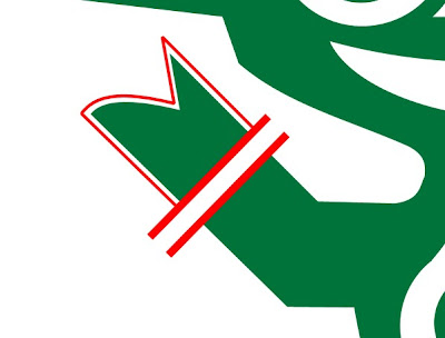
Look at his hand. Although it would've been easy to end his extended arm in a rounded sphere, a simple two-pronged triangular point, the designer here opted for a complex rounded point, which curves down and then back up into a sharp point. The "hand" is furthermore given further visual interest as it is "broken off" from the arm by a band of negative space; imagine how less interesting this part of the figure would've been without these two distinctive features.

Get in close to the eye; look at how what appears to be a simple circular band inside a patch of negative space is actually three concentric circles of alternating colors; note also how the boldly designed brow/nose shape does not actually trace the exact same arch as the eye does, but is vertically stretched upwards to not conform to the circle the eye inscribes but to with the overall shape of the head.
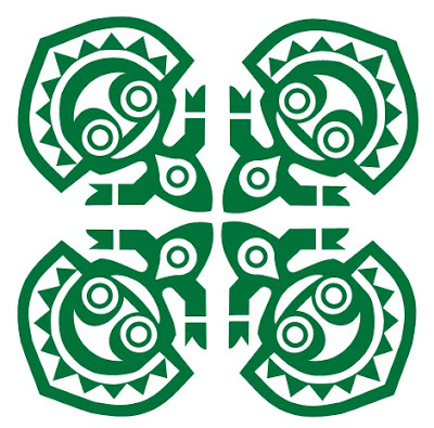
What you see above was actually the resort's "logo" for many years, it can be found on paper ephemera, drink glasses, and any number of other Polynesian Village stuffs. This is also, to my mind, where the true brilliance and versatility of the design becomes apparent. Look at how the arms mirror each other to create lines extending horizontally and vertically at 0 and 90 degrees; how the receding bodies all point towards center; how the entire pattern becomes like an abstraction of a tropical flower. Look, particularly, at the fascinating shapes created by the negative space between and among the figures. If the whole shape is basically an embellished triangle, here's the next logical step:
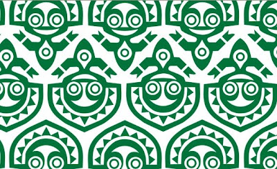
This eye-popping design is taken from a 1972 Polynesian Village check-in folder; the way the figures fit together here is just brilliant to me.
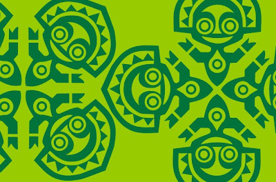
I think the reason this figure has remained with us while the other icons (which I will discuss in a moment) are things of the past is because this jolly, abstract little guy represents wholly visually the Polynesian's fascinating perch between traditional and modern; an outgrowth of the American mid-century fascination with the "primitive" while simultaneously representing the resort's impeccably modern construction and conveniences.
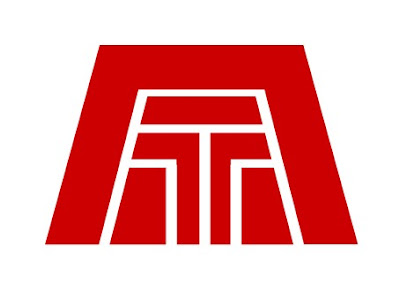
Nearly totally forgotten today is this 1971 logo for the Contemporary. Although it is indeed perhaps a little too literal minded for that Resort, I find this just as exciting as the Polynesian logo. The hotel's signature A-frame concourse is inscribed with an abstract T, which to my eye implies that this logo was designed before Roy O. Disney's last-minute name change from Tempo Bay to the Contemporary. Even better is the bold red chosen for the hotel, which reminds of the warm autumnal tones of the original arrangement of the Grand Canyon Concourse and is a strong contrast to the muted tropical green of the Polynesian's "icon".
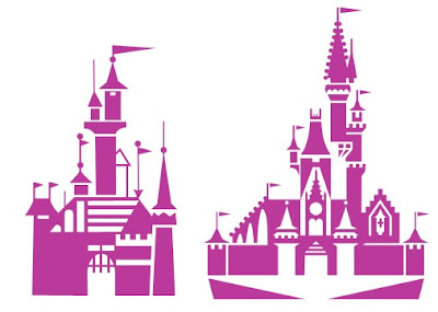
Often printed in regal purple, the Magic Kingdom's abstract castle (right) significantly upgrades the Disneyland castle icon (left), which bears traces of a Googie/Mid-Century Modern design aesthetic. The Cinderella Castle icon not only visually upgrades the castle to the splendor of the Florida model, but actually better represents the structure than the Disneyland version, even including the castle's forecourt stage and sweeping steps in the form of abstract triangles below the spires. The use of both positive and negative space here is especially effective in contrast to the 1955 design. This icon was used most often on Magic Kingdom ticket books.

Possibly the most obscure is this wonderful design for the Golf Resort, which places a golf club and ball inside the exaggerated D of "Walt Disney World". The placement of the circle to represent the ball is perfect, just barely touching the outside edge of the golf club enough to remain a "negative space" embellishment of the figure of the club inside the D. The version to the left of it is as it appeared on the Resort's sign, in subtle shades of brown - not the tropical green of the Polynesian, in keeping with the clubhouse's more subdued atmosphere. The font is a subtle modification of Arial, in plain, sans-serif text, carefully blocked to create the very image of a relaxed retreat.

Here is a digital reproduction of the sign that once stood by the entrance, and there may be no more complete single representation of another era at Walt Disney World than this, with it's tastefully subdued aesthetic.
There is, strangely, no "icon" for Fort Wilderness, nor for Treasure/Discovery Island, was ever made, although I have included Lake Buena Vista's iconic "white bird" (
which is still used today, by the way). EPCOT Center, of course, famously continued the trend of having strongly visual icons for each location in EPCOT, and even the Reedy Creek Improvement District had and
still uses it's own classy little icon. These are leftovers from a brilliant era of design at Disney, and these 1970's era Disney iconography are near the top of my list of things I would love to see Disney return to in spirit.

 Upon arrival in 1971, Walt Disney World had many design brilliancies. The US Steel manufactured rooms in the Polynesian and Contemporary; the Utilidor; the Magic Kingdom itself. But overriding many other interests in the 1970's Walt Disney World, for me, is the graphic design of the era. In the Resort's fleeting first ten years, the company consistently turned out amazing graphic design, tastefully realized and stripped down in simplicity. The overall logo for the resort is one example: its' stylized montage of castle, Contemporary tower, monorail and sailboat effectively realizing all of the spheres the Resort was intended to offer (in early 1970's souvenir books these were even named things like The Lands of Magic, The Land of Hospitality, The Land of Recreation, etc...). Yet many components of the overall experiences each had their individual little icons.

