I was recently perusing the excellent blog 2719 Hyperion and found this article referencing the recent controversy over the supposed installation of The Three Caballeros into the EPCOT attraction El Rio del Tiempo. Having taken part in this debate recently on several fronts, it became evident to me after several posts that I was not only the only person who had seen the film recently, but one of perhaps only 13 – 15% of people involved in the debate which had seen it at all.
Truthfully, current Disney fandom displays an abhorrent lack of knowledge or interest in the actual history and accomplishments of the company in lesser known works. While dreck like High School Musical is wrung dry by the corporate structure, eternally seeking profits, a large percentage of the fandom, especially its’ younger members, embrace whatever Disney is promoting as “the best thing” du jour, effectively creating what I like to term a “middle brow fandom” which persues whatever carrot is dangled before it. So in the interest of helping others discover the varied and strange history of the Walt Disney Company, I tell you: throw out your copies of The Little Mermaid, Mickey’s Twice Upon a Christmas, and Kim Possible. Throw out your DVDs of High School Musical and Cinderella. And start over from scratch with this hastily-complied list of alternative Walt-Era classics:
Plane Crazy (1928): The really-for-real first Mickey Mouse short is hilarious and blissfully non-PC. Ub Iwerks’ gifted animation has Mickey torturing a whole barnyard of animals in an attempt to build an airplane so he can get Minnie up in the air and take advantage of her. Yes, you read that right. Don’t worry; she escapes from the lusty mouse by using her panties as a parachute. This was originally animated silent.
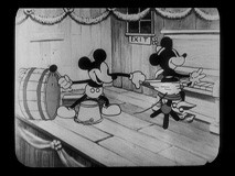
The Shindig (1930): This black and white short has just about everything that makes the early Mickey Mouse shorts so wonderful and also has just about everything that makes politically correct parents, the ones who complain about Pirates of the Caribbean shooting rifles at each other at Disneyland, want to go take a running jump off a cliff. It has Mickey snapping Minnie’s panties in time to “Pop, Goes the Weasel”. Clarabelle Cow lounges around naked with her udder hanging out, reading a dirty novel. And at the end, Mickey is literally flattened by an enormously fat girl pig.
Pluto’s Judgement Day (1935): The nightmare atmosphere this short generates compares favorably to the best output of the Fleisher studios from years before. In addition to being beautifully animated and having images and jokes as unsettling as they are funny, this is one of the best non-Silly Symphonies to demonstrate the Disney Studio’s amazing use of music to set tempo and tone. The cat chorus’ wailing cries of “we want Plu-to! We want Plu-to!” haunted many of my formative years.
Donald’s Lucky Day (1939): The Disney studio’s fantastic se nd up of
Symphony Hour (1942): Not only is this the last color appearance of Horace Horsecollar and Clarabelle Cow (now wearing a dress and minus udders), it’s the last outing for Mickey, Donald and Goofy together. Donald and Pete (as Mr. Macaroni) steal the show, but it has plenty of complex, detailed animation as the musical instruments slowly fall apart at the hands of the musicians. It’s also very funny and you get to hear the big rodent announced as “Michael Mouse”.
How to Play Football (1942): This short is so funny it’s almost difficult to watch: the cheerleaders beating themselves unconscious with their routine, the bizarre ellipsis created by blocking out action and narration with the crowd, the team members strewn across the locker room, and the animation of the coaches. It’s one of the fastest paced and funniest shorts of the entire Disney canon.
The Vanishing Private (1942): Although it may not be as morale-boosting or have as great a song as Der Fuehrer’s Face, this is another short which is so funny you wonder if the Warner Brothers animators began sneaking into the studio and working on the shorts under the cover of night. Also necessary viewing is The Old Army Game, from the next year, where Donald and Pete thinks the duck has been sawed in half by barbed wire and commanding officer Pete gives Donald his pistol to kill himself!
Victory Through Air Power (1943): The beautifully animated segments make this under-seen masterpiece more than just an illustrated lecture, and the final segment of the Allies’ symbolic defeat of the Japanese empire (storyboarded by Marc Davis) may be one of the most powerful things you’ll find in a Disney film that isn’t called Bambi. More chillingly, we know that this film convinced FDR to strengthen the
Duck Pimples (1945): This short is so surreal and strange that I thought for years it was a dream I had as a child. Makes a great double feature with the similarly creepy, shadowy and spare Donald Duck and the Gorilla.
The Three Caballeros (1946): The end result of the studio’s experimentations with color, music, surreal images, and new techniques is this absolutely beautiful film – it’s a masterpiece  and, technically, something of a Fantasia redux only set to a lively Latin soundtrack that’s one of Disney’s best ever. Much of the film takes place in Donald’s head as he literally goes out of his mind in a sex-fueled surrealistic reverie. Ward Kimball’s fantastic titular musical set piece is a highlight. The use of live-action and animation here is a forerunner to Song of the South, which is more logically structured but also not as interesting. It has a slow opening so be patient.
Melody Time (1948): This one is rather scattershot and slow, so having a DVD and being able to skip over the sometimes tiresome segments is actually a good thing here. But it has two absolute masterpieces wrapped up in it: Johnny Appleseed and Pecos Bill. The Pecos Bill segment, in particular, which begins with the haunting “Blue Shadows on the Trail” before building into the relentless pace of the story of Bill himself, is perfection itself and one of the studio’s best examples of sophisticated pacing, rising and falling action, and color stylization. Before DVD we had to sit through the much worse Gold Diggers of 1935 in order to see Busby Berkley’s masterful Lullaby of Broadway, so we shouldn’t be too hard on this overachieving package picture.
The Adventures of Ichabod & Mr. Toad (1949): Another underrated masterpiece, and much better than it’s follow up, the perennially boring Cinderella. Bing Crosby’s narration in the second segment is, particularly, a very sophisticated use of voiceover as Bing speaks both for and about all of the characters. Especially noteworthy is the wonderful “Tale of the Headless Horseman” number which sets up the famous chase through the woods and manages to make you laugh and feel very uncomfortable all at once. “A hip hip and a clippity-clop! He’s out looking for a head to chop! So don’t stop to figure out a plan – you can’t reason with a headless man!”
Out of Scale (1951): Those who are up on their Walt biographies will immediately recognize Donald Duck’s hobby in this short as a cute send-up of boss Walt’s Carolwood Pacific. Even better is Donald’s behavior in this short, which is at its’ most unhinged and erratic as he seeks to destroy Chip and Dale’s home as it’s “out of scale” with all of his miniature trees. The solution is particularly brilliant.
Teachers are People (1952): This one edges out the wonderful How to Be a Detective and How to Dance Goofy shorts for the best of the latter 50’s cycle because of it’s honesty in portraying young children as ruthless and bizarre violence obsessed little creatures. Goofy collects a succession of deadly weapons from young George. The ending is especially hilarious given our current school anxieties: “I will not bomb the school!”
20,000 Leagues Under the Sea (1954): Walt’s best and most serious live-action work is actually a haunting portrait of a man driven to madness, with Captain Nemo as perhaps James Mason’s second-best performance (I’ve always had a soft spot for his wonderful villain in North by Northwest). Top notch effects work, great performances by Kirk Douglas (master of guitar twirling) and Peter Lorre, and Harper Goff’s fantastic Nautilus all give an air of excellence. Today it’s easy to overlook that the film ends with one of the most loaded images you could have in a movie released in Cold War
Pigs is Pigs (1954): The manic pace and unusual animation style, combined with the clever story and charming verse-jig of this short piece makes it a standout in the studio’s rather spotty later career after it had decided to retire its’ most famous animated stars almost for good. It’s also, unexpectedly, a very funny parody of bureaucracy and makes good use of dialect humor. And yes, the multiplying guinea pigs are adorable.
Dateline:
 Paul Bunyan (1958): The last of Disney’s trio of “American Legends” shorts is just as good as the other two, with some great Paul Frees material (“T’weren’t nuthin’!”), a driving theme song and a touching ending. The animation is regrettably simplier than Johnny Appleseed and Pecos Bill, and the short is badly in need of restoration.
The Saga of Windwagon Smith (1961): This highly contested short has always enchanted me, and not just for its eccentric visual style, wonderful music and original concept, but a magisterial, ghostly ending that I find to be beautiful and affecting.
A Symposium on Popular Song (1962): All hail Ludwig von Drake. Hail, hail. All hail the Sherman Brothers. Hail, hail. All hail X Actencio and Bill Justice’s eccentric stop-motion animation which so enriches The Parent Trap and Mary Poppins. But wait – there’s a short that combines all of them! This hidden gem is as funny, strange and charming as it ought to be, with the
The Tenth Anniversary Show (1965): Perhaps the best way to remember Walt, he’s awfully charming and strange as he leads Julie Reihm around the WED model shop and won’t stop taking pictures of her. Later he stands in front of a process screen and promises us pretty girls in Adventureland. We love you, Walt.
Thanks for everybody’s feedback and support through this blog’s first few months, and everybody have a very happy New Year!


